Shiny Apps are becoming ubiquitous as a way for data scientists to present the results of an analysis, and also to engage with information consumers who may not be coders. The trend I see is that the greater the variety of skills and interests of the information consumers for any particular project, the more valued are interactive visualizations that can be integrated into enterprise-wide communication workflows. So, it is not surprising to see Shiny apps popping up in all manner of healthcare and medical applications. If data scientists are going to bring predictive analytics into clinical workflows where doctors, nurses, scientists, technicians and administrators are all part of near real-time decision processes, they are going to have to be even more inventive in providing these multi-skilled teams with low-friction tools to ingest and manipulate information. Below are few interesting Shiny apps that are broadly related to Health Care and Medicine. My guess is that interactive visualizations like these will improve research and clinical workflows, and eventually change how all of us look at Health Care and Medicine.
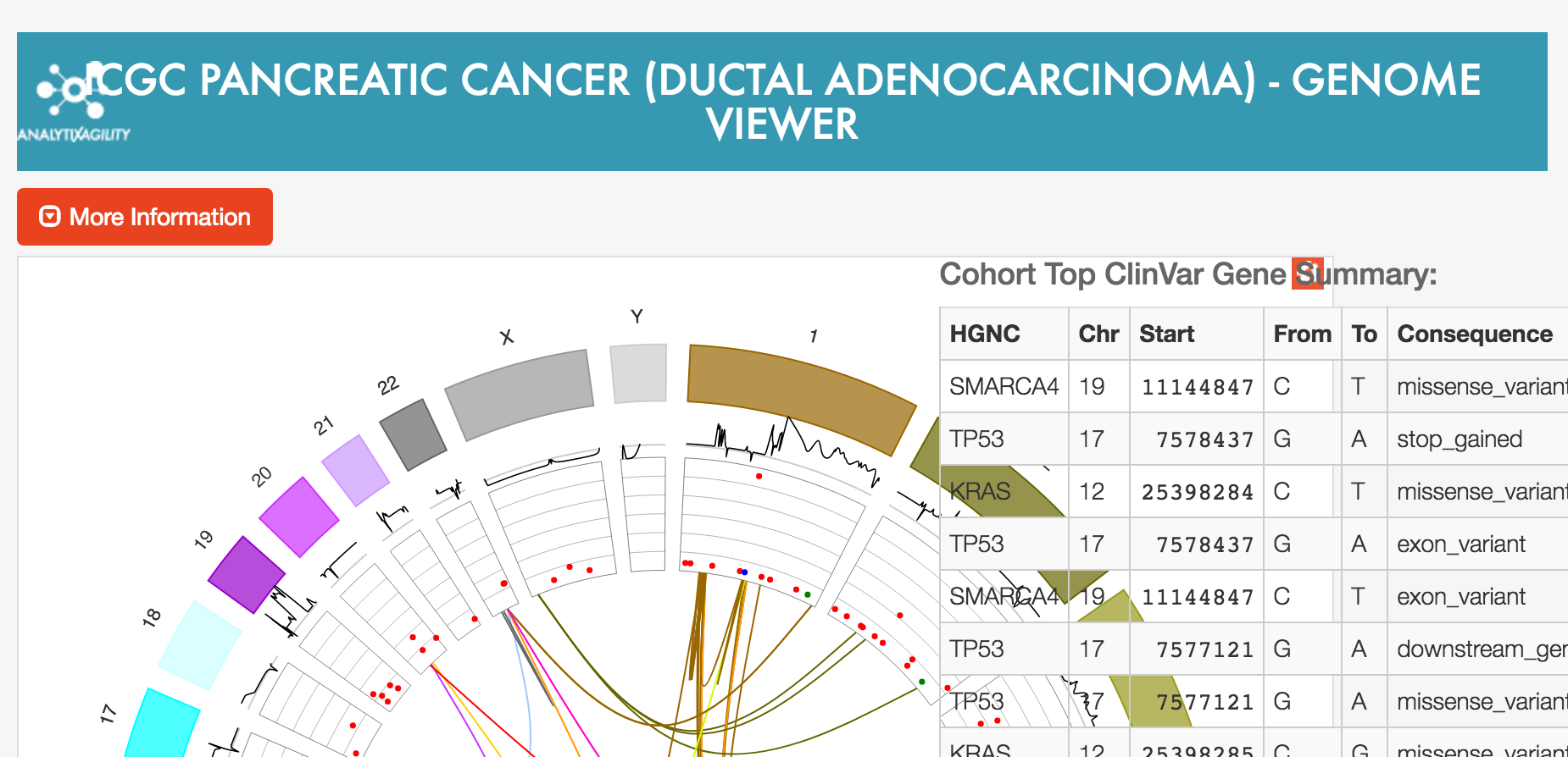
The Genome viewer for ICGC cancer, built by the folks at Aridhia, is geared towards researchers. You can learn how to interpret the plot and learn the story behind its creation here.
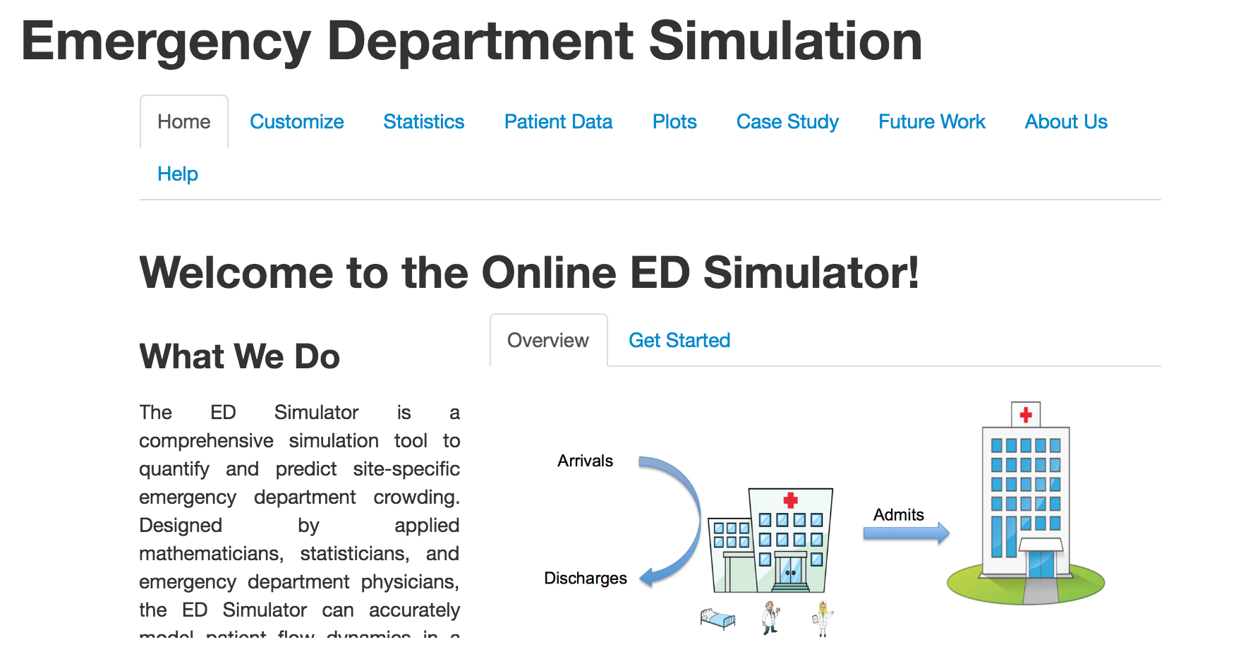
The Emergency Department Simulation, built by a group of mathematicians and physicians, models patient flow information under different assumptions about emergency department case loads, and illustrates how predictive analytics and statistical analysis can be integrated into operational clinical workflows.
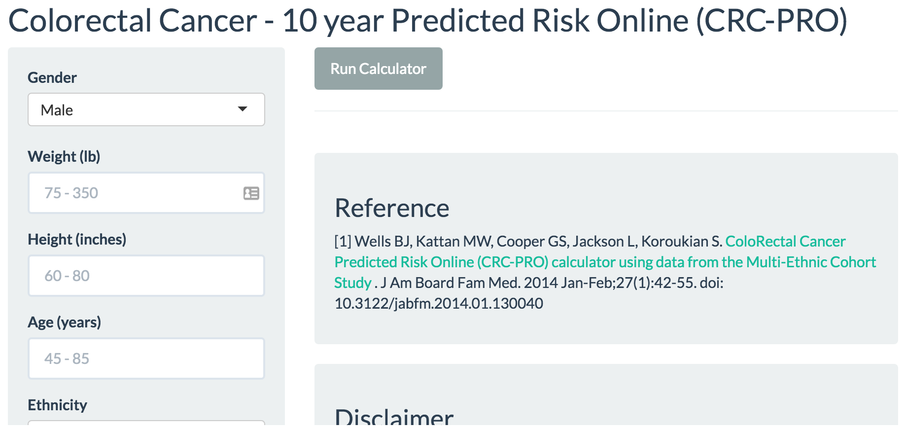
The Colorectal Cancer risk calculator from the Cleveland Clinic targets physicians and the general public to personalize the risk of this disease. I found working through different “what if” scenarios of great help in thinking about the risk factors that are under my control.
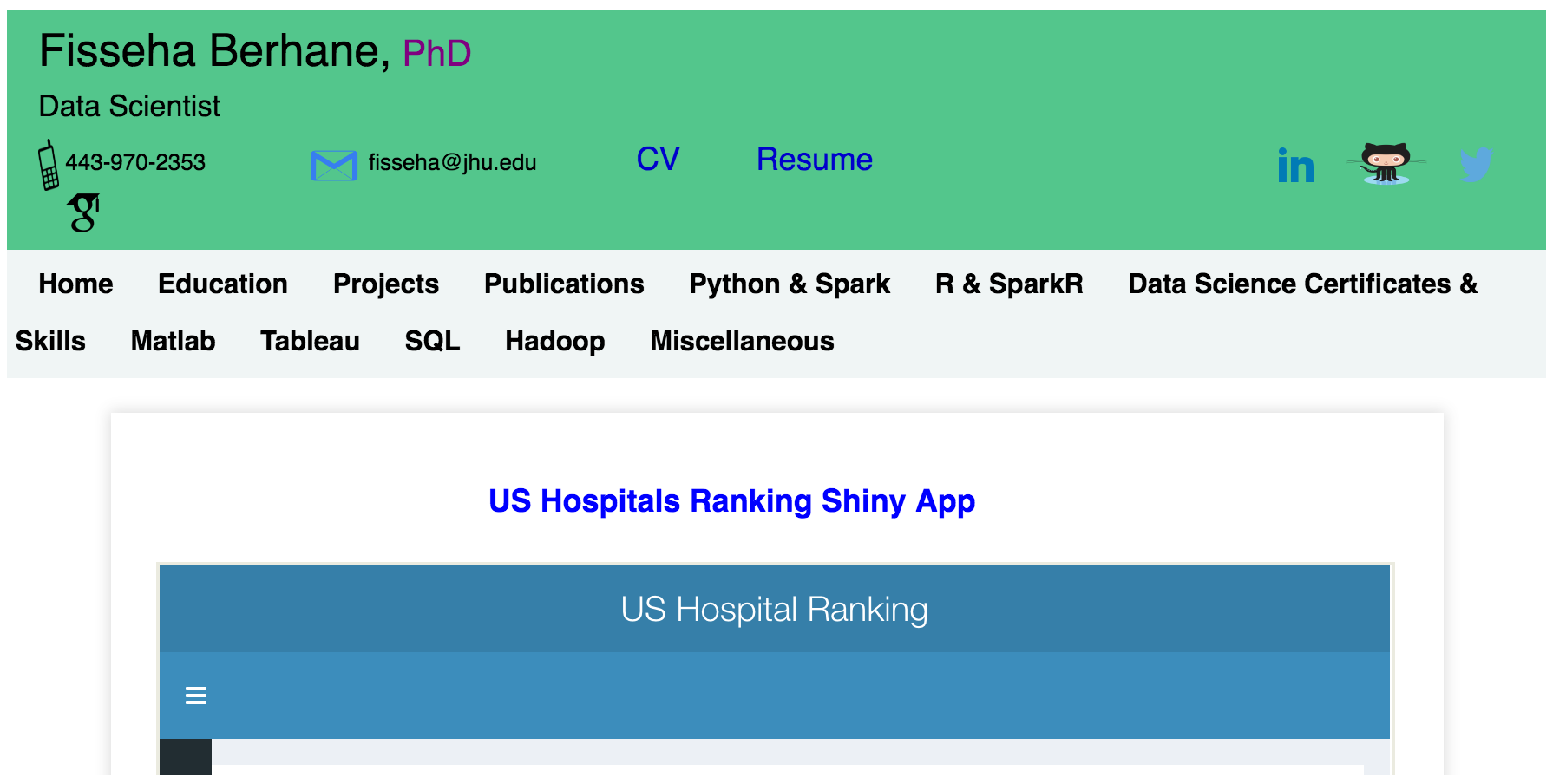
Finally, these two Shiny Apps that provide information about US hospitals should be of interest to public health planners, as well as to the general public. The Hospital Ranking App compares hospital outcomes for heart attack, heart failure, and pneumonia against national statistics.
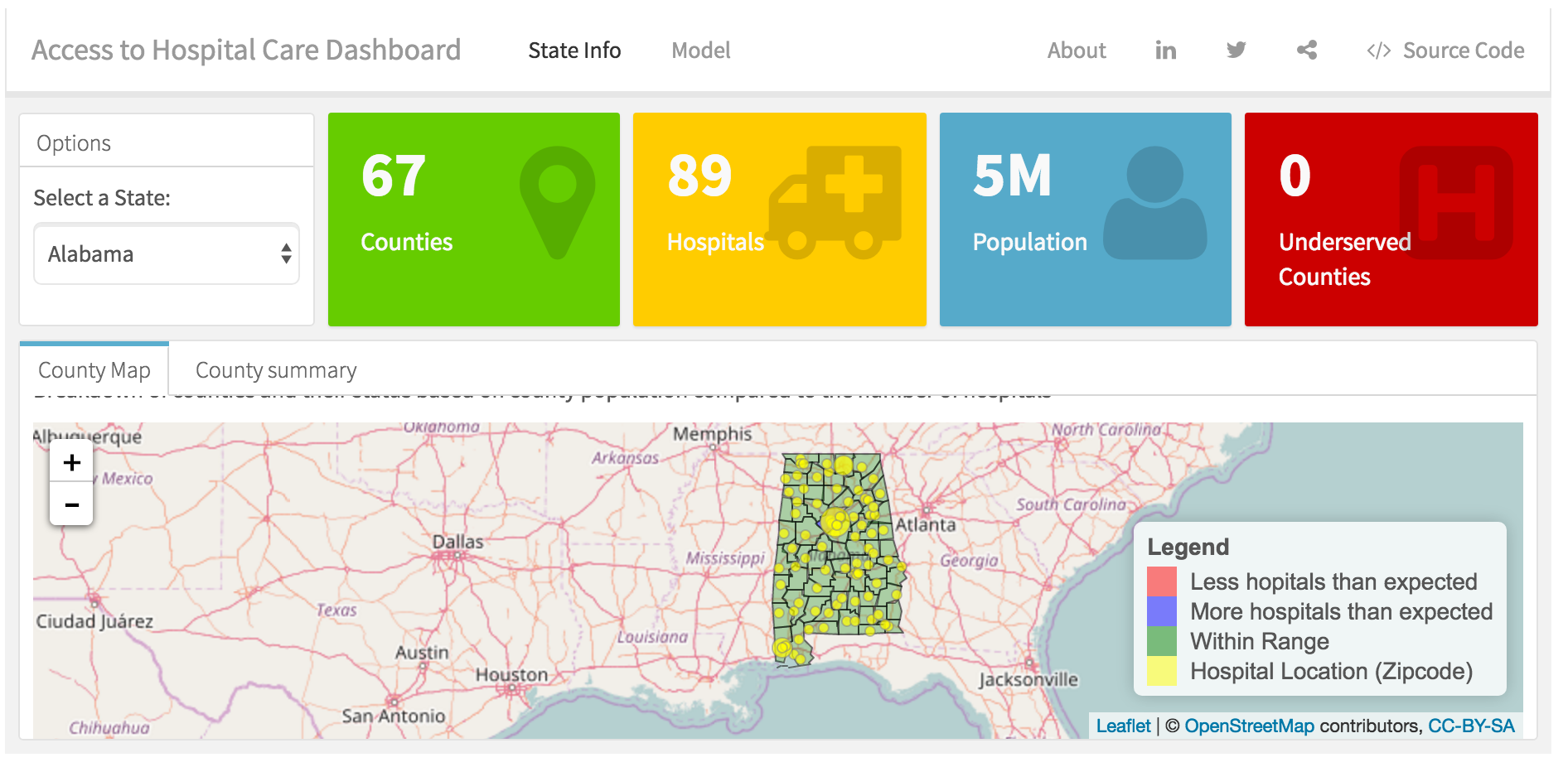
The Access to Hospital Care Dashboard plots the density of hospitals throughout the United States, and indicates under-served areas.
If you or your team are doing this kind of work, we here at R Views would love to hear about it.
You may leave a comment below or discuss the post in the forum community.rstudio.com.