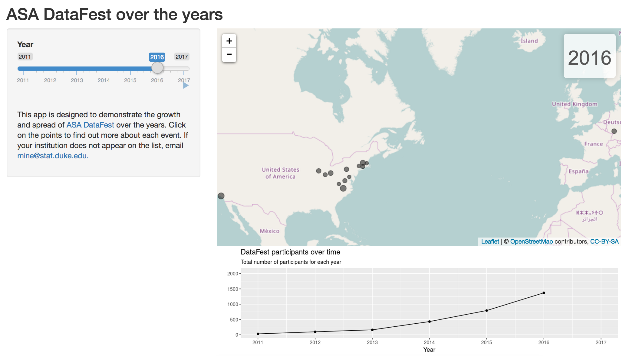
In a previous post, I introduced DataFest and how one can streamline the organization of this event using Google Forms and tools from the tidyverse. In this post, I’ll walk through building a Shiny app that demonstrates the growth of DataFest over the years, both in terms of host locations and participating institutions, as well as in terms of the number of students who participated in each event.
Here is a list of all packages used in this article:
library(tidyverse)
library(googlesheets)
library(devtools)
library(ggmap)
library(stringr)
library(leaflet)
The data were contributed by the event organizers, and were collected using a Google Form.
To begin, the data are read using the googlesheets package.
datafest_wide <- gs_title("DataFest over the years (Responses)") %>%
  gs_read()
Data prep
Then minimal manipulation is applied to column names, and a new column concatenating city, state, and country is added to be used in geocoding.
# rename columns
yrs <- sort(rep(2011:2017, 3))
cols <- c("df_", "num_part_", "other_inst_")

names(datafest_wide) <- c("timestamp", "host", "city", "state", "country", "url",
                     paste0(cols, yrs))

# geocode host location
datafest_wide <- datafest_wide %>%
  mutate(address = paste(city, state, country)) %>%
  mutate_geocode(address)
Note that we need to use the development version of the ggmap package for mutate_geocode() to play nicely with a tbl_df. You can install this version with install_github("dkahle/ggmap").
Next, we convert the data from wide to long format using functionality from the tidyr package. First, we gather the columns that contain yearly information (for each year, we have an indicator for whether an event was hosted at the location, the number of students that participated, and other participating institutions, if any). Then, we strip the year information from variable names, and instead save it as a variable in the dataset. Finally, we spread the key-value pair across three columns.
datafest_long <- datafest_wide %>%
  gather(key, value, df_2011:other_inst_2017) %>%
  mutate(year = as.numeric(str_match(key, "[0-9]+"))) %>%
  mutate(key = str_replace(key, "_[0-9]+", "")) %>%
  spread(key, value) %>%
  mutate(num_part = as.numeric(num_part))
Map of 2017 ASA DataFests
The eventual goal of this post is to make a Shiny app that maps DataFest spread and growth over the years; however, I’ll start by making a map for just one year, 2017, to develop the code for the map, and then use this code within a Shiny app.
Going forward, I’ll refer to the long dataset as datafest.
datafest <- datafest_longFirst, I take a subset of the data for hosts that held an event in 2017:
datafest_2017 <- filter(datafest, year == 2017 & df == "Yes")Then, I set a few colors to be used in the plot,
href_color <- "#A7C6C6"
marker_color <- "black"
part_color <- "#89548A"
as well as the bounds of the plot based on the min/max longitude/latitude.
left <- floor(min(datafest$lon))
right <- ceiling(max(datafest$lon))
bottom <- floor(min(datafest$lat))
top <- ceiling(max(datafest$lat))
I will be making the map using the leaflet package, as this package allows for easily overlaying markers and popups to maps. The popups are text bubbles that appear when a point is clicked, and that contain additional information about that data point. This is a good place to add some event-specific information, such as name of host, and link to their event homepage, other participating institutions (if any), and number of participants.
host_text <- paste0(
  "<b><a href='", datafest_2017$url, "' style='color:",
  href_color, "'>", datafest_2017$host, "</a></b>"
)

other_inst_text <- paste0(
  ifelse(is.na(datafest_2017$other_inst),
         "",
         paste0("<br>", "with participation from ", datafest_2017$other_inst))
)

part_text <- paste0(
  "<font color=", part_color,">", datafest_2017$num_part,
  " participants</font>"
)

popups <- paste0(
  host_text, other_inst_text, "<br>", part_text
)
We’re finally ready to make our map! Note that the radii of the points are proportional to the log of the number of participants (times an arbitrary factor for visual appeal).
leaflet() %>%
  addTiles() %>%
  fitBounds(lng1 = left, lat1 = bottom, lng2 = right, lat2 = top) %>%
  addCircleMarkers(lng = datafest_2017$lon, lat = datafest_2017$lat,
                   radius = log(datafest_2017$num_part) * 1.2,
                   fillColor = marker_color,
                   color = marker_color,
                   weight = 1,
                   fillOpacity = 0.5,
                   popup = popups)
Shiny app
Next, we build upon our earlier plot to create a Shiny app that has the following three components:
- A slider input with animation for values between 2011 and 2017 (DataFest years, so far)
- A line plot that shows the increase in the number participants over the year
- A map that shows the spread of DataFest geographically over the years
You can find and interact with the app at https://gallery.shinyapps.io/datafest-map-all-years/, and the code for the app, as well as all steps up to this point, can be found at this GitHub repo.

You may leave a comment below or discuss the post in the forum community.rstudio.com.