In previous posts here, here, and here, we spent quite a bit of time on portfolio volatility, using the standard deviation of returns as a proxy for volatility. Today we will begin to a two-part series on additional statistics that aid our understanding of return dispersion: skewness and kurtosis. Beyond being fancy words and required vocabulary for CFA level 1, these two concepts are both important and fascinating for lovers of returns distributions. For today, we will focus on skewness.
Skewness is the degree to which returns are asymmetric around the mean. Since a normal distribution is symmetric around the mean, skewness can be taken as one measure of how returns are not distributed normally. Why does skewness matter? If portfolio returns are right, or positively, skewed, it implies numerous small negative returns and a few large positive returns. If portfolio returns are left, or negatively, skewed, it implies numerous small positive returns and few large negative returns. The phrase “large negative returns” should trigger Pavlovian sweating for investors, even if it’s preceded by a diminutive modifier like “just a few”. For a portfolio manager, a negatively skewed distribution of returns implies a portfolio at risk of rare but large losses. This makes us nervous and is a bit like saying, “I’m healthy, except for my occasional massive heart attack.”
Let’s get to it.
First, have a look at one equation for skewness:
\[Skew=\sum_{t=1}^n (x_i-\overline{x})^3/n \bigg/ (\sum_{t=1}^n (x_i-\overline{x})^2/n)^{3/2}\]
Skew has important substantive implications for risk, and is also a concept that lends itself to data visualization. In fact, I find the visualizations of skewness more illuminating than the numbers themselves (though the numbers are what matter in the end). In this section, we will cover how to calculate skewness using xts and tidyverse methods, how to calculate rolling skewness, and how to create several data visualizations as pedagogical aids. We will be working with our usual portfolio consisting of:
+ SPY (S&P500 fund) weighted 25%
+ EFA (a non-US equities fund) weighted 25%
+ IJS (a small-cap value fund) weighted 20%
+ EEM (an emerging-mkts fund) weighted 20%
+ AGG (a bond fund) weighted 10%
Before we can calculate the skewness, we need to find portfolio monthly returns, which was covered in this post.
Building off that previous work, we will be working with two objects of portfolio returns:
+ portfolio_returns_xts_rebalanced_monthly (an xts of monthly returns)
+ portfolio_returns_tq_rebalanced_monthly (a tibble of monthly returns)
Let’s begin in the xts world and make use of the skewness() function from PerformanceAnalytics.
library(PerformanceAnalytics)
skew_xts <-  skewness(portfolio_returns_xts_rebalanced_monthly$returns)

skew_xts
## [1] -0.1710568Our portfolio is relatively balanced, and a slight negative skewness of -0.1710568 is unsurprising and unworrisome. However, that final number could be omitting important information and we will resist the temptation to stop there. For example, is that slight negative skew being caused by one very large negative monthly return? If so, what happened? Or is it caused by several medium-sized negative returns? What caused those? Were they consecutive? Are they seasonal? We need to investigate further.
Before doing so and having fun with data visualization, let’s explore the tidyverse methods and confirm consistent results.
We will make use of the same skewness() function, but because we are using a tibble, we use summarise() as well and call summarise(skew = skewness(returns). It’s not necessary, but we are also going to run this calculation by hand, the same as we have done with standard deviation. Feel free to delete the by-hand section from your code should this be ported to enterprise scripts, but keep in mind that there is a benefit to forcing ourselves and loved ones to write out equations: it emphasizes what those nice built-in functions are doing under the hood. If a client, customer or risk officer were ever to drill into our skewness calculations, it would be nice to have a super-firm grasp on the equation.
library(tidyverse)
library(tidyquant)
skew_tidy <-
  portfolio_returns_tq_rebalanced_monthly %>%
  summarise(skew_builtin = skewness(returns),
            skew_byhand =
              (sum((returns - mean(returns))^3)/length(returns))/
              ((sum((returns - mean(returns))^2)/length(returns)))^(3/2)) %>%
  select(skew_builtin, skew_byhand)
Let’s confirm that we have consistent calculations.
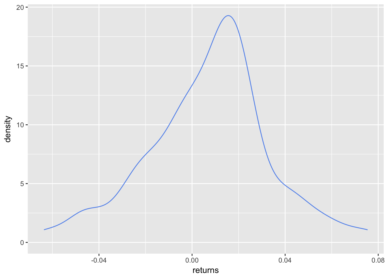
skew_xts## [1] -0.1710568skew_tidy$skew_builtin## [1] -0.1710568skew_tidy$skew_byhand## [1] -0.1710568The results are consistent using xts and our tidyverse, by-hand methods. Again, though, that singular number -0.1710568 does not fully illuminate the riskiness or distribution of this portfolio. To dig deeper, let’s first visualize the density of returns with stat_density from ggplot2.
portfolio_density_plot <-
  portfolio_returns_tq_rebalanced_monthly %>%
  ggplot(aes(x = returns)) +
  stat_density(geom = "line", alpha = 1, colour = "cornflowerblue")

portfolio_density_plot
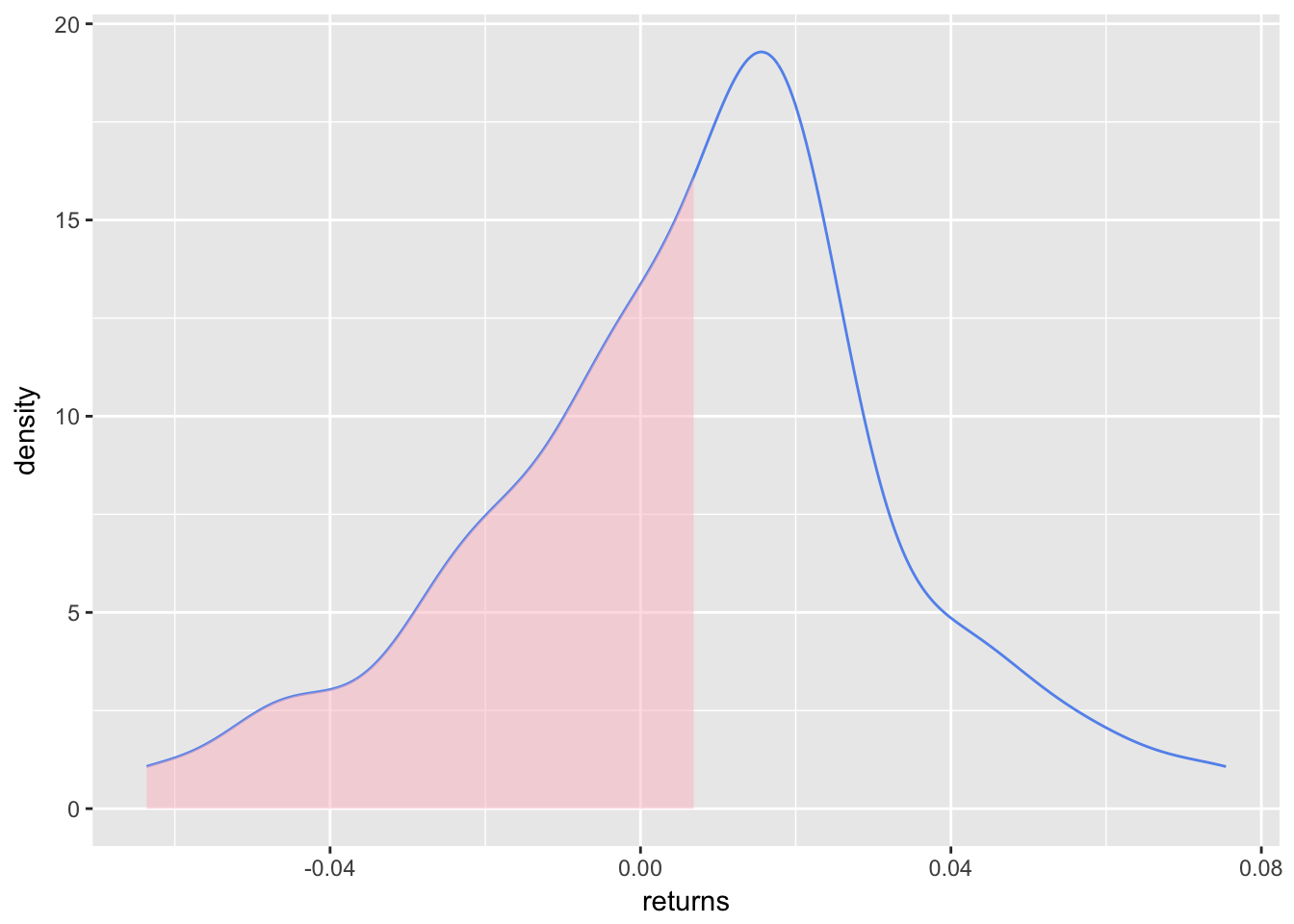
The slight negative skew is a bit more evident here. It would be nice to shade the area that falls below some threshold again, and let’s go with the mean return. To do that, let’s create an object called shaded_area using ggplot_build(portfolio_density_plot)$data[[1]] %>% filter(x < mean(portfolio_returns_tq_rebalanced_monthly$returns)). That snippet will take our original ggplot object and create a new object filtered for x values less than mean return. Then we use geom_area to add the shaded area to portfolio_density_plot.
shaded_area_data <-
  ggplot_build(portfolio_density_plot)$data[[1]] %>%
  filter(x < mean(portfolio_returns_tq_rebalanced_monthly$returns))

portfolio_density_plot_shaded <-
  portfolio_density_plot +
  geom_area(data = shaded_area_data, aes(x = x, y = y), fill="pink", alpha = 0.5)

portfolio_density_plot_shaded
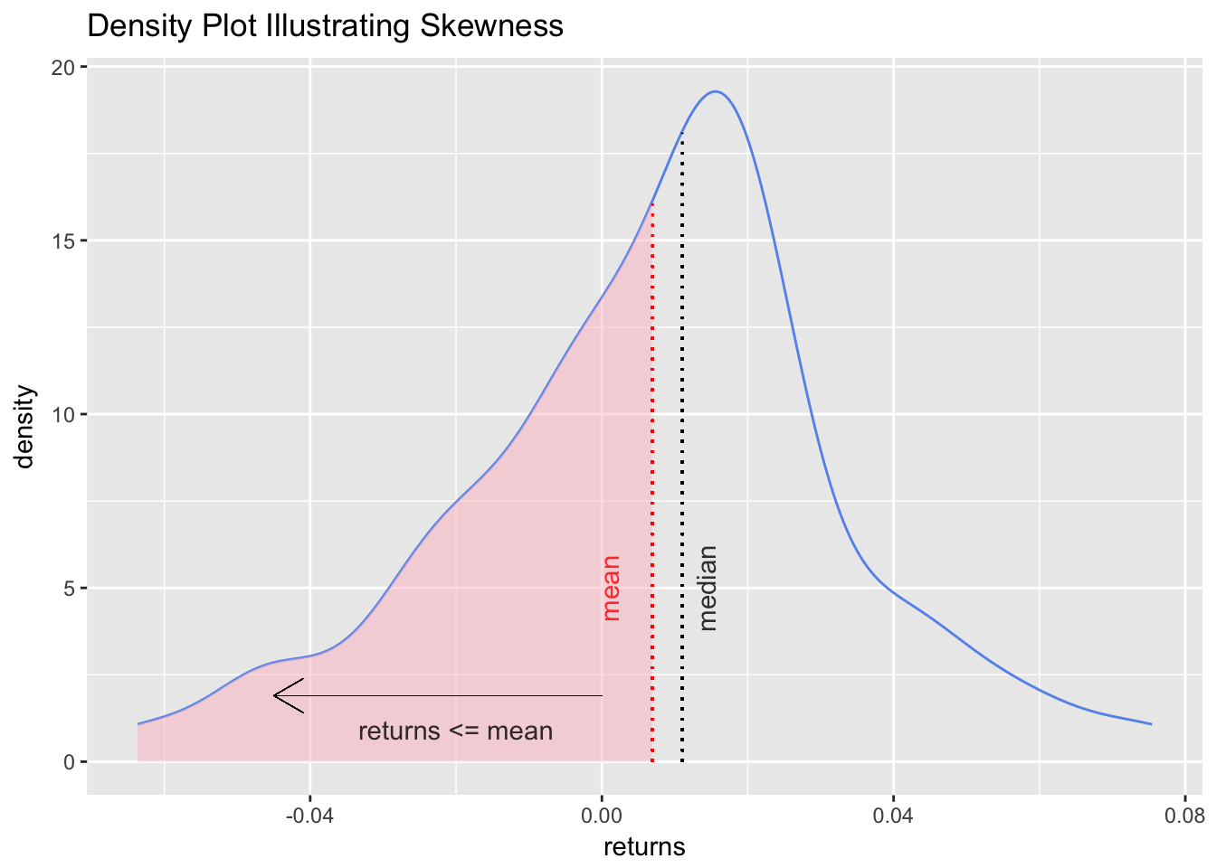
The shaded area highlights the mass of returns that fall below the mean. Let’s add a vertical line at the mean and median, and some explanatory labels. This will help to emphasize that negative skew indicates a mean less than the median.
First, create variables for mean and median so that we can add a vertical line.
median <- median(portfolio_returns_tq_rebalanced_monthly$returns)
mean <- mean(portfolio_returns_tq_rebalanced_monthly$returns)
We want the vertical lines to just touch the density plot so we once again use a call to ggplot_build(portfolio_density_plot)$data[[1]].
median_line_data <-
  ggplot_build(portfolio_density_plot)$data[[1]] %>%
  filter(x <= median)
Now we can start adding aesthetics to the latest iteration of our graph, which is stored in the object portfolio_density_plot_shaded.
portfolio_density_plot_shaded +

  geom_segment(aes(x = 0, y = 1.9, xend = -.045, yend = 1.9),
               arrow = arrow(length = unit(0.5, "cm")), size = .05) +

  annotate(geom = "text", x = -.02, y = .1, label = "returns <= mean",
           fontface = "plain", alpha = .8, vjust =  -1) +

  geom_segment(data = shaded_area_data, aes(x = mean, y = 0, xend = mean, yend = density),
               color = "red", linetype = "dotted") +

  annotate(geom = "text", x = mean, y = 5, label = "mean", color = "red",
           fontface = "plain", angle = 90, alpha = .8, vjust =  -1.75) +

  geom_segment(data = median_line_data, aes(x = median, y = 0, xend = median, yend = density),
               color = "black", linetype = "dotted") +

  annotate(geom = "text", x = median, y = 5, label = "median",
           fontface = "plain", angle = 90, alpha = .8, vjust =  1.75) +


  ggtitle("Density Plot Illustrating Skewness")
We added quite a bit to the chart, possibly too much, but it’s better to be over-inclusive now to test different variants. We can delete any of those features when using this chart later, or refer back to these lines of code should we ever want to reuse some of the aesthetics.
At this point, we have calculated the skewness of this portfolio throughout its history, and done so using three methods. We have also created an explanatory visualization.
Similar to the portfolio standard deviation, though, our work is not complete until we look at rolling skewness. Perhaps the first two years of the portfolio were positive skewed, and last two were negative skewed but the overall skewness is slightly negative. We would like to understand how the skewness has changed over time, and in different economic and market regimes. To do so, we calculate and visualize the rolling skewness over time.
In the xts world, calculating rolling skewness is almost identical to calculating rolling standard deviation, except we call the skewness() function instead of StdDev(). Since this is a rolling calculation, we need a window of time for each skewness; here, we will use a six-month window.
window <- 6
rolling_skew_xts <- na.omit(rollapply(portfolio_returns_xts_rebalanced_monthly, window,
                           function(x) skewness(x)))
Now we pop that xts object into highcharter for a visualization. Let’s make sure our y-axis range is large enough to capture the nature of the rolling skewness fluctuations by setting the range to between 3 and -3 with hc_yAxis(..., max = 3, min = -3). I find that if we keep the range from 1 to -1, it makes most rolling skews look like a roller coaster.
library(highcharter)
highchart(type = "stock") %>%
  hc_title(text = "Rolling") %>%
  hc_add_series(rolling_skew_xts, name = "Rolling skewness", color = "cornflowerblue") %>%
  hc_yAxis(title = list(text = "skewness"),
           opposite = FALSE,
           max = 3,
           min = -3) %>%
  hc_navigator(enabled = FALSE) %>%
  hc_scrollbar(enabled = FALSE)
For completeness of methods, we can calculate rolling skewness in a tibble and then use ggplot.
We will make use of rollapply() from within tq_mutate in tidyquant.
rolling_skew_tidy <-
  portfolio_returns_tq_rebalanced_monthly %>%
  tq_mutate(select = returns,
            mutate_fun = rollapply,
            width      = window,
            FUN        = skewness,
            col_rename = "skew")
rolling_skew_tidy is ready for ggplot. ggplot is not purpose-built for time series plotting, but we can set aes(x = date, y = skew) to make the x-axis our date values.
library(scales)
theme_update(plot.title = element_text(hjust = 0.5))
rolling_skew_tidy %>%
  ggplot(aes(x = date, y = skew)) +
  geom_line(color = "cornflowerblue") +
  ggtitle("Rolling Skew with ggplot") +
  ylab(paste("Rolling", window, "month skewness", sep = " ")) +
  scale_y_continuous(limits = c(-3, 3), breaks = pretty_breaks(n = 8)) +
  scale_x_date(breaks = pretty_breaks(n = 8))
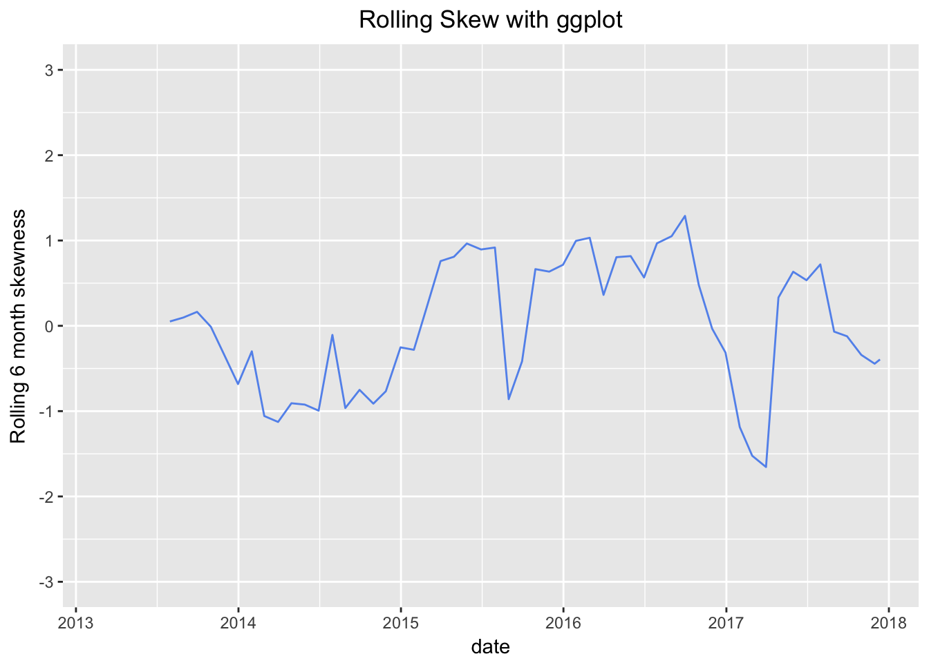
The rolling charts are quite illuminating and show that the six-month-interval skewness has been positive for about half the lifetime of this portfolio. Today, the overall skewness is negative, but the rolling skewness in mid-2016 was positive and greater than 1. It took a huge plunge starting at the end of 2016, and the lowest reading was -1.65 in March of 2017, most likely caused by one or two very large negative returns when the market was worried about the US election. We can see those worries start to abate as the rolling skewness becomes more positive throughout 2017.
That’s all for today. Thanks for reading and see you next time when we tackle kurtosis.
You may leave a comment below or discuss the post in the forum community.rstudio.com.