Happy 2018 and welcome to our first reproducible finance post of the year! What better way to ring in a new beginning than pondering/calculating/visualizing returns distributions.
We ended 2017 by tackling skewness, and we will begin 2018 by tackling kurtosis.
Kurtosis is a measure of the degree to which portfolio returns appear in the tails of our distribution. A normal distribution has a kurtosis of 3, which follows from the fact that a normal distribution does have some of its mass in its tails. A distribution with a kurtosis greater than 3 has more returns out in its tails than the normal, and one with kurtosis less than 3 has fewer returns in its tails than the normal. That matters to investors because more bad returns out in tails means that our portfolio might be at risk of a rare but huge downside. The terminology is a bit confusing. Negative kurtosis is considered less risky because it has fewer returns out in the tails. Negative == less risky? We’re not used to that in finance.
Kurtosis is often has the word ‘excess’ appended to its description, as in ‘negative excess kurtosis’ or ‘positive excess kurtosis’. That ‘excess’ is in comparison to a normal distribution kurtosis of 3. A distribution with negative excess kurtosis equal to -1 has an actual kurtosis of 2.
Enough with the faux investopedia entry, let’s get to the calculations, R code and visualizations.
Here’s the equation for excess kurtosis. Note that we subtract 3 at the end:
\[Kurtosis=\sum_{t=1}^n (x_i-\overline{x})^4/n \bigg/ (\sum_{t=1}^n (x_i-\overline{x})^2/n)^{2}-3 \]
By way of reminder, we will be working with our usual portfolio consisting of:
+ SPY (S&P500 fund) weighted 25%
+ EFA (a non-US equities fund) weighted 25%
+ IJS (a small-cap value fund) weighted 20%
+ EEM (an emerging-mkts fund) weighted 20%
+ AGG (a bond fund) weighted 10%
Before we can calculate kurtosis, we need to find portfolio monthly returns, which was covered in this post.
Building off that previous work, we will be working with two objects of portfolio returns:
+ portfolio_returns_xts_rebalanced_monthly (an xts of monthly returns)
+ portfolio_returns_tq_rebalanced_monthly (a tibble of monthly returns)
Now we are going to test our past self’s work on skewness, and reuse that code flow to expedite the kurtosis work. The logic will remain the same, but we will call different built-in functions and different by-hand calculations.
For the xts world, we use the kurtosis() function instead of the skewness() function.
kurt_xts <-  kurtosis(portfolio_returns_xts_rebalanced_monthly$returns)

kurt_xts
## [1] 0.5267736For tidy, we have the same piped flow and use the formula for kurtosis for our by-hand calculations. Our by-hand result is labeled with kurt_byhand, and involves quite a few parentheticals to map it back to the kurtosis equation above.
kurt_tidy <-
  portfolio_returns_tq_rebalanced_monthly %>%
  summarise(
            kurt_builtin = kurtosis(returns),
            kurt_byhand =
              ((sum((returns - mean(returns))^4)/length(returns))/
              ((sum((returns - mean(returns))^2)/length(returns))^2)) - 3) %>%
  select(kurt_builtin, kurt_byhand)
Let’s confirm that we have consistent calculations.
kurt_xts## [1] 0.5267736kurt_tidy$kurt_builtin## [1] 0.5267736kurt_tidy$kurt_byhand## [1] 0.5267736We have consistent results from xts and the tidy built-in/by-hand worlds, and we were able to reuse our code from above to shorten the development time here. dd
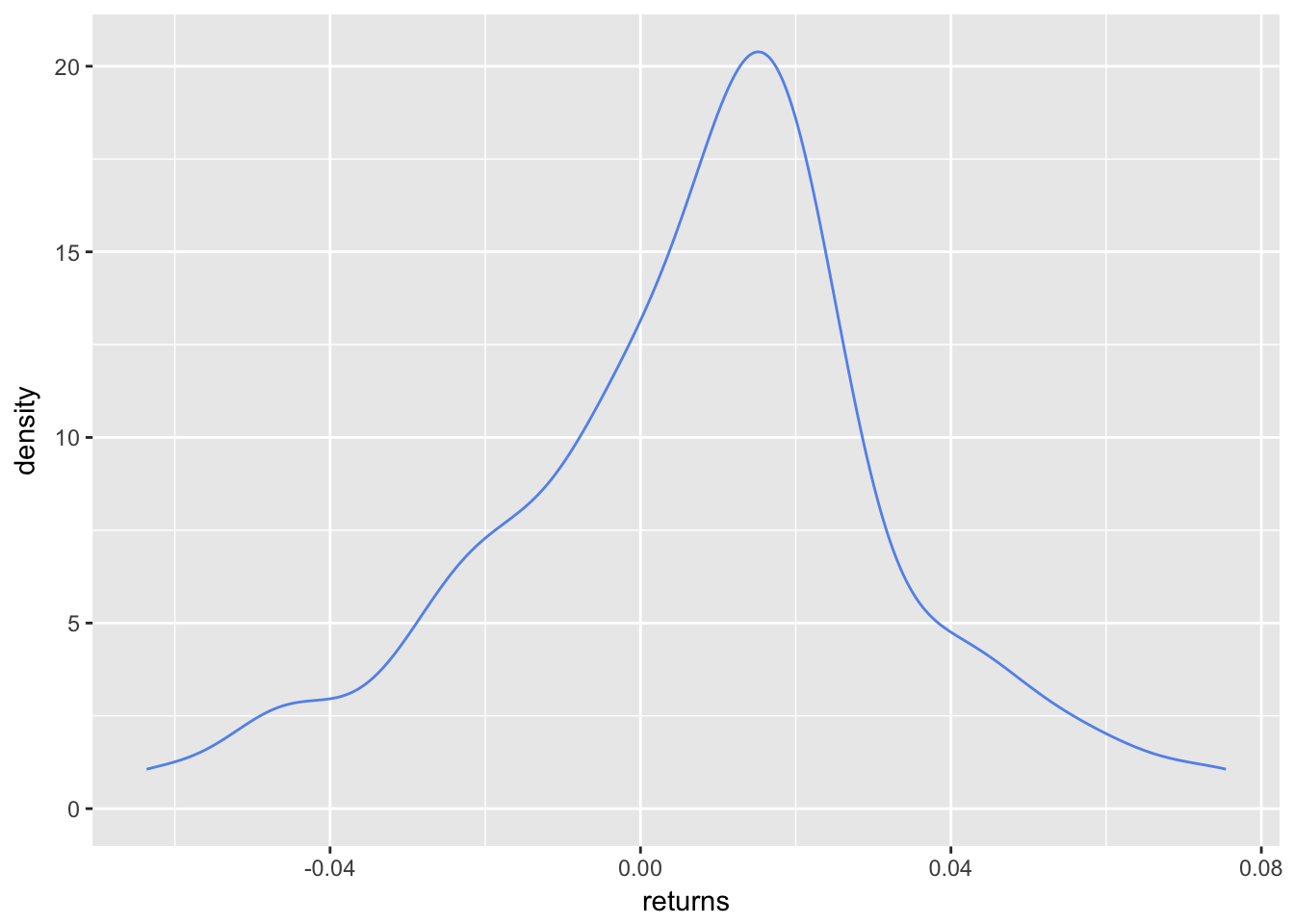
Let’s do the same with the visualizations and head straight for a density plot, starting with the same portfolio_density_plot.
portfolio_density_plot <-
  portfolio_returns_tq_rebalanced_monthly %>%
  ggplot(aes(x = returns)) +
  stat_density(geom = "line", alpha = 1, colour = "cornflowerblue")

portfolio_density_plot
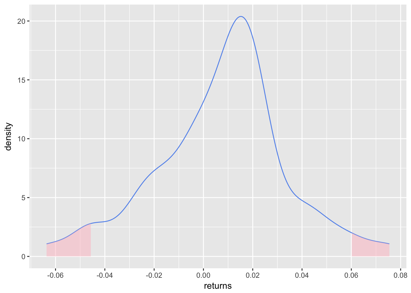
We are interested in both tails for kurtosis, so let’s shade at 2 standard deviations above and below the mean return (for our skewness work, we only shaded the negative tail).
mean <- mean(portfolio_returns_tq_rebalanced_monthly$returns)

sd_pos <-  mean + (2 * sd(portfolio_returns_tq_rebalanced_monthly$returns))

sd_neg <- mean - (2 * sd(portfolio_returns_tq_rebalanced_monthly$returns))

sd_pos_shaded_area <-
  ggplot_build(portfolio_density_plot)$data[[1]] %>%
  filter(x > sd_pos )

sd_neg_shaded_area <-
  ggplot_build(portfolio_density_plot)$data[[1]] %>%
  filter(x < sd_neg)

  portfolio_density_plot <-
    portfolio_density_plot +
    geom_area(data = sd_pos_shaded_area, aes(x = x, y = y), fill="pink", alpha = 0.5) +
    geom_area(data = sd_neg_shaded_area, aes(x = x, y = y), fill="pink", alpha = 0.5) +
    scale_x_continuous(breaks = scales::pretty_breaks(n = 10))

  portfolio_density_plot
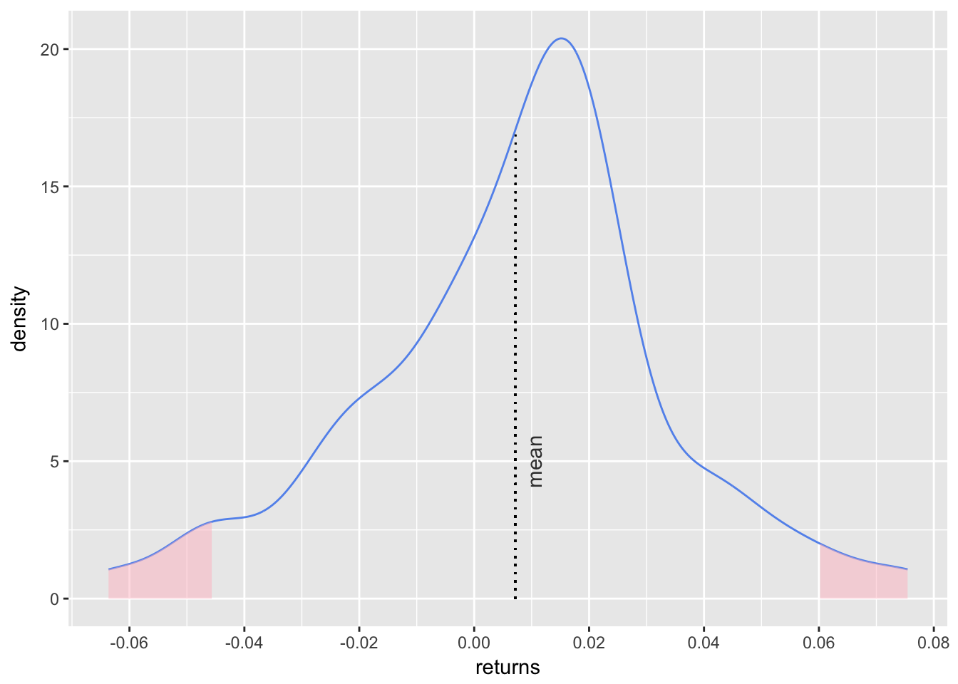
That density chart is a good look at the mass in both tails, where we have defined ‘tail’ as being two standard deviations away from the mean. We can add a line for the mean, as did in our skewness visualization, with the following.
mean <- mean(portfolio_returns_tq_rebalanced_monthly$returns)

mean_line_data <-
  ggplot_build(portfolio_density_plot)$data[[1]] %>%
  filter(x <= mean)


portfolio_density_plot +

geom_segment(data = mean_line_data, aes(x = mean, y = 0, xend = mean, yend = density),
               color = "black", linetype = "dotted") +

  annotate(geom = "text", x = mean, y = 5, label = "mean",
           fontface = "plain", angle = 90, alpha = .8, vjust =  1.75)
Finally, we can calculate and chart the rolling kurtosis with the same logic as we did for skewness. The only difference is that here we call fun = kurtosis instead of fun = skewness.
window <- 6
rolling_kurt_xts <- na.omit(apply.rolling(portfolio_returns_xts_rebalanced_monthly, window,
                           fun = kurtosis))
Now we pop that xts object into highcharter for a visualization.
highchart(type = "stock") %>%
  hc_title(text = "Rolling Kurt") %>%
  hc_add_series(rolling_kurt_xts, name = "Rolling kurtosis", color = "cornflowerblue") %>%
  hc_yAxis(title = list(text = "kurtosis"),
           opposite = FALSE,
           max = .03,
           min = -.03) %>%
  hc_navigator(enabled = FALSE) %>%
  hc_scrollbar(enabled = FALSE)
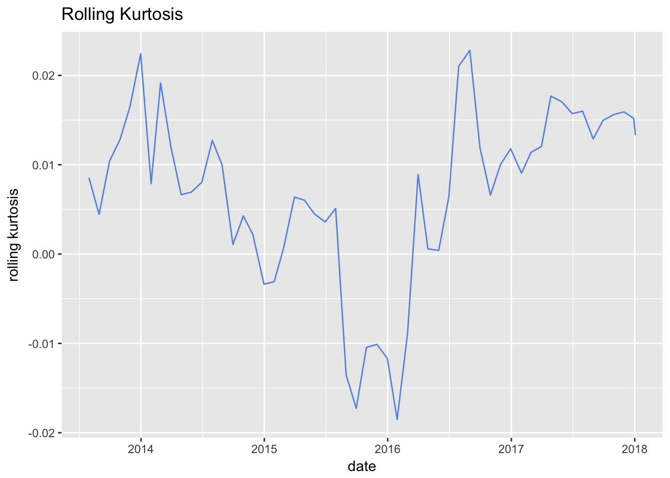
We didn’t cover this before, but what if we wanted to use ggplot for the rolling kurtosis? We could convert that xts object to a tibble with tk_tbl() from the timetk package, and then pipe straight to ggplot.
rolling_kurt_xts %>%
  tk_tbl(preserve_index = TRUE, rename_index = "date") %>%
  rename(rolling_kurtosis = calcs) %>%
  ggplot(aes(x = date, y = rolling_kurtosis)) +
  geom_line(color = "cornflowerblue") +
  xlab("date") +
  ylab("rolling kurtosis") +
  ggtitle("Rolling Kurtosis")
Interestingly, this portfolio has displayed slight positive rolling excess kurtosis for most of its life, except during the last half of 2015 through early 2016.
That’s all for today. Our work on kurtosis was made a lot more efficient by our work on skewness - so let’s thank our 2017 selves for constructing a reproducible and reusable code flow! See you next time.
You may leave a comment below or discuss the post in the forum community.rstudio.com.