Samuel Berchuck is a Postdoctoral Associate in Duke University’s Department of Statistical Science and Forge-Duke’s Center for Actionable Health Data Science.
Joshua L. Warren is an Assistant Professor of Biostatistics at Yale University.
Looking Forward in Glaucoma Progression Research
The contribution of the womblR package and corresponding statistical methodology is a technique for correctly accounting for the complex spatial structure of the visual field. The purpose of this method is to properly model visual field data, so that an effective diagnostic is derived that discriminates progression status. This is one of many important clinical questions that needs to be addressed in glaucoma research. Others include: quantifying visual field variability to create simulations of healthy and progression patients, combining multiple data modalities to obtain a composite diagnostic, and predicting the timing and spatial location of future vision loss. There is opportunity within the glaucoma literature for the development of quantitative methods that answer important clinical questions, are easy to understand, and are simple to use. To this end, in closing this three-part series, we present a final example of a new method that uses change points to assess future vision loss.
Modeling Changes on the Visual Field Using Spatial Change Points
To motivate the use of change points, we note that patients diagnosed with glaucoma are often monitored for years with slow changes in visual functionality. It is not until disease progression that notable vision loss occurs, and the deterioration is often swift. This disease course inspires a modeling framework that can identify a point of functional change in the course of follow-up, thus change points are employed. This is an appealing modeling framework, because the concept of disease progression becomes intrinsically parameterized into the model, with the change point representing the point of functional change. In this model, the time of the change point triggers a simultaneous change in both the mean and variance process. Furthermore, to account for the typical trend of a long period of monitoring with little change followed by abrupt vision loss, we force the mean and variance to be constant before the change point. For the mean process, and assuming data from a patient with nine visual field tests, this results in \[\mu_t\left(\mathbf{s}_i\right)=\left\{ \begin{array}{ll}
{\beta}_0\left(\mathbf{s}_i\right) & x_t \leq \theta\left(\mathbf{s}_i\right),\\
{\beta}_0\left(\mathbf{s}_i\right) + {\beta}_1\left(\mathbf{s}_i\right)\left\{x_t-\theta\left(\mathbf{s}_i\right)\right\} & \theta\left(\mathbf{s}_i\right) \leq x_t.\end{array} \right. \quad t = 1,\ldots,9 \quad i = 1,\ldots,52 \] Here, the change point at location \(\mathbf{s}_i\) is given by \(\theta(\mathbf{s}_i)\), and \(x_t\) is the days from baseline visit for follow-up visit \(t\). A final important detail is that the change points \(\theta(\mathbf{s}_i)\) are truncated in the observed follow-up range, \((x_1, x_9)\). In practice, the true change point can occur outside of this region, so we define a latent process, \(\eta(\mathbf{s}_i)\), that defines the true change point, \(\theta(\mathbf{s}_i) = \max\{\min\{\eta(\mathbf{s}_i), x_9\}, x_1\}\). Finally, all of the location-specific effects are modeled using a novel multivariate conditional autoregressive (MCAR) prior that incorporates the anatomy detailed in the womblR method. More details can be found in Berchuck et al. 2018.
We once again rely on MCMC methods for inference, and a package similar to womblR was developed that implements the spatially varying change point model, spCP. This package has much of the same functionality as womblR, and we demonstrate its functionality below.
We begin by loading spCP. All of the visual field data (VFSeries), adjacencies (HFAII_Queen), and anatomical angles (GarwayHeath) are included in the spCP package.
###Load package
library(spCP)

###Format data
blind_spot <- c(26, 35) # define blind spot
VFSeries <- VFSeries[order(VFSeries$Location), ] # sort by location
VFSeries <- VFSeries[order(VFSeries$Visit), ] # sort by visit
VFSeries <- VFSeries[!VFSeries$Location %in% blind_spot, ] # remove blind spot locations
Y <- VFSeries$DLS # define observed outcome data
Time <- unique(VFSeries$Time) / 365 # years since baseline visit
MaxTime <- max(Time)

###Neighborhood objects
W <- HFAII_Queen[-blind_spot, -blind_spot] # visual field adjacency matrix
M <- dim(W)[1] # number of locations
DM <- GarwayHeath[-blind_spot] # Garway-Heath angles
Nu <- length(Time) # number of visits

###Obtain bounds for spatial parameter (details are in Berchuck et al. 2018)
pdist <- function(x, y) pmin(abs(x - y), (360 - pmax(x, y) + pmin(x, y))) #Dissimilarity metric distance function (i.e., circumference)
DM_Matrix <- matrix(nrow = M, ncol = M)
for (i in 1:M) {
  for (j in 1:M) {
    DM_Matrix[i, j] <- pdist(DM[i], DM[j])
  }
}
BAlpha <- -log(0.5) / min(DM_Matrix[DM_Matrix > 0])
AAlpha <- 0

###Hyperparameters
Hypers <- list(Alpha = list(AAlpha = AAlpha, BAlpha = BAlpha),
               Sigma = list(Xi = 6, Psi = diag(5)),
               Delta = list(Kappa2 = 1000))

###Starting values
Starting <- list(Sigma = 0.01 * diag(5),
                 Alpha = mean(c(AAlpha, BAlpha)),
                 Delta = c(0, 0, 0, 0, 0))

###Metropolis tuning variances
Tuning <- list(Lambda0Vec = rep(1, M),
               Lambda1Vec = rep(1, M),
               EtaVec = rep(1, M),
               Alpha = 1)

###MCMC inputs
MCMC <- list(NBurn = 10000, NSims = 250000, NThin = 25, NPilot = 20)
Once the inputs have been properly formatted, the program can be run.
###Run MCMC sampler
reg.spCP <- spCP(Y = Y, DM = DM, W = W, Time = Time,
                 Starting = Starting, Hypers = Hypers, Tuning = Tuning, MCMC = MCMC,
                 Family = "tobit",
                 Weights = "continuous",
                 Distance = "circumference",
                 Rho = 0.99,
                 ScaleY = 10,
                 ScaleDM = 100,
                 Seed = 54)
## Burn-in progress: |*************************************************|
## Sampler progress: 0%.. 10%.. 20%.. 30%.. 40%.. 50%.. 60%.. 70%.. 80%.. 90%.. 100%..
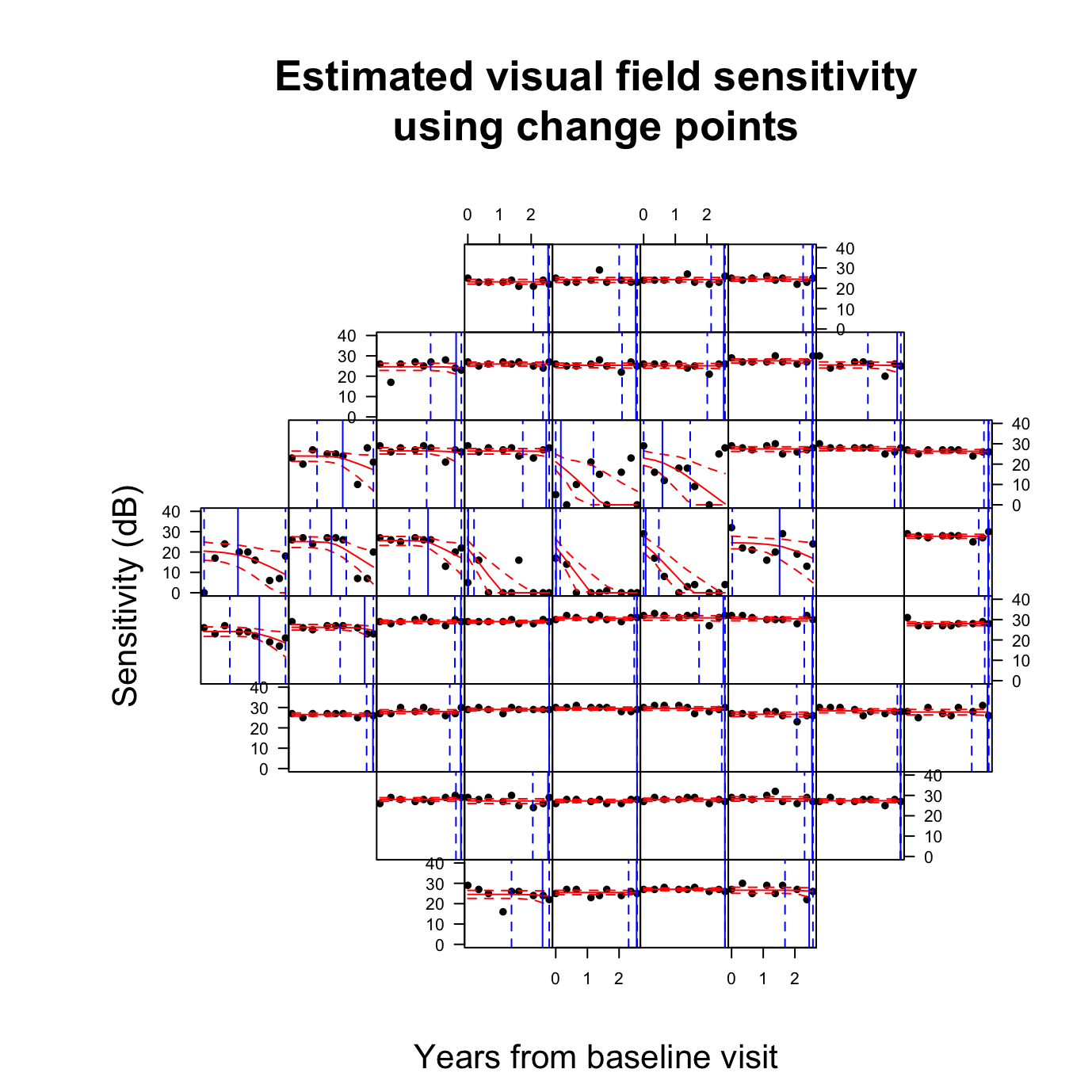
To visualize the estimated change points, we can use the PlotCP function from spcP. The function requires the model fit object and the original data set, plus the variable names of the raw DLS, time (in years), and spatial locations.
VFSeries$TimeYears <- VFSeries$Time / 365
PlotCP(reg.spCP,
       VFSeries,
       dls = "DLS",
       time = "TimeYears",
       location = "Location",
       cp.line = TRUE,
       cp.ci = TRUE)
Using the PlotCP function, we present the posterior means of the change points using a blue vertical line, with dashed 95% credible intervals. Furthermore, the mean process and credible interval are plotted using red lines, and the raw DLS values are given by black points. For this example patient, the majority of the change points are at the edges of follow-up. When the DLS is constant over time, the estimated change points are at the end of follow-up, while any trends that are present before follow-up correspond to the change point occurring at the beginning. This information provides clinicians with visual and quantitative confirmation of functional changes across the visual field.
Change Points as a Proxy for Progression
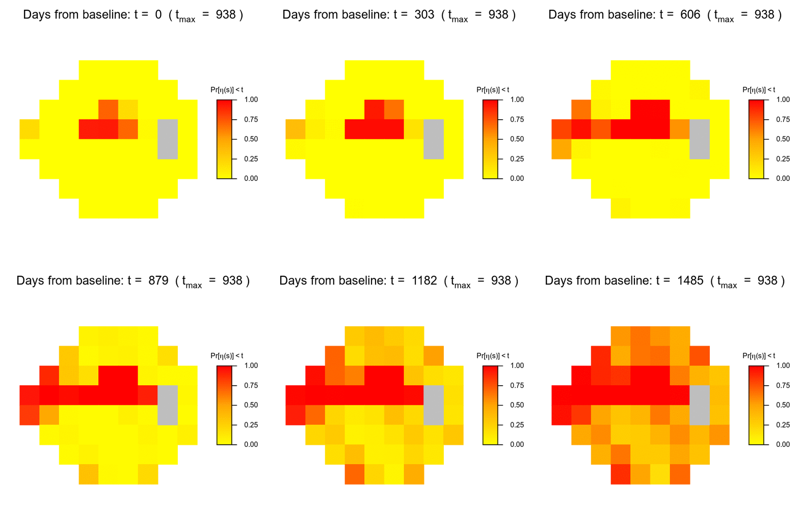
To formalize the importance of the change points, we look to convert their presence or absence into a clinical decision. We decide to calculate the probability that a change point has been observed at each location across the visual field. To provide a tool that is useful for clinicians, we create a gif that presents the probability of a change point throughout a patient’s follow-up, and are able to predict one and a half years into the future. In Berchuck et al. 2018, it is shown that these change points are highly predictive of progression.
We begin by extracting and calculating the change point probabilities.
###Extract change point posterior samples
eta <- reg.spCP$eta

###Convert change points to probabilties of occuring before time t
NFrames <- 50 # number of frames in GIF
GIF_Times <- seq(0, MaxTime + 1.5, length.out = NFrames) # obtain GIF 1.5 years after the end of follow-up
GIF_Days <- round(GIF_Times * 365) # convert to days for use later
CP_Probs <- matrix(nrow = M, ncol = NFrames)

###Obtain probabilties at each time point
for (t in 1:NFrames) {
  CP_Probs[, t] <- apply(eta, 2, function(x) mean(x < GIF_Times[t]))
}
colnames(CP_Probs) <- GIF_Times
Now, to create a gif of the probabilities, we use the magick package, and in particular, the functions image_graph and image_animate. Furthermore, we use the PlotSensitivity function from womblR to plot the predicted probabilities on the visual field.
###Load packages
library(magick) # package for creating GIFs
library(womblR) # loaded for PlotSensitivity

###Create GIF
Img <- image_graph(600, 600, res = 96)
for (f in 1:NFrames) {
  p <- womblR::PlotSensitivity(CP_Probs[, f],
                               legend.lab = expression(paste("Pr[", eta, "(s)] < ", t)),
                               zlim = c(0, 1),
                               bins = 250,
                               legend.round = 2,
                               border = FALSE,
                               main = bquote("Days from baseline: t = " ~ .(GIF_Days[f]) ~ " (" ~ t[max] ~ " = " ~ .(Time[Nu] * 365) ~ ")"))
}
dev.off()
## quartz_off_screen
## 2Now, we animate and print the created gif using the image_animate function, specifying 10 frames per second using the fps option.
Animation <- image_animate(Img, fps = 10)
Animation
This gif has many properties that make it clinically useful. The space-time nature of the image allows for clinicians to understand not only the current state of the disease, but also the progression pattern throughout all of follow-up. Furthermore, the gif shows the pattern and future risk of progression over the next one and a half years, presenting clinicians a tool for planning for future risk.
Conclusions and Future Directions
The hope in developing these R packages is for them to be used clinically, and to inspire other quantitative scientists to do the same. When statistical methods are typically developed for medical research, it is more common for the methodologies to be published without any corresponding software package. This means that no matter how impactful the method may be, it is unlikely to make a clinical impact for many years, due to the complexity in implementing the inferential methods. Clinicians are dependent on quantitative methods for analyzing the massive amounts of data that exist in today’s world, and they are typically reliant on the proprietary software that is built into the imaging machines themselves. This software is useful, but because the methods are often not published, it can be difficult to interpret the results. More open-source software being developed for medical research will lead to greater collaboration and visibility of the important problems being addressed by health researchers. The R environment, including CRAN and RStudio, make it particularly easy to create and share R packages, and the development of Rcpp and its relatives allow for the packages to be computationally fast. Our hope is that the womblR and spCP packages illustrate this concept and excite people to get involved in glaucoma research, or one of many other important health areas.
Reference
- Berchuck, S.I., Mwanza, J.C., & Warren, J.L. (2018). “A Spatially Varying Change Points Model for Monitoring Glaucoma Progression Using Visual Field Data”.
You may leave a comment below or discuss the post in the forum community.rstudio.com.