Welcome to Reproducible Finance 2019! It’s a new year, a new beginning, the Earth has completed one more trip around the sun, and that means it’s time to look back on the previous January to December cycle.
Today and next time, we’ll explore the returns and volatilities of various market sectors in 2018. We might also get into fund flows and explore a new data source because this fantastic piece from the FT has the wheels turning. So much data, so little time.
Back to the task at hand, today we will grab data on the daily returns of various stock market sector ETFs and build exploratory data visualizations around that data.
From an R code perspective, we will get familiar with a new source for market data (tiingo, which has come up in several conversations recently and seems to be gaining nice traction in the R world), build some ggplots, and dive into highcharter a bit. In that sense, it’s also somewhat of a look back to our previous work because we’ll be stepping through some good ‘ol data import, wrangling, and visualization. Some of the code flows might look familiar to long-time readers, but if you’ve joined us recently and haven’t gone back to read the oh-so-invigorating previous posts, this should give a good sense of how we think about working with financial data.
Let’s get to it. We want to import data on 10 sector ETFs and also on SPY, the market ETF. We’ll first need the tickers of each sector ETF:
ticker = ("XLY", "XLP", "XLE",
          "XLF", "XLV", "XLI", "XLB",
          "XLK", "XLU", "XLRE",
          "SPY")
And our sector labels are:
sector = ("Consumer Discretionary", "Consumer Staples", "Energy",
          "Financials", "Health Care", "Industrials", "Materials",
          "Information Technology", "Utilities", "Real Estate",
          "Market")
We can use the tibble() function to save those as columns of new tibble.
First, let’s load up our packages for the day, because we’ll need the tibble package via tidyverse.
library(tidyverse)
library(tidyquant)
library(riingo)
library(timetk)
library(tibbletime)
library(highcharter)
library(htmltools)
And on to creating a tibble:
etf_ticker_sector <- tibble(
  ticker = c("XLY", "XLP", "XLE",
          "XLF", "XLV", "XLI", "XLB",
          "XLK", "XLU", "XLRE",
          "SPY"),
  sector = c("Consumer Discretionary", "Consumer Staples", "Energy",
          "Financials", "Health Care", "Industrials", "Materials",
          "Information Technology", "Utilities", "Real Estate",
          "Market")
)

etf_ticker_sector
# A tibble: 11 x 2
ticker sector
<chr> <chr>
1 XLY Consumer Discretionary
2 XLP Consumer Staples
3 XLE Energy
4 XLF Financials
5 XLV Health Care
6 XLI Industrials
7 XLB Materials
8 XLK Information Technology
9 XLU Utilities
10 XLRE Real Estate
11 SPY Market Now, we want to import the daily prices for 2018 for these tickers. We could use getSymbols() to access Yahoo! Finance as we have done for the last three years, but let’s do something crazy and explore a new data source, the excellent tiingo, which we access via the riingo package. The workhorse function to grab price data is riingo_prices(), to which we need to supply our tickers and a start_date/end_date pair.
Let’s start with the tickers, which we have already saved in the ticker column of etf_ticker_sector. That wasn’t really necessary. We could have just created a vector called tickers_vector by calling tickers_vector = c("ticker1", "ticker2", ...) and then passed that vector straight to riingo_prices. But I didn’t want to do that because I prefer to get my data to a tibble first and, as we’ll see, it will make it easier to add back in our sector labels, since they are aligned with our tickers in one object.
To pass our ticker column to riingo_prices(), we start with our tibble etf_ticker_sector and then pipe it to pull(ticker). That will create a vector from the ticker column. The pull() function is very useful in these situations where we want to pipe or extract a column as a vector.
Here’s the result of pulling the tickers:
  etf_ticker_sector %>%
  pull(ticker)
[1] "XLY" "XLP" "XLE" "XLF" "XLV" "XLI" "XLB" "XLK" "XLU" "XLRE"
[11] "SPY" Now we want to pass those tickers to riingo_prices(), but first we need to create an API key. riingo makes that quite convenient:
riingo_browse_signup()
# This requires that you are signed in on the site once you sign up
riingo_browse_token()
Then we set our key for use this session with:
# Need an API key for tiingo

riingo_set_token("your API key here")
Next, we can pipe straight to riingo_prices(). We will set start_date = "2017-12-29" and end_date = "2018-12-31" to get prices for just 2018. I wanted the last trading day of 2017 because eventually we’ll calculate daily returns of 2018.
  etf_ticker_sector %>%
  pull(ticker) %>%
  riingo_prices(.,
                start_date = "2017-12-29",
                end_date = "2018-12-31") %>%
  head()
# A tibble: 6 x 14
ticker date close high low open volume adjClose
<chr> <dttm> <dbl> <dbl> <dbl> <dbl> <int> <dbl>
1 XLY 2017-12-29 00:00:00 98.7 99.4 98.6 99.3 2.63e6 97.5
2 XLY 2018-01-02 00:00:00 100. 100. 99.1 99.1 4.90e6 98.9
3 XLY 2018-01-03 00:00:00 101. 101. 100. 100. 5.32e6 99.4
4 XLY 2018-01-04 00:00:00 101. 101. 100. 101. 3.46e6 99.7
5 XLY 2018-01-05 00:00:00 102. 102. 101. 101. 4.29e6 101.
6 XLY 2018-01-08 00:00:00 102. 102. 102. 102. 2.67e6 101.
# … with 6 more variables: adjHigh <dbl>, adjLow <dbl>, adjOpen <dbl>,
# adjVolume <int>, divCash <dbl>, splitFactor <dbl>Alright, there’s quite a bit of data here: OHLC, volume, ticker dividends, splits, and note that the date column is in POSIX format.
Let’s go ahead and coerce that to date format and add back in our sector labels. We coerce the date with the ymd() function from lubricate, and then add our labels with a call to left_join(etf_ticker_sector, by = "ticker"). There’s a column called ticker in the prices data and in our original tibble, so we can join by that column and add back the sector labels.
It’s a good idea to use group_by(ticker) and then slice(1) to grab the first row of each ticker. This helps to confirm that the sector labels got added how we planned.
  etf_ticker_sector %>%
  pull(ticker) %>%
  riingo_prices(.,
                start_date = "2017-12-29",
                end_date = "2018-12-31") %>%
  mutate(date = ymd(date)) %>%
  left_join(etf_ticker_sector, by = "ticker") %>%
  select(sector, everything()) %>%
  group_by(ticker) %>%
  slice(1)
# A tibble: 11 x 15
# Groups: ticker [11]
sector ticker date close high low open volume adjClose adjHigh
<chr> <chr> <date> <dbl> <dbl> <dbl> <dbl> <int> <dbl> <dbl>
1 Market SPY 2017-12-29 267. 269. 267. 269. 9.60e7 262. 264.
2 Mater… XLB 2017-12-29 60.5 60.9 60.5 60.9 2.48e6 59.3 59.7
3 Energy XLE 2017-12-29 72.3 72.7 72.1 72.7 7.36e6 70.1 70.5
4 Finan… XLF 2017-12-29 27.9 28.2 27.9 28.2 5.52e7 27.4 27.7
5 Indus… XLI 2017-12-29 75.7 76 75.6 76.0 4.83e6 74.2 74.6
6 Infor… XLK 2017-12-29 64.0 64.4 63.9 64.3 6.69e6 63.0 63.4
7 Consu… XLP 2017-12-29 56.9 57.2 56.9 56.9 5.09e6 55.2 55.5
8 Real … XLRE 2017-12-29 32.9 33.0 32.9 33.0 9.26e5 31.8 31.8
9 Utili… XLU 2017-12-29 52.7 52.9 52.6 52.8 7.03e6 50.9 51.1
10 Healt… XLV 2017-12-29 82.7 83.5 82.6 83.3 4.88e6 81.4 82.2
11 Consu… XLY 2017-12-29 98.7 99.4 98.6 99.3 2.63e6 97.5 98.2
# … with 5 more variables: adjLow <dbl>, adjOpen <dbl>, adjVolume <int>,
# divCash <dbl>, splitFactor <dbl>Okay, we have daily data for our ETFs and sector labels. Now, let’s calculate the daily returns of each sector. We’ll start by slimming our data down to just the sector, date, and adjClose columns. Then we’ll group_by(sector) and calculate daily returns with mutate(daily_return = log(adjClose) - log(lag(adjClose))).
  etf_ticker_sector %>%
  pull(ticker) %>%
  riingo_prices(.,
                start_date = "2017-12-29",
                end_date = "2018-12-31") %>%
  mutate(date = ymd(date)) %>%
  left_join(etf_ticker_sector, by = "ticker") %>%
  select(sector, date, adjClose) %>%
  group_by(sector) %>%
  mutate(daily_return = log(adjClose) - log(lag(adjClose))) %>%
  na.omit() %>%
  slice(1)
# A tibble: 11 x 4
# Groups: sector [11]
sector date adjClose daily_return
<chr> <date> <dbl> <dbl>
1 Consumer Discretionary 2018-01-02 98.9 0.0151
2 Consumer Staples 2018-01-02 54.9 -0.00617
3 Energy 2018-01-02 71.3 0.0163
4 Financials 2018-01-02 27.4 0.000358
5 Health Care 2018-01-02 82.3 0.0112
6 Industrials 2018-01-02 74.7 0.00593
7 Information Technology 2018-01-02 63.8 0.0123
8 Market 2018-01-02 264. 0.00713
9 Materials 2018-01-02 60.2 0.0141
10 Real Estate 2018-01-02 31.6 -0.00578
11 Utilities 2018-01-02 50.4 -0.00934 Notice that our first daily return is for January 2nd. That makes sense because January 1st is generally a national holiday and the markets are closed. If we did have a daily return for January 1st, it would be worth investigating to make sure the market was indeed open that day.
Let’s go ahead and save that data on daily returns by sector as an object called sector_returns_2018.
sector_returns_2018 <-
  etf_ticker_sector %>%
  pull(ticker) %>%
  riingo_prices(.,
                start_date = "2017-12-29",
                end_date = "2018-12-31") %>%
  mutate(date = ymd(date)) %>%
  left_join(etf_ticker_sector, by = "ticker") %>%
  select(sector, date, adjClose) %>%
  group_by(sector) %>%
  mutate(daily_return = log(adjClose) - log(lag(adjClose))) %>%
  na.omit()
We have our data and now the fun part - let’s do some exploration and visualization and get a feel for 2018. We start with ggplot() and create a chart showing the daily return of each ETF, colored. We want date on the x axis, daily returns on the y-axis and different colors by sector. That means a call to ggplot(aes(x = date, y = daily_return, color = sector)).
sector_returns_2018 %>%
  ggplot(aes(x = date, y = daily_return, color = sector))
Mmmmm, not exactly what we had in mind. It’s a blank canvas! That’s because we have told ggplot() what data we want mapped where, but we haven’t layered on a geom yet. Let’s add geom_col().
sector_returns_2018 %>%
  ggplot(aes(x = date, y = daily_return, color = sector)) +
  geom_col()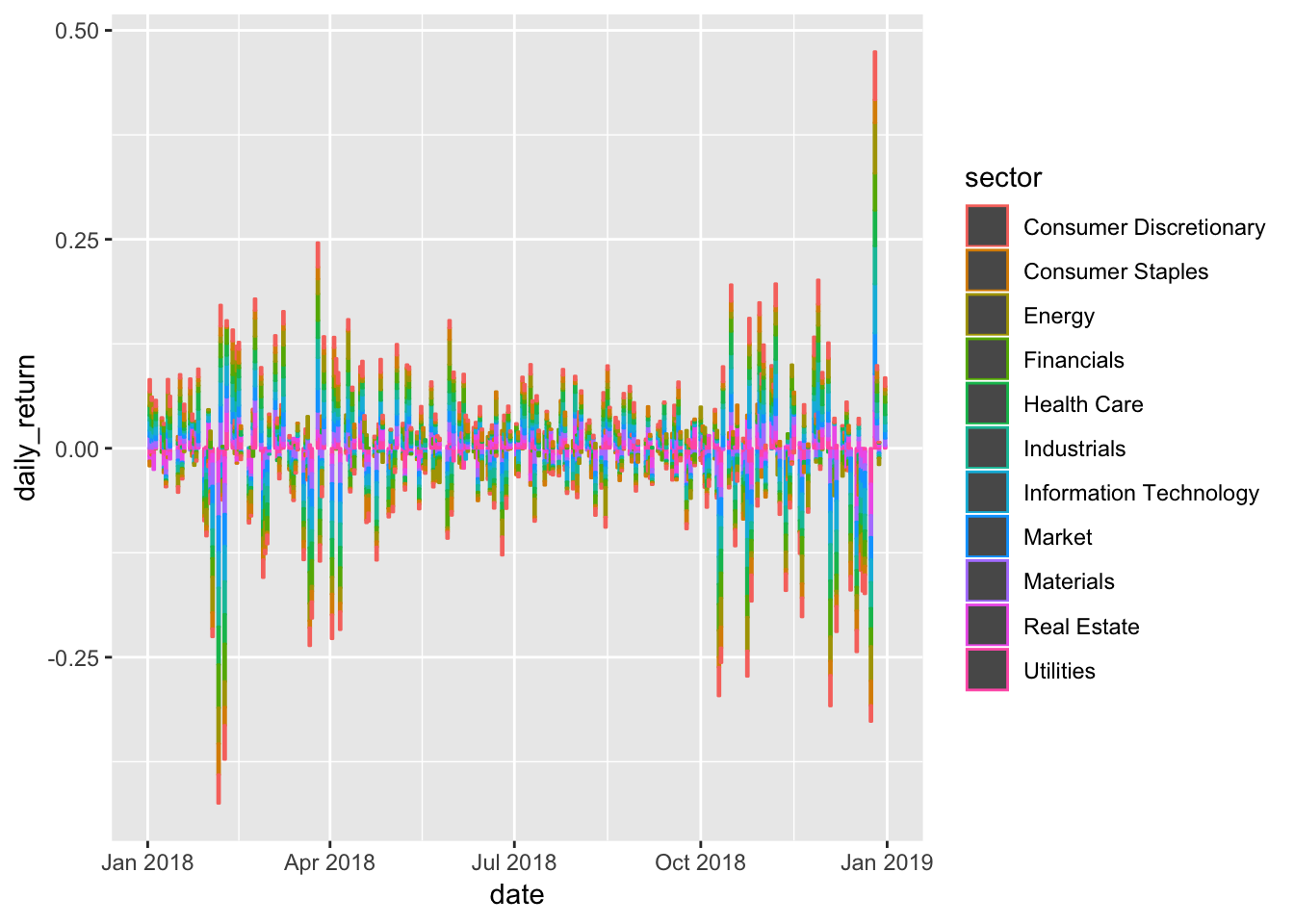
Better, we have a chart of all our data! But it’s a bit hard to see the individual returns. Let’s facet_wrap() by sector. I also don’t love that legend, so we’ll add show.legend = FALSE to geom_col().
sector_returns_2018 %>%
  ggplot(aes(x = date, y = daily_return, color = sector)) +
  geom_col(show.legend = FALSE) +
  facet_wrap(~sector)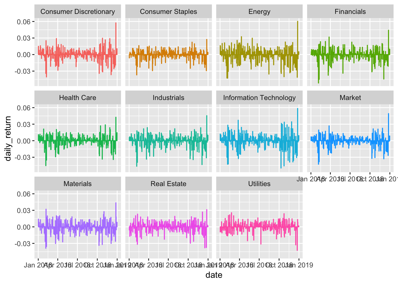
Very close, but the date is all jumbled and the y-axis label isn’t quite right - there’s no % sign. Let’s change the angle of the date labels to 45 degrees with theme(axis.text.x = element_text(angle = 45, vjust = 1, hjust=1)) and add the percentage sign with scale_y_continuous(labels = function(x) paste0(x, "%")).
sector_returns_2018 %>%
  ggplot(aes(x = date, y = daily_return, color = sector)) +
  geom_col(show.legend = FALSE) +
  facet_wrap(~sector) +
  theme(axis.text.x = element_text(angle = 45, vjust = 1, hjust=1)) +
  scale_y_continuous(labels = function(x) paste0(x, "%")) +
  # clean up the x and y axis titles
  labs(x = "", y = "daily returns")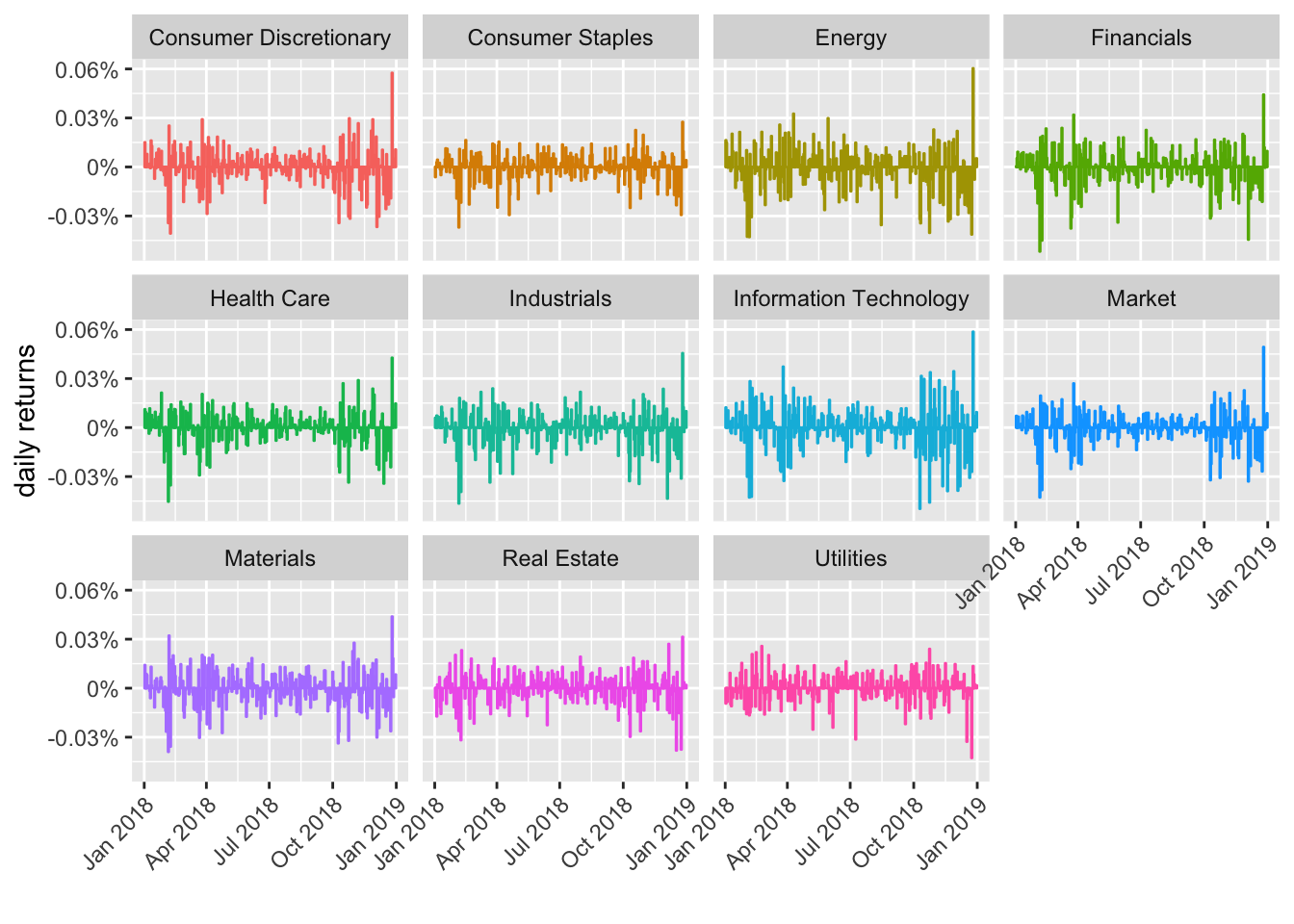
That’s an interesting panel of charts to my eye - tech looks pretty volatile since October! We can and will (next time) get more rigorous about such assessments by using the rolling standard deviation (and we’ll add a new tool by using exponential weighting), but the basic pipeline of raw data to tibble for wrangling and transformation, then to chart for exploration, will remain the same.
Let’s stick with just daily returns for today and plot the same data with a different color schema. Instead of coloring by sector, let’s color by whether the daily return was positive or negative. This is going to be similar to what we did in a previous post on highcharting jobs Friday.
First, let’s create two new columns called col_pos and col_neg. col_pos will hold the daily returns that are positive and an NA for returns that are negative. We code that with:
sector_returns_2018 %>%
mutate(col_pos =if_else(daily_return > 0,
                  daily_return, as.numeric(NA)))
And col_neg will hold negative returns:
sector_returns_2018 %>%
mutate(col_neg =if_else(daily_return < 0,
                  daily_return, as.numeric(NA)))
Then, we’ll tell ggplot() to chart those two columns in their own geoms and choose a custom color. The geoms won’t overlap because they have no common data. Here is the full code flow. We start with sector_returns_2018, create our new color columns, then pipe to ggplot().
sector_returns_2018 %>%
   mutate(col_pos =
           if_else(daily_return > 0,
                  daily_return, as.numeric(NA)),
         col_neg =
           if_else(daily_return < 0,
                  daily_return, as.numeric(NA))) %>%
  ggplot(aes(x = date)) +
  geom_col(aes(y = col_neg),
               alpha = .85,
               fill = "pink",
               color = "pink") +
  geom_col(aes(y = col_pos),
               alpha = .85,
               fill = "cornflowerblue",
               color = "cornflowerblue") +
  facet_wrap(~sector)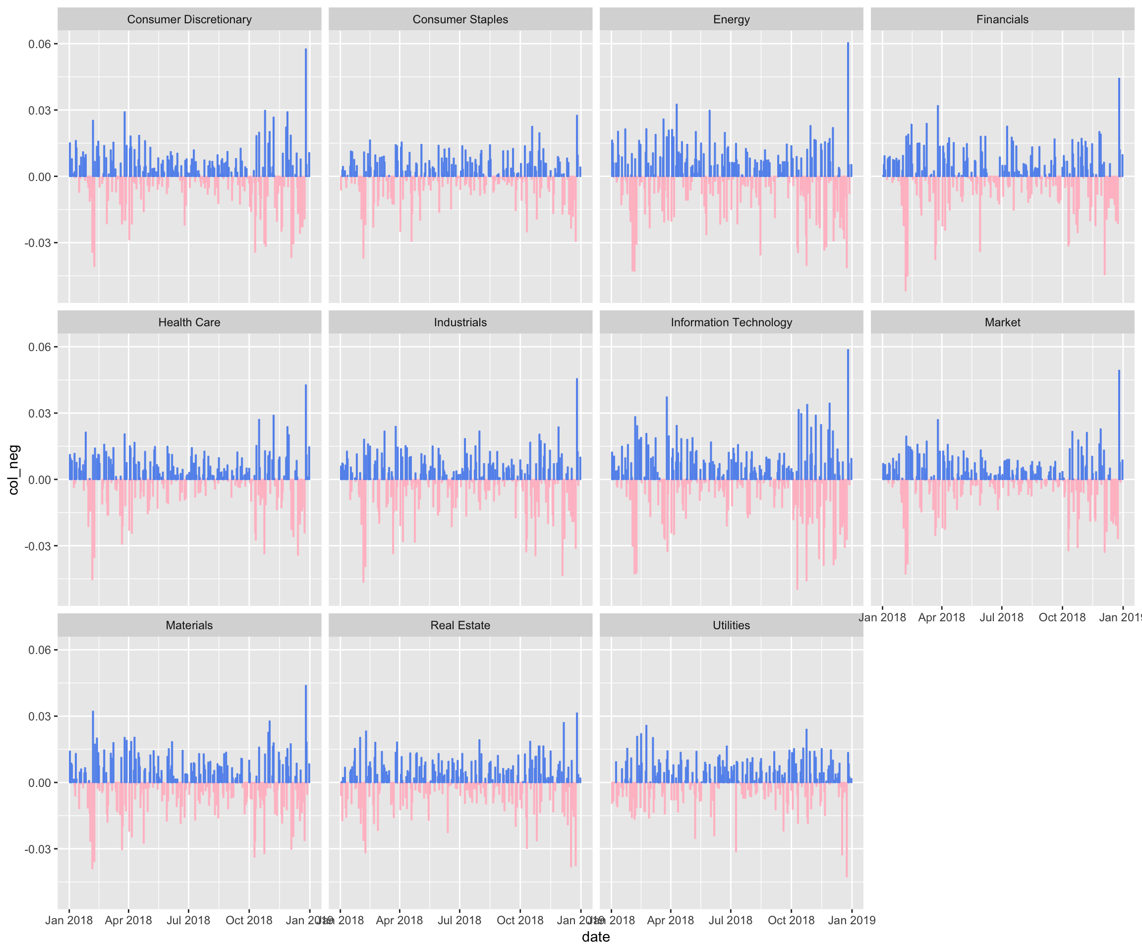
That looks good, but let’s do some further customization of the non-substantive aesthetics, meaning the aesthetics that don’t actually depend on our data.
sector_returns_2018 %>%
   mutate(col_pos =
           if_else(daily_return > 0,
                  daily_return, as.numeric(NA)),
         col_neg =
           if_else(daily_return < 0,
                  daily_return, as.numeric(NA))) %>%
  ggplot(aes(x = date)) +
  geom_col(aes(y = col_neg),
               alpha = .85,
               fill = "pink",
               color = "pink") +
  geom_col(aes(y = col_pos),
               alpha = .85,
               fill = "cornflowerblue",
               color = "cornflowerblue") +
  facet_wrap(~sector, shrink = FALSE) +
  labs(title = "2018 daily returns", y = "daily returns") +
  theme_minimal() +
  theme(axis.text.x = element_text(angle = 90, hjust = 1),
        plot.title = element_text(hjust = 0.5),
        plot.subtitle = element_text(hjust = 0.5),
        strip.background = element_blank(),
        strip.placement = "inside",
        strip.text = element_text(size=15),
        panel.spacing = unit(0.2, "lines") ,
        panel.background=element_rect(fill="white"))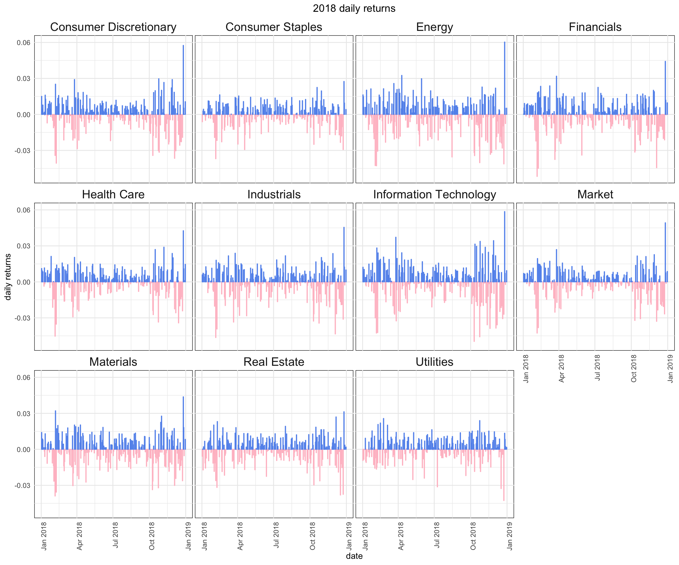
Before we close, let’s take some of this work and translate it to highcharter. If we simply want to chart one sector’s daily returns, it would be a relatively straightforward mapping from ggplot() to highcharter. We start with our tibble sector_returns_2018, add a column to hold different color hex codes, and then pass the data to hchart() using a ., and set aesthetics with hcaes(). The key is to first filter() down to our sector of choice, in this case filter(sector == "Information Technology").
sector_returns_2018 %>%
  mutate(color_col = if_else(daily_return > 0, "#6495ed", "#ff9999"),
          date = ymd(date)) %>%
  filter(sector == "Information Technology") %>%
  hchart(., hcaes(x = date, y = daily_return, color = color_col),
         type = "column",
pointWidth = 4)I love highcharter, and in the next month I’ll be launching a DataCamp course that covers Highcharter for Finance, but, I must say, it doesn’t have a good way to facet_wrap() and build separate charts for each sector. We can dream about some sort of hc_facet function but for now we’ll need to build a custom function for that job, similar to what we did for the jobs report.
We start by spreading our data to wide format, because we’re going to build a chart using each column.
sector_returns_2018_wide <-
  sector_returns_2018 %>%
  select(-adjClose) %>%
  spread(sector, daily_return)

sector_returns_2018_wide
# A tibble: 251 x 12
date `Consumer Discr… `Consumer Stapl… Energy Financials
<date> <dbl> <dbl> <dbl> <dbl>
1 2018-01-02 0.0151 -0.00617 1.63e-2 0.000358
2 2018-01-03 0.00458 -0.000354 1.49e-2 0.00536
3 2018-01-04 0.00327 0.00283 6.02e-3 0.00922
4 2018-01-05 0.00789 0.00440 -4.00e-4 0.00282
5 2018-01-08 0.00118 0.00246 5.98e-3 -0.00141
6 2018-01-09 0.00196 -0.00140 -2.52e-3 0.00772
7 2018-01-10 -0.000686 -0.00493 -1.20e-3 0.00836
8 2018-01-11 0.0161 -0.00141 2.03e-2 0.00484
9 2018-01-12 0.0128 0.000353 9.60e-3 0.00893
10 2018-01-16 -0.00717 0.00458 -1.27e-2 -0.00274
# … with 241 more rows, and 7 more variables: `Health Care` <dbl>,
# Industrials <dbl>, `Information Technology` <dbl>, Market <dbl>,
# Materials <dbl>, `Real Estate` <dbl>, Utilities <dbl>Now, for our function that will create a separate highchart for each sector, we start with map() and pass in the columns names from that wide tibble we just created. That’s how we will iterate over each sector. After mapping across the names, we use function(x) to pass the column name into our code flow.
map(names(sector_returns_2018_wide[2:11]), function(x){

sector_returns_2018_hc <-
  sector_returns_2018 %>%
  filter(sector == x) %>%
   mutate(coloract = if_else(daily_return > 0, "#6495ed", "#ff9999"))

highchart() %>%
  hc_title(text = paste(x, "2018 daily returns", sep = " ")) %>%
  hc_add_series(sector_returns_2018_hc,
                type = "column",
                pointWidth = 4,
                hcaes(x = date,
                      y = daily_return,
                      color = coloract),
                name = "daily return") %>%
  hc_xAxis(type = "datetime") %>%
  hc_tooltip(pointFormat = "{point.date}: {point.daily_return: .4f}%") %>%
  hc_legend(enabled = FALSE) %>%
  hc_exporting(enabled = TRUE)
})
If you run the code chunk above, it will create 11 separate highcharts of our data as stand-alone charts, meaning they won’t be laid out with any structure. That’s fine, but I want to be able to lay these out in a grid and control the height of each chart. For that, we use hw_grid(rowheight = 300, ncol = 3) %>% htmltools::browsable(). That will create a grid that displays each of the charts - one for each sector’s daily returns.
map(names(sector_returns_2018_wide[2:11]), function(x){

sector_returns_2018_hc <-
  sector_returns_2018 %>%
  filter(sector == x) %>%
   mutate(coloract = if_else(daily_return > 0, "#6495ed", "#ff9999"),
          date = ymd(date))

highchart() %>%
  hc_title(text = paste(x, "2018 daily returns", sep = " ")) %>%
  hc_add_series(sector_returns_2018_hc,
                type = "column",
                pointWidth = 4,
                hcaes(x = date,
                      y = daily_return,
                      color = coloract),
                name = "daily return") %>%
  hc_xAxis(type = "datetime") %>%
  hc_tooltip(pointFormat = "{point.date}: {point.daily_return: .4f}%") %>%
  hc_legend(enabled = FALSE) %>%
  hc_exporting(enabled = TRUE)
}) %>%
  hw_grid(rowheight = 300, ncol = 3) %>%
  htmltools::browsable()
That’s all for today. In general, the flow here was to create a tibble of tickers and labels, grab price data, and visualize daily returns organized by the original labels. We applied it to sectors, but it could just as easily be applied to other labels like risk levels, geography, beta, etc.
Shameless book plug for those who read to the end: if you like this sort of thing, check out my new book Reproducible Finance with R!
Thanks for reading and see you next time.
You may leave a comment below or discuss the post in the forum community.rstudio.com.