Welcome to the second installment of Reproducible Finance 2019!
In the previous post, we looked back on the daily returns for several market sectors in 2018. Today, we’ll continue that theme and look at some summary statistics for 2018, and then extend out to previous years and different ways of visualizing our data. There’s not much heavy computation or even modeling today, but the goal is to lay some foundational code that we could use for different years or buckets of stocks, and to create some exploratory visualizations.
First, let’s load up our packages for the day.
library(tidyverse)
library(tidyquant)
library(riingo)
library(highcharter)
Next let’s grab our prices and returns for market sectors. We covered this in detail in the previous post and I won’t walk through it again, but here is the full code.
Note one change: last time, we imported data and calculated returns for just 2018. Today, I’ll set the start date to start_date = "2007-12-29" and import data for the 10 years from 2008 - 2018. That’s because, in addition to looking at summary statistics in just 2018, we will also look at some stats on a yearly basis from 2008 - 2018.
Here’s the code to import prices and calculate daily returns for our sector ETFs.
etf_ticker_sector <- tibble(
  ticker = c("XLY", "XLP", "XLE",
          "XLF", "XLV", "XLI", "XLB",
          "XLK", "XLU", "XLRE",
          "SPY"),
  sector = c("Consumer Discretionary", "Consumer Staples", "Energy",
          "Financials", "Health Care", "Industrials", "Materials",
          "Information Technology", "Utilities", "Real Estate",
          "Market")
)


#riingo_set_token("your API key here")

sector_returns_2008_2018 <-
  etf_ticker_sector %>%
  pull(ticker) %>%
  riingo_prices(.,
                start_date = "2007-12-29",
                end_date = "2018-12-31") %>%
  mutate(date = ymd(date)) %>%
  left_join(etf_ticker_sector, by = "ticker") %>%
  select(sector, date, adjClose) %>%
  group_by(sector) %>%
  mutate(daily_return = log(adjClose) - log(lag(adjClose))) %>%
  na.omit()
Let’s take a quick peek at the first observation for each sector by using slice(1), which will respect our group_by().
sector_returns_2008_2018 %>%
  group_by(sector) %>%
  slice(1)
# A tibble: 11 x 4
# Groups: sector [11]
sector date adjClose daily_return
<chr> <date> <dbl> <dbl>
1 Consumer Discretionary 2008-01-02 27.3 -0.0154
2 Consumer Staples 2008-01-02 21.1 -0.0143
3 Energy 2008-01-02 62.5 0.00189
4 Financials 2008-01-02 18.6 -0.0199
5 Health Care 2008-01-02 28.8 -0.0105
6 Industrials 2008-01-02 30.4 -0.0167
7 Information Technology 2008-01-02 21.8 -0.0205
8 Market 2008-01-02 115. -0.00879
9 Materials 2008-01-02 32.2 -0.00964
10 Real Estate 2015-10-09 26.7 -0.00166
11 Utilities 2008-01-02 27.8 -0.00569This looks good, but I’d like to confirm that we successfully imported prices and calculated returns for each year and for each sector, meaning I want group_by(year, sector) and then slice(1). Problem is: there’s not currently a column called year.
We can fix that by separating the date column into year and month with the incredibly useful separate() function. We will run separate(date, c("year", "month"), sep = "-", remove = FALSE). I use remove = FALSE because I want to keep the date column.
It’s not necessary, but for ease of viewing in this post, I’ll peek at just sectors that contain the word “Consumer”, by calling filter(sector, str_detect("Consumer")).
sector_returns_2008_2018 %>%
  separate(date, c("year", "month"), sep = "-", remove = FALSE) %>%
  group_by(year, sector) %>%
  slice(1) %>%
  filter(str_detect(sector, "Consumer"))
# A tibble: 22 x 6
# Groups: year, sector [22]
sector date year month adjClose daily_return
<chr> <date> <chr> <chr> <dbl> <dbl>
1 Consumer Discretionary 2008-01-02 2008 01 27.3 -0.0154
2 Consumer Staples 2008-01-02 2008 01 21.1 -0.0143
3 Consumer Discretionary 2009-01-02 2009 01 19.5 0.0489
4 Consumer Staples 2009-01-02 2009 01 18.5 0.0141
5 Consumer Discretionary 2010-01-04 2010 01 26.3 0.00770
6 Consumer Staples 2010-01-04 2010 01 20.9 0.00753
7 Consumer Discretionary 2011-01-03 2011 01 33.7 0.0117
8 Consumer Staples 2011-01-03 2011 01 23.6 0.00136
9 Consumer Discretionary 2012-01-03 2012 01 35.6 0.00842
10 Consumer Staples 2012-01-03 2012 01 26.9 -0.000924
# … with 12 more rowsOK, we’ve confirmed that we have prices and returns for our sectors for each year. Those new month and year columns will come in handy later, so let’s go ahead and save them.
sector_returns_2008_2018_year_mon <-
  sector_returns_2008_2018 %>%
  separate(date, c("year", "month"), sep = "-", remove = FALSE) %>%
  group_by(year, sector)
We’re going to look back on several summary statistics for 2018 first: mean daily return, standard deviation, skewness, and kurtosis of daily returns. We will use the summarise() function and then filter(year == "2018") to get our stats for just 2018.
sector_returns_2008_2018_year_mon %>%
  summarise(avg = mean(daily_return),
            stddev = sd(daily_return),
            skew = skewness(daily_return),
            kurt = kurtosis(daily_return)) %>%
  filter(year == "2018")
# A tibble: 11 x 6
# Groups: year [1]
year sector avg stddev skew kurt
<chr> <chr> <dbl> <dbl> <dbl> <dbl>
1 2018 Consumer Discretionary 0.0000629 0.0122 -0.199 2.61
2 2018 Consumer Staples -0.000335 0.00915 -0.664 1.54
3 2018 Energy -0.000801 0.0140 -0.294 1.58
4 2018 Financials -0.000557 0.0124 -0.675 2.47
5 2018 Health Care 0.000243 0.0111 -0.604 2.31
6 2018 Industrials -0.000566 0.0120 -0.717 2.08
7 2018 Information Technology -0.0000667 0.0147 -0.336 1.82
8 2018 Market -0.000186 0.0108 -0.479 3.18
9 2018 Materials -0.000641 0.0121 -0.210 0.861
10 2018 Real Estate -0.0000957 0.0103 -0.548 1.41
11 2018 Utilities 0.000153 0.00956 -0.621 1.82 We can build off that code flow to select just the years 2014 and 2015 with filter(year %in% c("2014", "2015") and, say, the energy sector with str_detect(sector, "Energy").
sector_returns_2008_2018_year_mon %>%
  summarise(avg = mean(daily_return),
            stddev = sd(daily_return),
            skew = skewness(daily_return),
            kurt = kurtosis(daily_return)) %>%
  filter(year %in% c("2014", "2015") &
        str_detect(sector, "Energy"))
# A tibble: 2 x 6
# Groups: year [2]
year sector avg stddev skew kurt
<chr> <chr> <dbl> <dbl> <dbl> <dbl>
1 2014 Energy -0.000361 0.0117 -0.891 4.43
2 2015 Energy -0.000959 0.0157 0.0157 0.813Think about how that code flow might be useful in a Shiny application, where we let the end user choose a sector, a year, and possibly which summary stats to calculate and display.
Now let’s do some visualizing.
We’ll start with a column chart, where the height is equal to the sector skewness for the chosen year.
sector_returns_2008_2018_year_mon %>%
  summarise(avg = mean(daily_return),
            stddev = sd(daily_return),
            skew = skewness(daily_return),
            kurt = kurtosis(daily_return)) %>%
 filter(year == "2018") %>%
  ggplot(aes(x = sector, y = skew, fill = sector)) +
  geom_col(width = .3) +
  ylim(-1,1) +
  theme(axis.text.x = element_text(angle = 90, vjust = 1, hjust=1))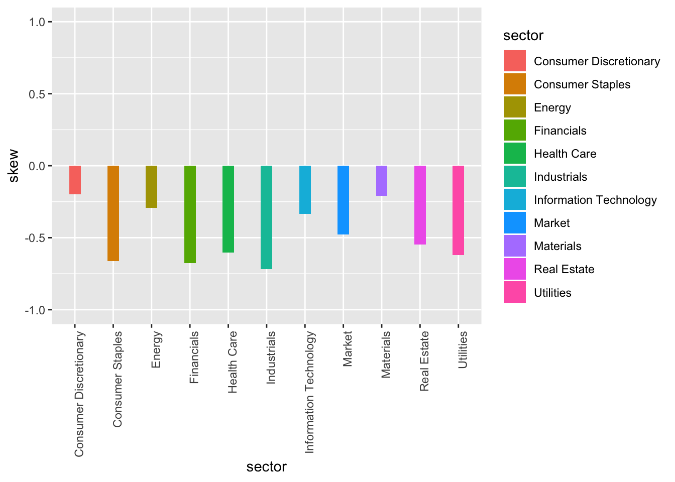
Here’s the same exact data, except we’ll use a scatter plot where the height of each point is the skewness.
sector_returns_2008_2018_year_mon %>%
  summarise(avg = mean(daily_return),
            stddev = sd(daily_return),
            skew = skewness(daily_return),
            kurt = kurtosis(daily_return)) %>%
 filter(year == "2018") %>%
  ggplot(aes(x = sector, y = skew, color = sector)) +
  geom_point(size = .8) +
  ylim(-1, 1) +
  theme(axis.text.x = element_text(angle = 90, vjust = 1, hjust=1))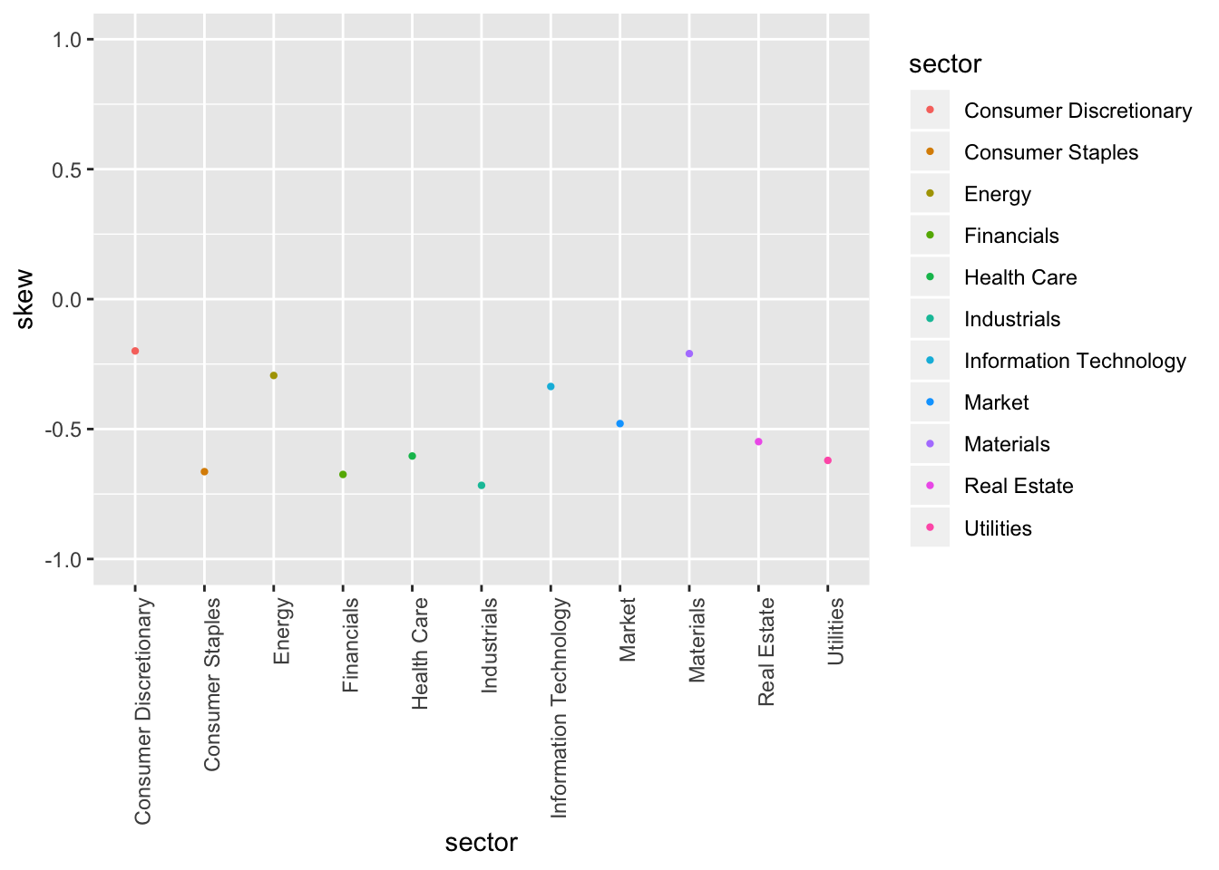
For both of the charts above, we could change our filter(year == ...) to choose a different year and build a new chart, but instead let’s comment out the year filter altogether, meaning we will chart all years, and then call facet_wrap(~year).
sector_returns_2008_2018_year_mon %>%
  summarise(avg = mean(daily_return),
            stddev = sd(daily_return),
            skew = skewness(daily_return),
            kurt = kurtosis(daily_return)) %>%
 # filter(year == "2018") %>%
  ggplot(aes(x = sector, y = skew, fill = sector)) +
  geom_col(width = .5) +
  ylim(-1, 1) +
  theme(axis.text.x = element_text(angle = 90, vjust = 1, hjust=1)) +
  facet_wrap(~year)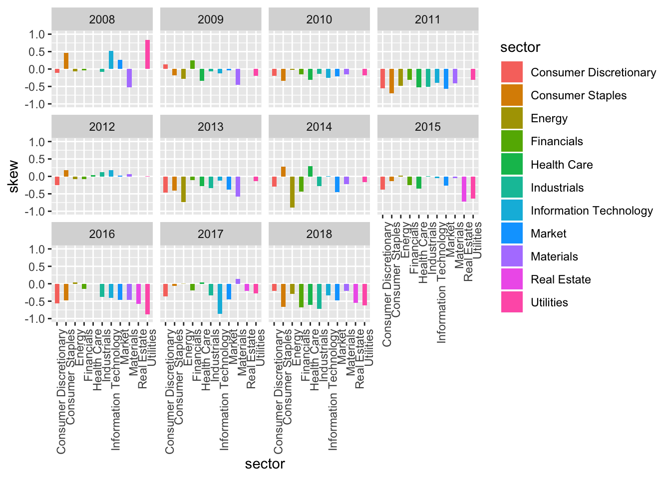
This post was originally going to be focused on standard deviation, and not skewness, but there was recently an excellent piece on the Think New Found blog that discusses skewness and its importance as a risk measure. Definitely worth a read for the risk-return obsessed amongst us. For an R code reference, we covered skewness extensively in this previous blog post, and there’s bare code for the calculations on the Reproducible Finance site here.
Those ggplots are nice, but let’s take a quick look at how we might do this with highcharter.
sector_returns_2008_2018_year_mon %>%
  summarise(avg = mean(daily_return),
            stddev = sd(daily_return),
            skew = skewness(daily_return),
            kurt = kurtosis(daily_return)) %>%
 filter(year == "2018") %>%
 hchart(.,
       type = 'column',
       hcaes(y = skew,
             x = sector,
             group = sector)) %>%
  hc_title(text = "2018 Sector Skew") %>%
  hc_subtitle(text = "by sector") %>%
  hc_xAxis(title = list(text = "")) %>%
  hc_tooltip(headerFormat = "",
             pointFormat = "skewness: {point.y: .4f}% <br>
                            mean return: {point.avg: .4f}") %>%
  hc_yAxis(labels = list(format = "{value}%")) %>%
  hc_add_theme(hc_theme_flat()) %>%
  hc_exporting(enabled = TRUE) %>%
  hc_legend(enabled = FALSE)
Hover on the bars and notice that we included the mean return for each sector as well. That’s the beauty of highcharter: we can easily add more data in the tooltip using the hc_tooltip() function. Those skews look pretty daunting, but that’s down to the scale of the y-axis of this chart, which defaults to a max of 0 and a minimum of .8%. Let’s coerce it to max of 1 and a min of -1, which is a rough boundary for where we are comfortable with skewness.
sector_returns_2008_2018_year_mon %>%
  summarise(avg = mean(daily_return),
            stddev = sd(daily_return),
            skew = skewness(daily_return),
            kurt = kurtosis(daily_return)) %>%
 filter(year == "2018") %>%
 hchart(.,
       type = 'column',
       hcaes(y = skew,
             x = sector,
             group = sector)) %>%
  hc_title(text = "2018 Skew by Sector") %>%
  hc_xAxis(title = list(text = "")) %>%
  hc_tooltip(headerFormat = "",
             pointFormat = "skewness: {point.y: .4f}% <br>
                            mean return: {point.avg: .4f}") %>%
  hc_yAxis(labels = list(format = "{value}%"),
           min = -1,
           max =1) %>%
  hc_add_theme(hc_theme_flat()) %>%
  hc_exporting(enabled = TRUE) %>%
  hc_legend(enabled = FALSE)
Let’s explore one more piece of data. After breaking up the date into year and month and looking at the daily returns and skewness, I got to wondering if the minimum daily return for each sector tended to fall in a certain month. There’s no reason it should, but it seems like a trend we might want to parse, or at least have thought about in case we need it.
My first instinct was to use summarise() and get the minimum daily return for each year-sector pair.
sector_returns_2008_2018_year_mon %>%
  summarise(min_ret = min(daily_return)) %>%
  head()
# A tibble: 6 x 3
# Groups: year [1]
year sector min_ret
<chr> <chr> <dbl>
1 2008 Consumer Discretionary -0.116
2 2008 Consumer Staples -0.0568
3 2008 Energy -0.160
4 2008 Financials -0.182
5 2008 Health Care -0.0687
6 2008 Industrials -0.0947The problem with that flow is that our month got deleted and we would like to preserve that for charting. We’re better off to filter() by the min(daily_return).
sector_returns_2008_2018_year_mon %>%
  select(-adjClose, -date) %>%
  filter(daily_return == min(daily_return)) %>%
  group_by(sector) %>%
  filter(year == "2008") %>%
  head()
# A tibble: 6 x 4
# Groups: sector [6]
sector year month daily_return
<chr> <chr> <chr> <dbl>
1 Consumer Discretionary 2008 10 -0.116
2 Consumer Staples 2008 12 -0.0568
3 Energy 2008 10 -0.160
4 Financials 2008 12 -0.182
5 Health Care 2008 10 -0.0687
6 Industrials 2008 10 -0.0947That’s giving us the same end data for the minimum daily return, but it’s also preserving the month column.
Let’s take a quick look to see if any months jump out as frequent holders of the minimum daily return. Note that we’ll need to ungroup() the data before running count(month).
sector_returns_2008_2018_year_mon %>%
  filter(daily_return == min(daily_return)) %>%
  ungroup() %>%
  count(month)
# A tibble: 11 x 2
month n
<chr> <int>
1 01 6
2 02 18
3 03 4
4 04 4
5 05 14
6 06 22
7 08 23
8 09 3
9 10 9
10 11 3
11 12 8Hmmm, months 5, 6 and 8 jump out a bit. Let’s translate those to their actual names using mutate(month = month(date, label = TRUE, abbr = FALSE)).
sector_returns_2008_2018_year_mon %>%
  filter(daily_return == min(daily_return)) %>%
  mutate(month = month(date, label = TRUE, abbr = FALSE)) %>%
  ungroup() %>%
  count(month)
# A tibble: 11 x 2
month n
<ord> <int>
1 January 6
2 February 18
3 March 4
4 April 4
5 May 14
6 June 22
7 August 23
8 September 3
9 October 9
10 November 3
11 December 8Visualizing these monthly tendencies was a bit more involved than I had anticipated, and that usually means I’ve missed a simpler solution somewhere, but I’ll post my brute force insanity in case it’s helpful to others.
I want to create a chart that looks like this, with months on the x-axis and the minimum daily return for each sector on the y-axis, almost as if we’re trying to see if the minimum daily returns tend to cluster in any months.
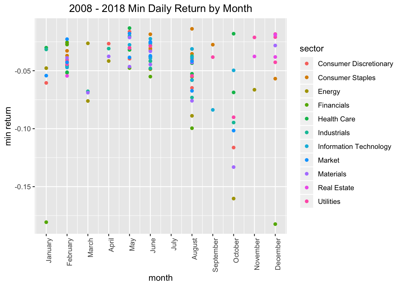
To create that chart, I want the names of the months on the x-axis, but also in the correct order. If we coerce the numbers to month names ahead of charting, ggplot will put them in alphabetical order, which is not what we want.
To solve that problem, I first created a vector of months.
months <-
  sector_returns_2008_2018_year_mon %>%
  mutate(months = month(date, label = TRUE, abbr = FALSE)) %>%
  pull() %>%
  levels() %>%
  as.character()

months
[1] "January" "February" "March" "April" "May"
[6] "June" "July" "August" "September" "October"
[11] "November" "December" Next, comes our usual flow from the sector returns to ggplot, but first we coerce the month column with as.numeric() (when we used separate() before, it created a character column). Then we put month on the x-axis with ggplot(aes(x = month...)). To create the proper labels, we use scale_x_continuous( breaks = c(1, 2, 3, 4, 5, 6, 7, 8, 9, 10, 11, 12), labels = months) to add 12 breaks and label them with our months vector that we created above.
sector_returns_2008_2018_year_mon %>%
filter(daily_return == min(daily_return)) %>%
mutate(month = as.numeric(month)) %>%
ggplot(aes(x = month, y = daily_return, color = sector)) +
geom_point() +
scale_x_continuous(breaks = c(1, 2, 3, 4, 5, 6, 7, 8, 9, 10, 11, 12),
labels = months) +
labs(y = "min return", title = "2008 - 2018 Min Returns by Month") +
theme(axis.text.x = element_text(angle = 90, hjust = 1),
plot.title = element_text(hjust = 0.5)) 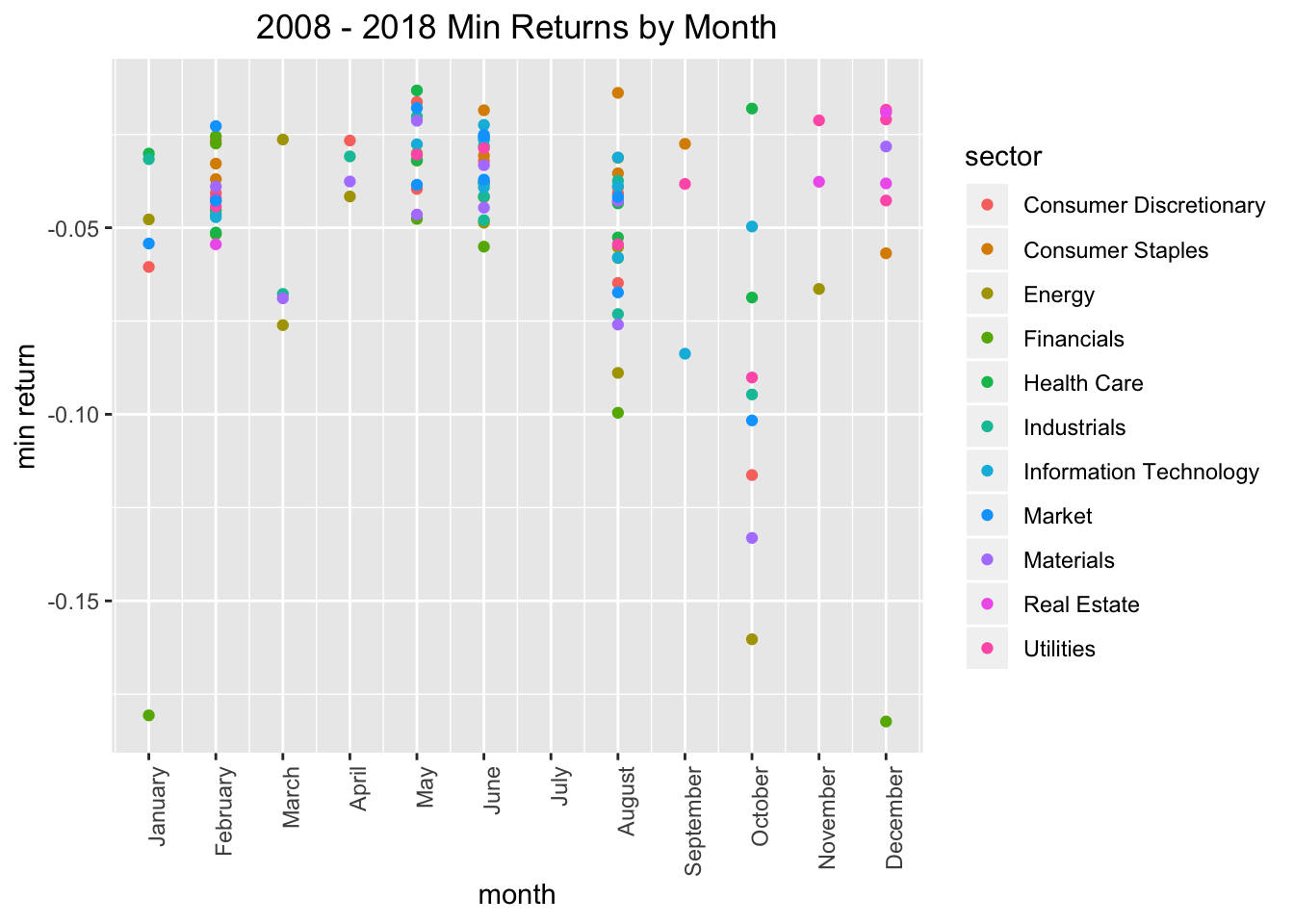 We can facet by sector if we want to break this into pieces.
  sector_returns_2008_2018_year_mon %>%
  filter(daily_return == min(daily_return)) %>%
  mutate(month = as.numeric(month)) %>%
    ggplot(aes(x = month, y = daily_return, color = sector)) +
    geom_point() +
    scale_x_continuous(breaks = c(1, 2, 3, 4, 5, 6, 7, 8, 9, 10, 11, 12),
                       labels = months)  +
   labs(y = "min return", title = "2008 - 2018 Min Returns by Month") +
    theme(axis.text.x = element_text(angle = 90, hjust = 1),
          plot.title = element_text(hjust = 0.5)) +
  facet_wrap(~sector)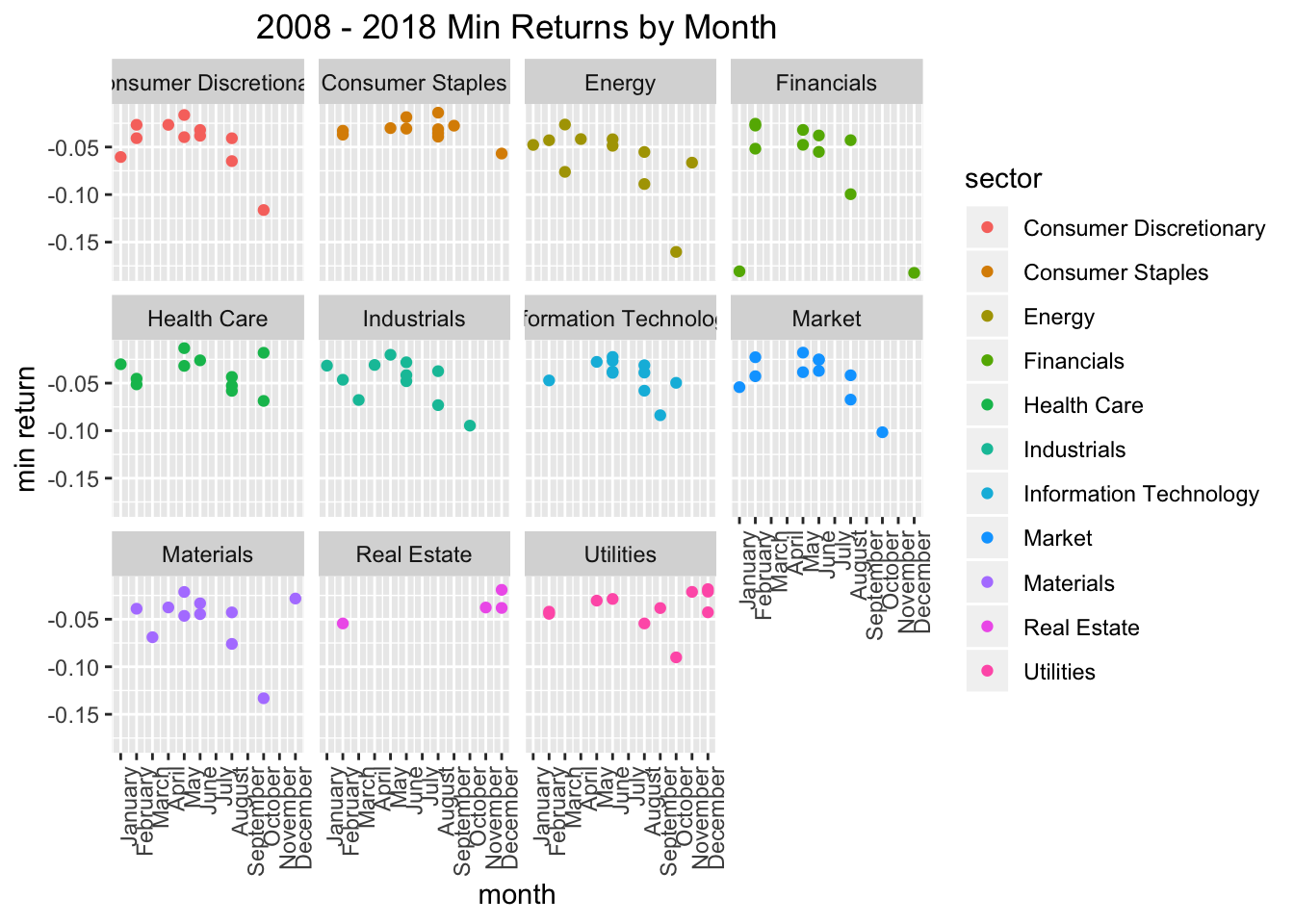
Or we can facet by year.
sector_returns_2008_2018_year_mon %>%
  filter(daily_return == min(daily_return)) %>%
  mutate(month = as.numeric(month)) %>%
    ggplot(aes(x = month, y = daily_return, color = sector)) +
    geom_point() +
    scale_x_continuous(breaks = c(1, 2, 3, 4, 5, 6, 7, 8, 9, 10, 11, 12),
                       labels = months)  +
   labs(y = "min return", title = "2008 - 2018 Min Returns by Month") +
    theme(axis.text.x = element_text(angle = 90, hjust = 1),
          plot.title = element_text(hjust = 0.5)) +
  facet_wrap(~year)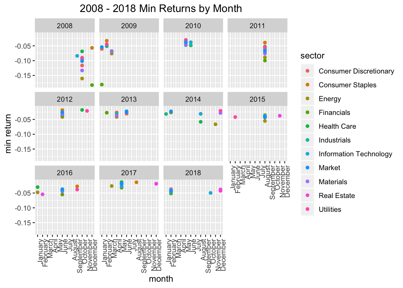
Interesting to see that in 2011, each of our sectors had their minimum daily return in the same month.
That’s all for today. Thanks for reading and see you next time!
You may leave a comment below or discuss the post in the forum community.rstudio.com.