In a recent post, I presented some of the theory underlying ROC curves, and outlined the history leading up to their present popularity for characterizing the performance of machine learning models. In this post, I describe how to search CRAN for packages to plot ROC curves, and highlight six useful packages.
Although I began with a few ideas about packages that I wanted to talk about, like ROCR and pROC, which I have found useful in the past, I decided to use Gábor Csárdi’s relatively new package pkgsearch to search through CRAN and see what’s out there. The package_search() function takes a text string as input and uses basic text mining techniques to search all of CRAN. The algorithm searches through package text fields, and produces a score for each package it finds that is weighted by the number of reverse dependencies and downloads.
library(tidyverse)  # for data manipulation
library(dlstats)    # for package download stats
library(pkgsearch)  # for searching packages
After some trial and error, I settled on the following query, which includes a number of interesting ROC-related packages.
rocPkg <- pkg_search(query="ROC",size=200)Then, I narrowed down the field to 46 packages by filtering out orphaned packages and packages with a score less than 190.
rocPkgShort <- rocPkg %>%
               filter(maintainer_name != "ORPHANED", score > 190) %>%
               select(score, package, downloads_last_month) %>%
               arrange(desc(downloads_last_month))
head(rocPkgShort)
## # A tibble: 6 x 3
## score package downloads_last_month
## <dbl> <chr> <int>
## 1 690. ROCR 56356
## 2 7938. pROC 39584
## 3 1328. PRROC 9058
## 4 833. sROC 4236
## 5 266. hmeasure 1946
## 6 1021. plotROC 1672To complete the selection process, I did the hard work of browsing the documentation for the packages to pick out what I thought would be generally useful to most data scientists. The following plot uses Guangchuang Yu’s dlstats package to look at the download history for the six packages I selected to profile.
library(dlstats)
shortList <- c("pROC","precrec","ROCit", "PRROC","ROCR","plotROC")
downloads <- cran_stats(shortList)
ggplot(downloads, aes(end, downloads, group=package, color=package)) +
  geom_line() + geom_point(aes(shape=package)) +
  scale_y_continuous(trans = 'log2')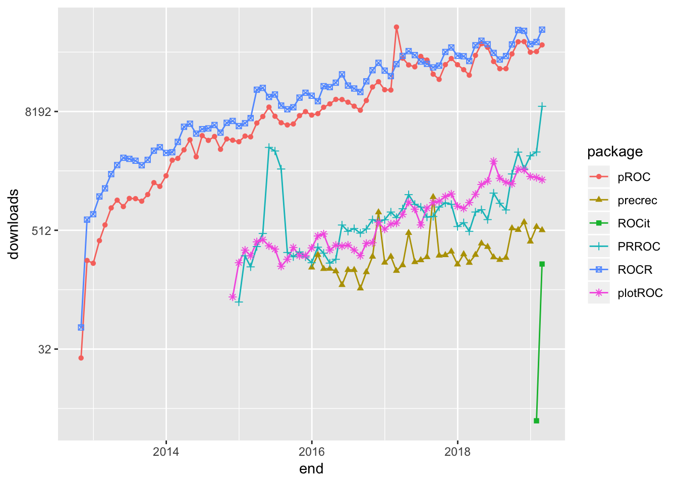
ROCR - 2005
ROCR has been around for almost 14 years, and has be a rock-solid workhorse for drawing ROC curves. I particularly like the way the performance() function has you set up calculation of the curve by entering the true positive rate, tpr, and false positive rate, fpr, parameters. Not only is this reassuringly transparent, it shows the flexibility to calculate nearly every performance measure for a binary classifier by entering the appropriate parameter. For example, to produce a precision-recall curve, you would enter prec and rec. Although there is no vignette, the documentation of the package is very good.
The following code sets up and plots the default ROCR ROC curve using a synthetic data set that comes with the package. I will use this same data set throughout this post.
library(ROCR)## Loading required package: gplots##
## Attaching package: 'gplots'## The following object is masked from 'package:stats':
##
## lowess# plot a ROC curve for a single prediction run
# and color the curve according to cutoff.
data(ROCR.simple)
df <- data.frame(ROCR.simple)
pred <- prediction(df$predictions, df$labels)
perf <- performance(pred,"tpr","fpr")
plot(perf,colorize=TRUE)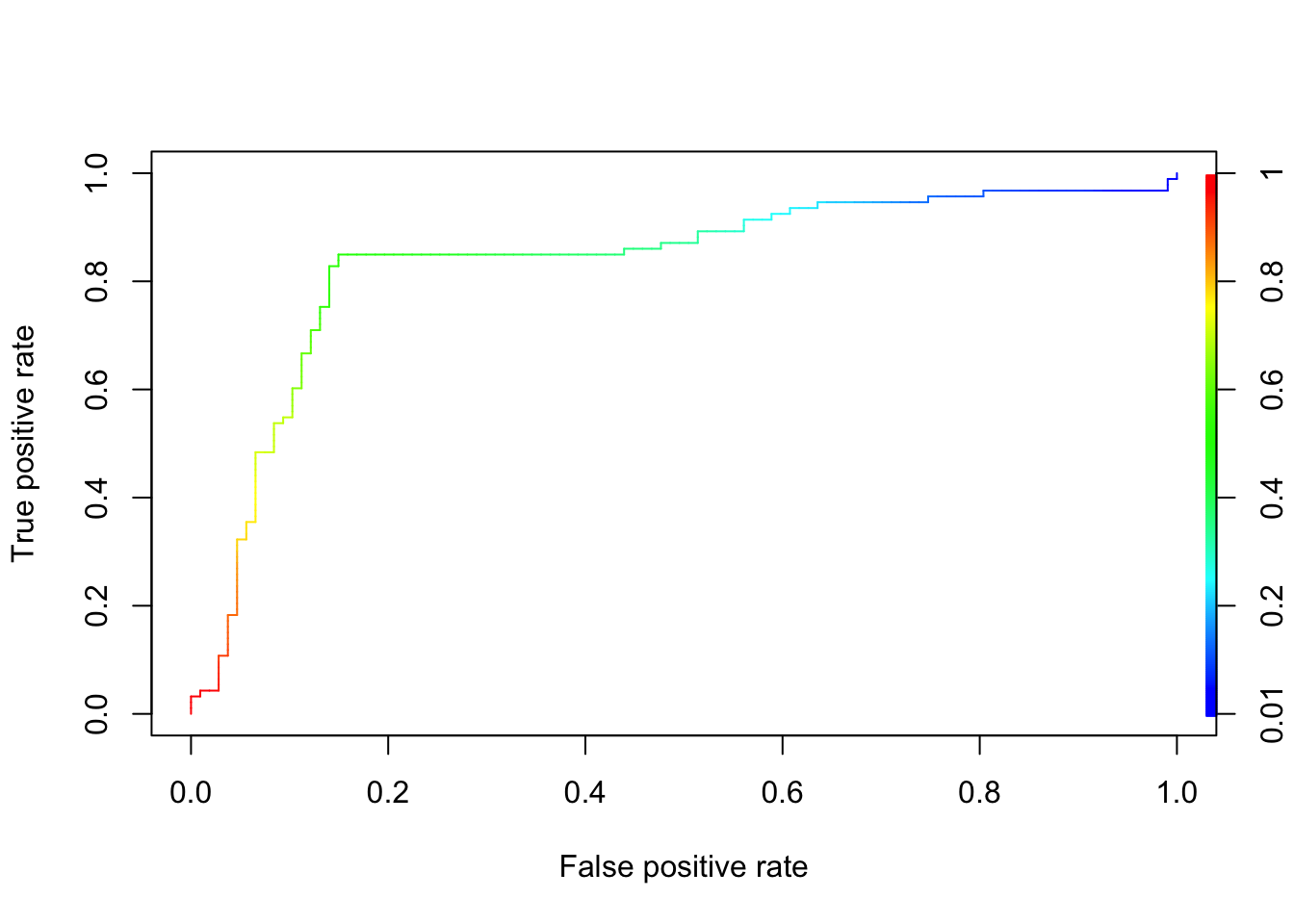
pROC - 2010
It is clear from the downloads curve that pROC is also popular with data scientists. I like that it is pretty easy to get confidence intervals for the Area Under the Curve, AUC, on the plot.
library(pROC)## Type 'citation("pROC")' for a citation.##
## Attaching package: 'pROC'## The following objects are masked from 'package:stats':
##
## cov, smooth, varpROC_obj <- roc(df$labels,df$predictions,
smoothed = TRUE,
# arguments for ci
ci=TRUE, ci.alpha=0.9, stratified=FALSE,
# arguments for plot
plot=TRUE, auc.polygon=TRUE, max.auc.polygon=TRUE, grid=TRUE,
print.auc=TRUE, show.thres=TRUE)
sens.ci <- ci.se(pROC_obj)
plot(sens.ci, type="shape", col="lightblue")## Warning in plot.ci.se(sens.ci, type = "shape", col = "lightblue"): Low
## definition shape.plot(sens.ci, type="bars")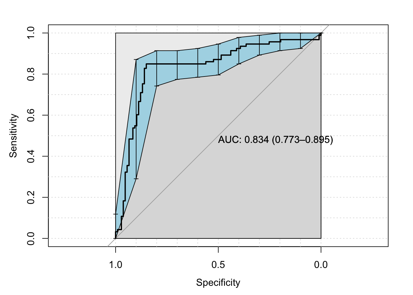
PRROC - 2014
Although not nearly as popular as ROCR and pROC, PRROC seems to be making a bit of a comeback lately. The terminology for the inputs is a bit eclectic, but once you figure that out the roc.curve() function plots a clean ROC curve with minimal fuss. PRROC is really set up to do precision-recall curves as the vignette indicates.
library(PRROC)

PRROC_obj <- roc.curve(scores.class0 = df$predictions, weights.class0=df$labels,
                       curve=TRUE)
plot(PRROC_obj)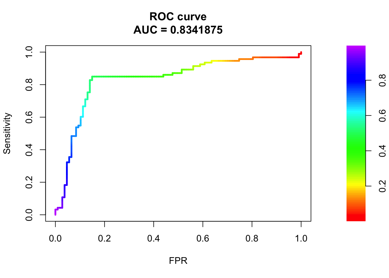
plotROC - 2014
plotROC is an excellent choice for drawing ROC curves with ggplot(). My guess is that it appears to enjoy only limited popularity because the documentation uses medical terminology like “disease status” and “markers”. Nevertheless, the documentation, which includes both a vignette and a Shiny application, is very good.
The package offers a number of feature-rich ggplot() geoms that enable the production of elaborate plots. The following plot contains some styling, and includes Clopper and Pearson (1934) exact method confidence intervals.
library(plotROC)
rocplot <- ggplot(df, aes(m = predictions, d = labels))+ geom_roc(n.cuts=20,labels=FALSE)
rocplot + style_roc(theme = theme_grey) + geom_rocci(fill="pink") 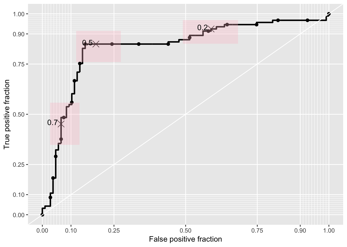
precrec - 2015
precrec is another library for plotting ROC and precision-recall curves.
library(precrec)##
## Attaching package: 'precrec'## The following object is masked from 'package:pROC':
##
## aucprecrec_obj <- evalmod(scores = df$predictions, labels = df$labels)
autoplot(precrec_obj)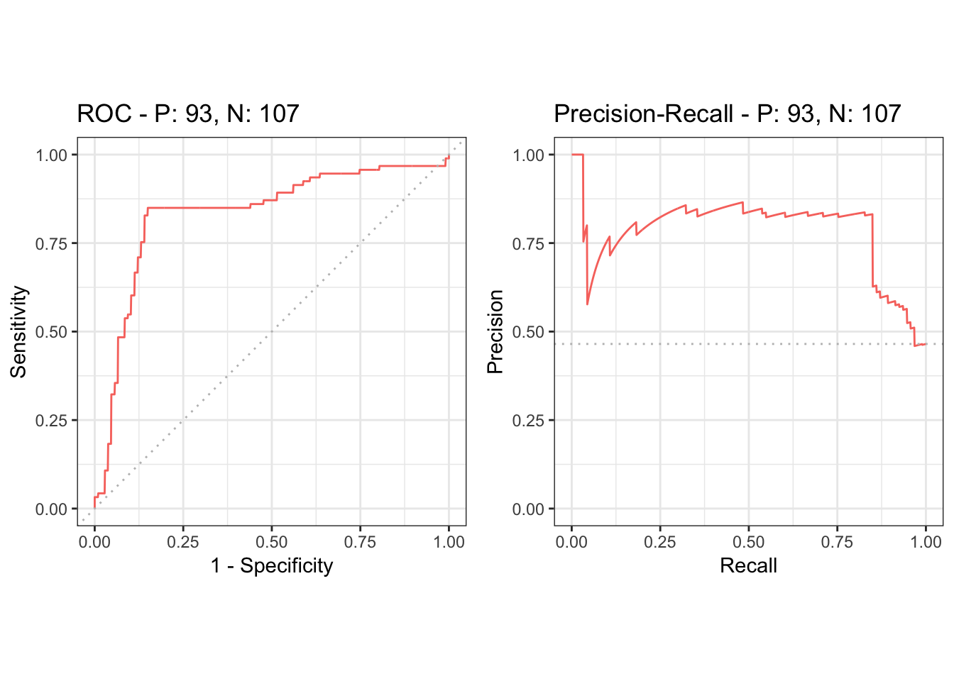
Parameter options for the evalmod() function make it easy to produce basic plots of various model features.
precrec_obj2 <- evalmod(scores = df$predictions, labels = df$labels, mode="basic")
autoplot(precrec_obj2) 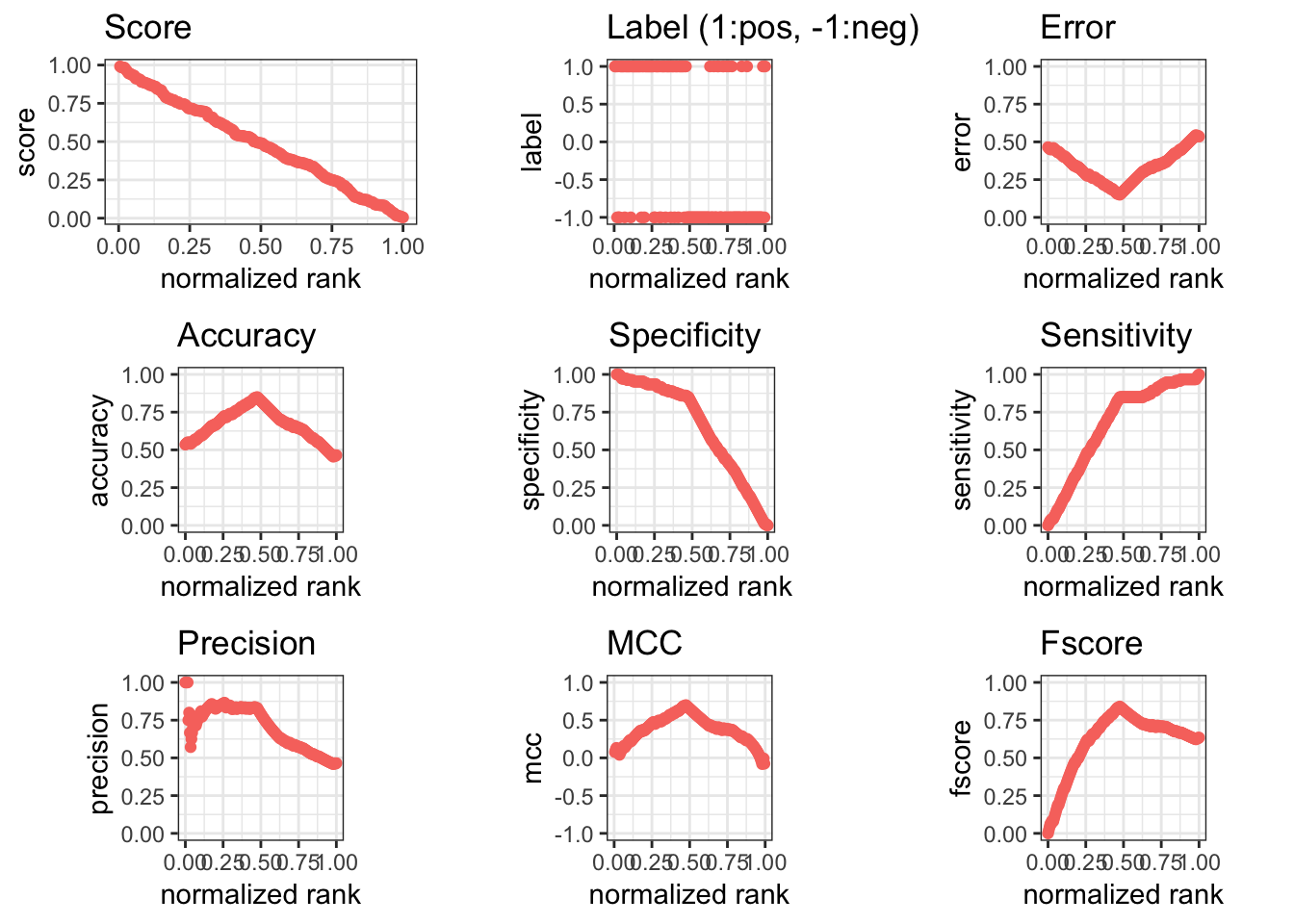
ROCit - 2019
ROCit is a new package for plotting ROC curves and other binary classification visualizations that rocketed onto the scene in January, and is climbing quickly in popularity. I would never have discovered it if I had automatically filtered my original search by downloads. The default plot includes the location of the Yourden’s J Statistic.
library(ROCit)## Warning: package 'ROCit' was built under R version 3.5.2ROCit_obj <- rocit(score=df$predictions,class=df$labels)
plot(ROCit_obj)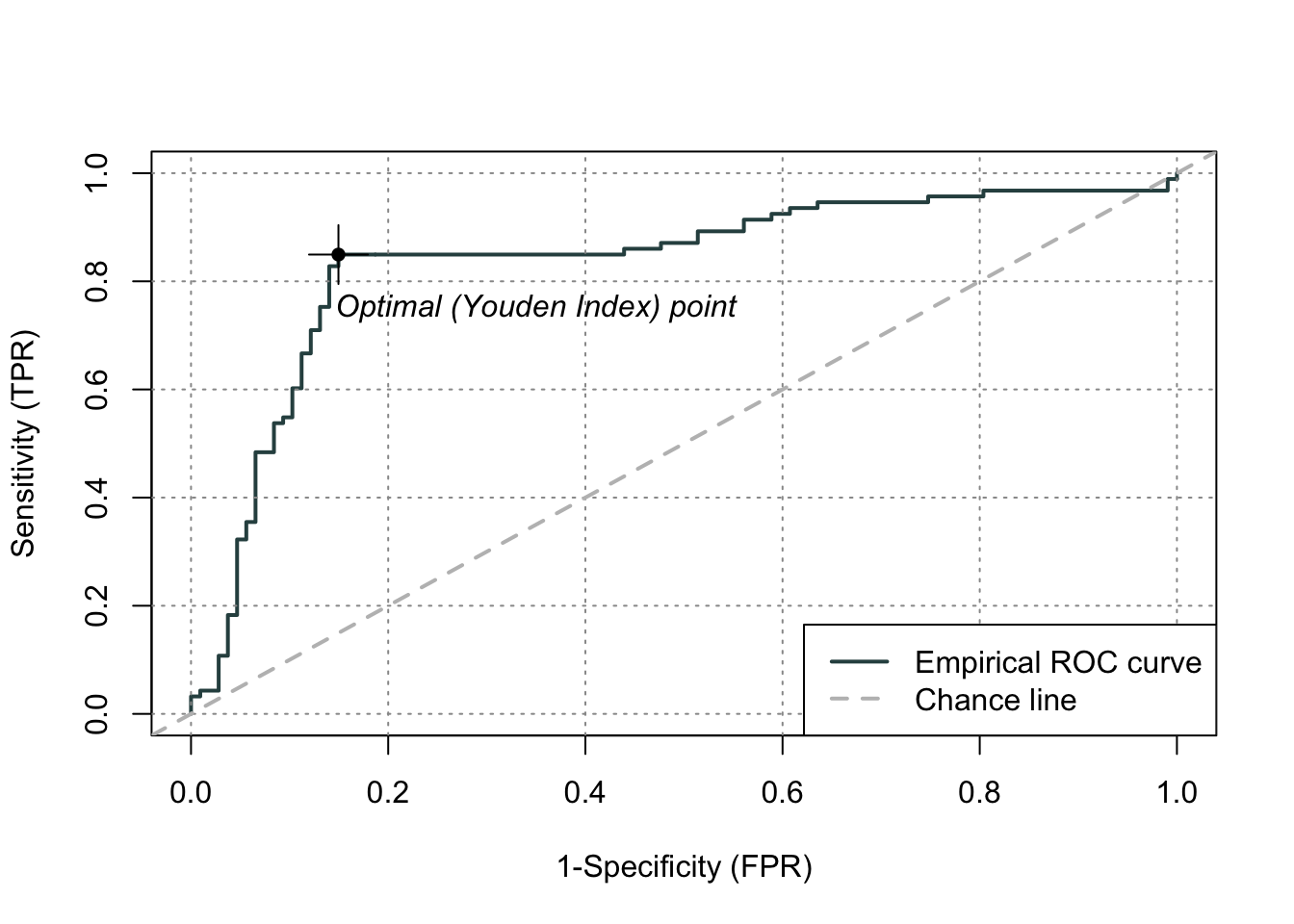
Several other visualizations are possible. The following plot shows the cumulative densities of the positive and negative responses. The KS statistic shows the maximum distance between the two curves.
ksplot(ROCit_obj)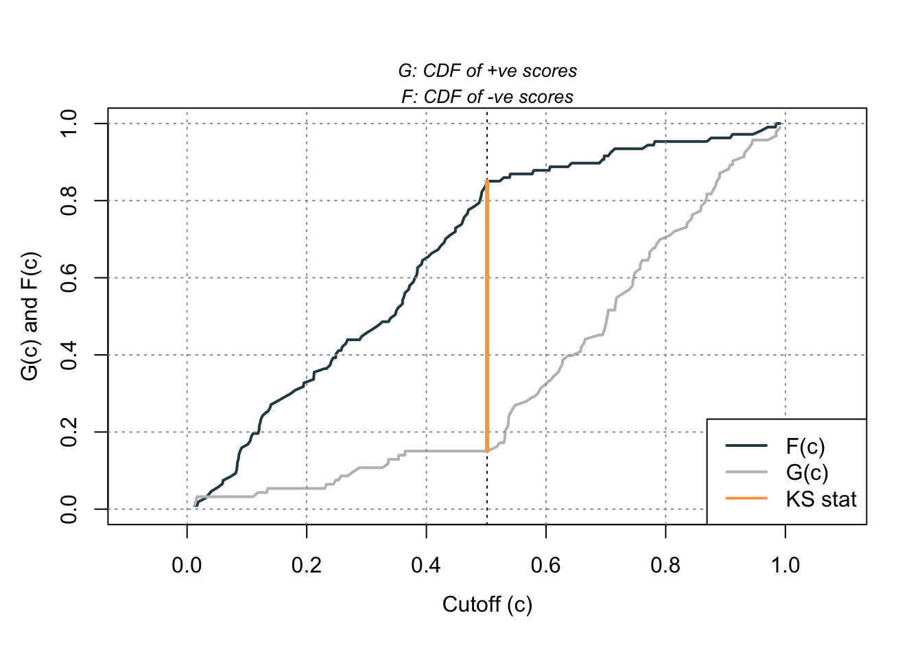
In this attempt to dig into CRAN and uncover some of the resources R contains for plotting ROC curves and other binary classifier visualizations, I have only scratched the surface. Moreover, I have deliberately ignored the many packages available for specialized applications, such as survivalROC for computing time-dependent ROC curves from censored survival data, and cvAUC, which contains functions for evaluating cross-validated AUC measures. Nevertheless, I hope that this little exercise will help you find what you are looking for.
You may leave a comment below or discuss the post in the forum community.rstudio.com.