In a previous post, we explored the dividend history of stocks included in the SP500, and we followed that with exploring the dividend history of some NASDAQ tickers. Today’s post is a short continuation of that tech dividend theme, with the aim of demonstrating how we can take our previous work and use it to quickly visualize research from the real world. In this case, the inspiration is the July 27th edition of Barron’s, which has an article called 8 Tech Stocks That Yield Steady Payouts. (As of this writing, a subscription is required to view that article, unfortunately. If you do peruse that issue, I also recommend the interview with GMO’s Jeff Montier, as well, as he offers an interesting viewpoint on modern monetary theory.)
The article breaks out eight tech stock with attractive dividends: IBM, HPQ, TXN, CSCO, INTC, ORCL, AAPL and MSFT. It also mentions QCOM as an interesting stock to watch. We’ll piggyback on the substance of the article and visualize the dividend history of those nine tickers.
First, let’s load up our packages and create a vector of tickers called barrons_tickers. We will pass that vector to tq_get(get = "dividends") just as we did last time. Indeed, we’re not going to do much differently today, but hopefully it’s a nice way to see how previous work can be applied to other situations. Ah, the joys of code that can be reused!
library(tidyverse)
library(tidyquant)
library(janitor)
library(plotly)
barrons_tickers <-
c("IBM", "HPQ", "TXN", "CSCO", "INTC", "ORCL", "AAPL", "MSFT", "QCOM")
barrons_dividends <-
barrons_tickers %>%
tq_get(get = "dividends")We can reuse our code from the previous post to quickly visualize these tickers’ dividend histories, along with a detailed tooltip setting in plotly.
ggplotly(
barrons_dividends %>%
  group_by(symbol) %>%
  mutate(info = paste(date,
                  '<br>symbol:', symbol,
                  '<br>div: $', dividends)) %>%
  ggplot(aes(x = date,
             y = dividends,
             color = symbol,
             label_tooltip = info)) +
  geom_point() +
  scale_y_continuous(labels = scales::dollar)  +
  scale_x_date(breaks = scales::pretty_breaks(n = 10)) +
  labs(x = "", y = "div/share", title = "Nasdaq dividends") +
  theme(plot.title = element_text(hjust = 0.5)),
tooltip = "label_tooltip"
)
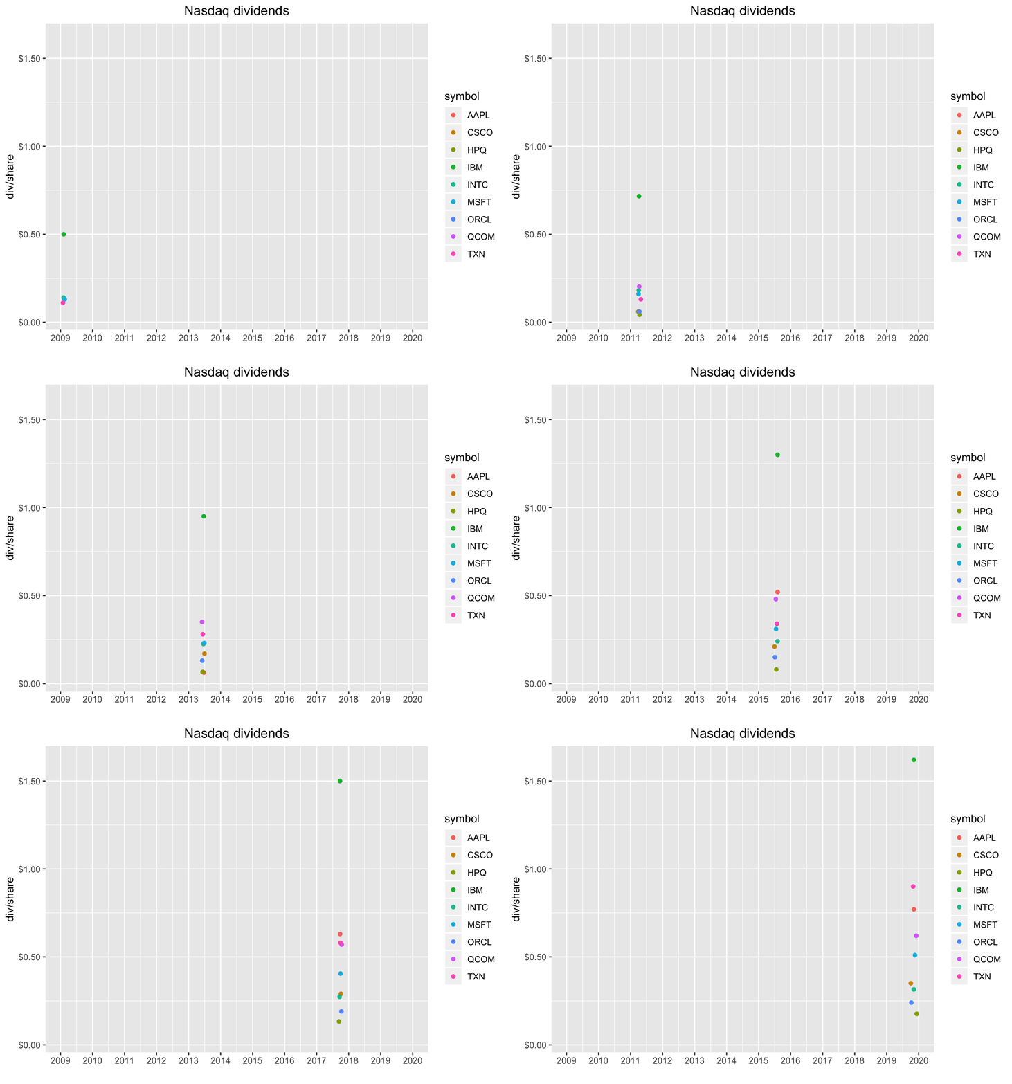
With a handful of stocks, our visualization really tells a nice story. We can more clearly see the four annual payments by each company, and it pops off the chart that IBM has been raising it’s dividend consistently. Not bad for a company that also owns Red Hat.
Let’s move beyond the dividend history and compare the dividend yields for each of these tickers. We’ll grab yesterday’s closing price by calling tq_get(get = "stock.prices", from = "2019-08-05").
barrons_price <-
barrons_tickers %>%
  tq_get(get = "stock.prices", from = "2019-08-05")
Now, we estimate the annual dividend payment by taking the most recent quarterly dividend via slice(n()) and multiplying by four.
barrons_dividends %>%
  group_by(symbol) %>%
  slice(n()) %>%
  mutate(total_div = dividends * 4)
# A tibble: 9 x 4
# Groups: symbol [9]
symbol date dividends total_div
<chr> <date> <dbl> <dbl>
1 AAPL 2019-11-07 0.77 3.08
2 CSCO 2019-10-03 0.35 1.4
3 HPQ 2019-12-10 0.176 0.704
4 IBM 2019-11-07 1.62 6.48
5 INTC 2019-11-06 0.315 1.26
6 MSFT 2019-11-20 0.51 2.04
7 ORCL 2019-10-09 0.24 0.96
8 QCOM 2019-12-04 0.62 2.48
9 TXN 2019-10-30 0.9 3.6 Next, we use left_join(barrons_price, by = "symbol") to add the most recent closing price.
barrons_dividends %>%
  group_by(symbol) %>%
  slice(n()) %>%
  mutate(total_div = dividends * 4) %>%
  left_join(barrons_price, by = "symbol") %>%
  head()
# A tibble: 6 x 11
# Groups: symbol [1]
symbol date.x dividends total_div date.y open high low close
<chr> <date> <dbl> <dbl> <date> <dbl> <dbl> <dbl> <dbl>
1 AAPL 2019-11-07 0.77 3.08 2019-08-05 198. 199. 193. 193.
2 AAPL 2019-11-07 0.77 3.08 2019-08-06 196. 198. 194. 197
3 AAPL 2019-11-07 0.77 3.08 2019-08-07 195. 200. 194. 199.
4 AAPL 2019-11-07 0.77 3.08 2019-08-08 200. 204. 199. 203.
5 AAPL 2019-11-07 0.77 3.08 2019-08-09 201. 203. 199. 201.
6 AAPL 2019-11-07 0.77 3.08 2019-08-12 200. 202. 199. 200.
# … with 2 more variables: volume <dbl>, adjusted <dbl>That worked, but note how we now have two date columns, called date.x and date.y, since both of our tibbles had a date column before we joined them. In the past we have dealt with that by deleting the duplicate but this time let’s use a select() inside left_join() to remove the duplicate before joining. The full call is left_join(select(barrons_price, -date), by = "symbol").
barrons_dividends %>%
  group_by(symbol) %>%
  slice(n()) %>%
  mutate(total_div = dividends * 4) %>%
  left_join(select(barrons_price, -date), by = "symbol") %>%
  head()
# A tibble: 6 x 10
# Groups: symbol [1]
symbol date dividends total_div open high low close volume
<chr> <date> <dbl> <dbl> <dbl> <dbl> <dbl> <dbl> <dbl>
1 AAPL 2019-11-07 0.77 3.08 198. 199. 193. 193. 5.24e7
2 AAPL 2019-11-07 0.77 3.08 196. 198. 194. 197 3.58e7
3 AAPL 2019-11-07 0.77 3.08 195. 200. 194. 199. 3.34e7
4 AAPL 2019-11-07 0.77 3.08 200. 204. 199. 203. 2.70e7
5 AAPL 2019-11-07 0.77 3.08 201. 203. 199. 201. 2.46e7
6 AAPL 2019-11-07 0.77 3.08 200. 202. 199. 200. 2.25e7
# … with 1 more variable: adjusted <dbl>Now, we calculate the yield with mutate(yield = total_div/close).
barrons_dividends %>%
  group_by(symbol) %>%
  slice(n()) %>%
  mutate(total_div = dividends * 4) %>%
  left_join(barrons_price, by = "symbol") %>%
  select(symbol, total_div, close) %>%
  mutate(yield = total_div/close)
# A tibble: 927 x 4
# Groups: symbol [9]
symbol total_div close yield
<chr> <dbl> <dbl> <dbl>
1 AAPL 3.08 193. 0.0159
2 AAPL 3.08 197 0.0156
3 AAPL 3.08 199. 0.0155
4 AAPL 3.08 203. 0.0151
5 AAPL 3.08 201. 0.0153
6 AAPL 3.08 200. 0.0154
7 AAPL 3.08 209. 0.0147
8 AAPL 3.08 203. 0.0152
9 AAPL 3.08 202. 0.0153
10 AAPL 3.08 206. 0.0149
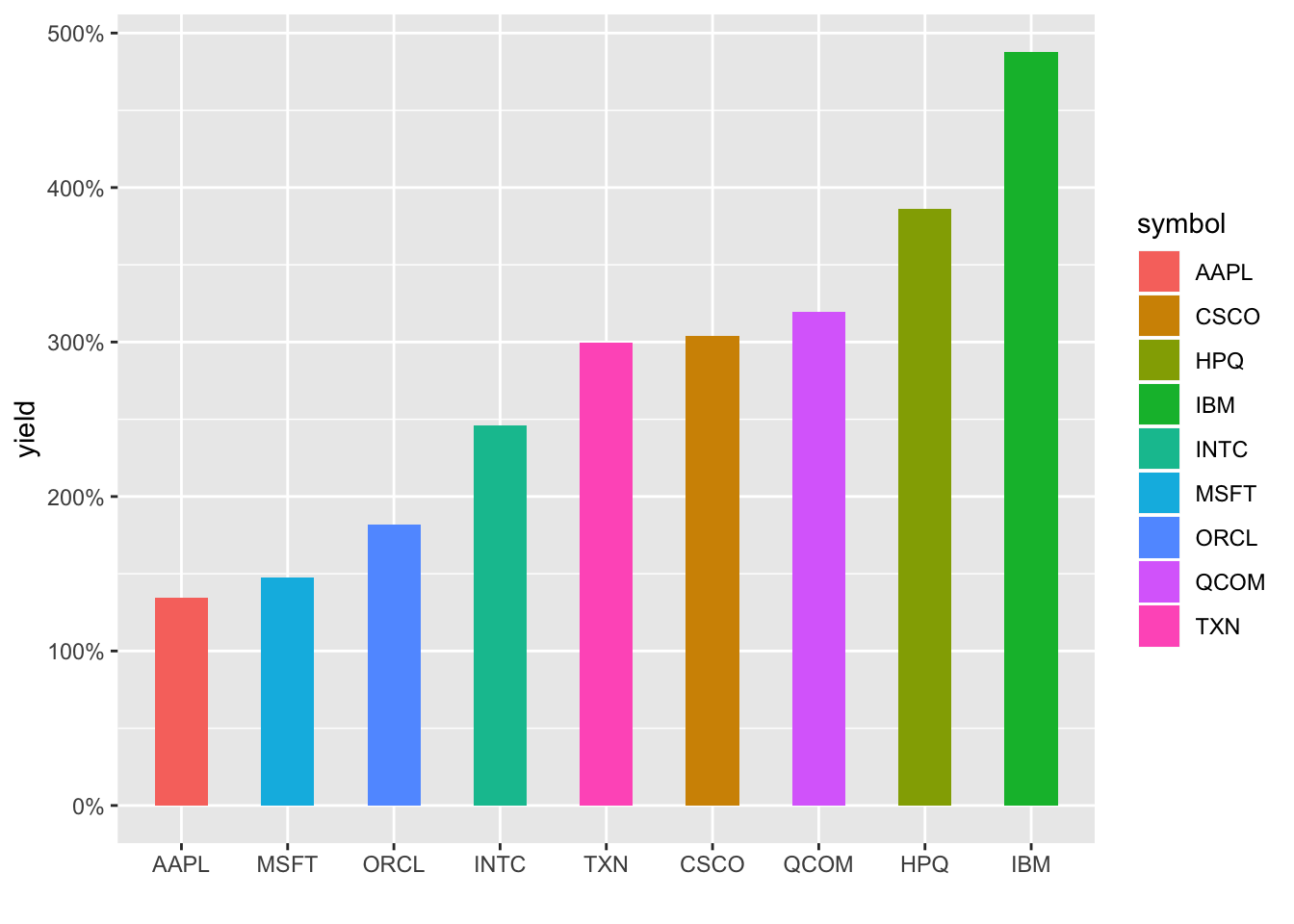
# … with 917 more rowsWe can plot the dividend yields as bar heights using geom_col().
barrons_dividends %>%
  group_by(symbol) %>%
  slice(n()) %>%
  mutate(total_div = dividends * 4) %>%
  left_join(barrons_price, by = "symbol") %>%
  select(symbol, total_div, close) %>%
  mutate(yield = total_div/close) %>%
  ggplot(aes(x = reorder(symbol, yield), y = yield, fill = symbol)) +
  geom_col(width = .5) +
  labs(x = "") +
  scale_y_continuous(labels = scales::percent)
We could wrap this up with a call to plotly, but let’s totally change directions and add some animation. Animate a chart? That sounds really hard, I guess we’ll need to loop through the dates and add dots as we go. A lot of work and who has the time…wait…boom…gganimate to the rescue!
The gganimate package makes this so painless it’s a shame. We add transition_reveal(date) to the end of the code flow, and that’s it! Well, not quite; on my machine, I needed to load the gifski and png packages before any of this works, but then we’re good to go.
library(gganimate)
library(gifski)
library(png)
barrons_dividends %>%
group_by(symbol) %>%
ggplot(aes(x = date,
y = dividends,
color = symbol)) +
geom_point() +
scale_y_continuous(labels = scales::dollar) +
scale_x_date(breaks = scales::pretty_breaks(n = 10)) +
labs(x = "", y = "div/share", title = "Nasdaq dividends") +
theme(plot.title = element_text(hjust = 0.5)) +
transition_reveal(date)
Nice!
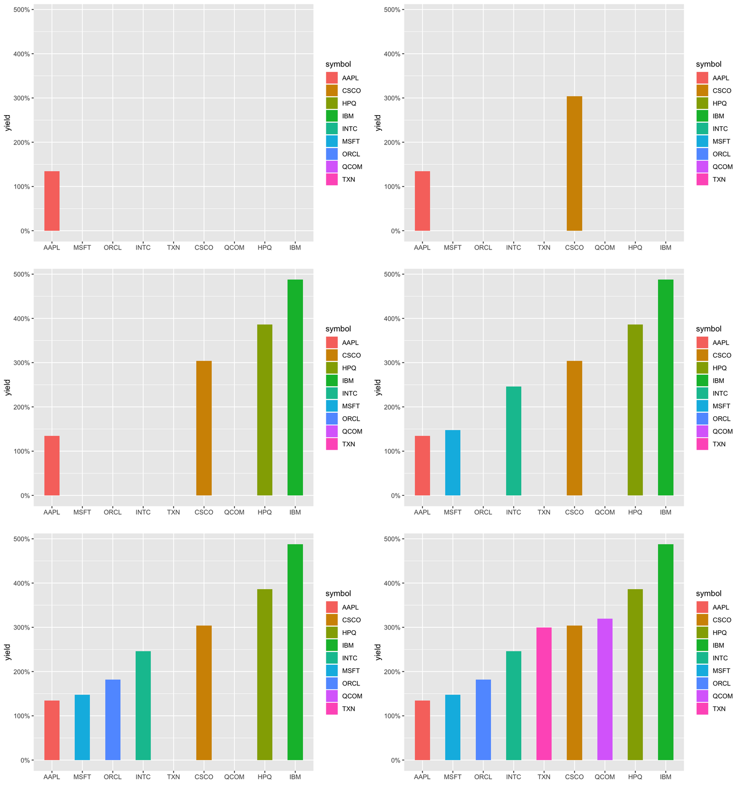
What about animating our chart that shows the dividend yield as bar heights? Well, we can’t reveal by date here, so we use transition_states(symbol).
barrons_dividends %>%
  group_by(symbol) %>%
  slice(n()) %>%
  mutate(total_div = dividends * 4) %>%
  left_join(select(barrons_price, -date), by = "symbol") %>%
  select(symbol, total_div, close) %>%
  mutate(yield = total_div/close) %>%
  ggplot(aes(x = reorder(symbol, yield), y = yield, fill = symbol)) +
  geom_col(width = .5) +
  labs(x = "") +
  scale_y_continuous(labels = scales::percent) +
  transition_states(symbol)
Ah, not quite perfect - notice the chart doesn’t respect the reorder in our aes(), so they appear in alphabetical order and each column disappears as the next one appears. Let’s use shadow_mark() to keep the previous bar and attempt to reorder the images with arrange().
barrons_dividends %>%
  group_by(symbol) %>%
  slice(n()) %>%
  mutate(total_div = dividends * 4) %>%
  left_join(select(barrons_price, -date), by = "symbol") %>%
  select(symbol, total_div, close) %>%
  mutate(yield = total_div/close) %>%
  arrange(yield) %>%
  ggplot(aes(x = reorder(symbol, yield), y = yield, fill = symbol)) +
  geom_col(width = .5) +
  labs(x = "") +
  scale_y_continuous(labels = scales::percent) +
  transition_states(symbol, wrap = FALSE) +
  shadow_mark()
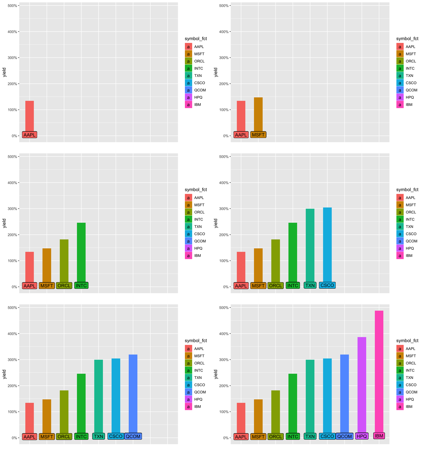
It is still not respecting the new order and defaulting to alphabetical. Let’s hard-code that reordering by converting symbol to a factor, ordered by yield. And that means a foray into the forcats package and fct_reorder(). Note we need to ungroup() first since symbol is our grouping column and then can call symbol_fct = forcats::as_factor(symbol) %>% fct_reorder(yield). I also think it would be a little more dramatic to remove the x-axis labels and have the ticker names appear on the chart.
barrons_dividends %>%
  group_by(symbol) %>%
  slice(n()) %>%
  mutate(total_div = dividends * 4) %>%
  left_join(select(barrons_price, -date), by = "symbol") %>%
  select(symbol, total_div, close) %>%
  mutate(yield = total_div/close) %>%
  ungroup() %>%
  mutate(symbol_fct = forcats::as_factor(symbol) %>% fct_reorder(yield)) %>%
  ggplot(aes(x = symbol_fct, y = yield, fill = symbol_fct)) +
  geom_col(width = .5) +
  geom_label(aes(label = symbol, y = yield), nudge_y = .03) +
  labs(x = "") +
  scale_y_continuous(labels = scales::percent) +
  theme(axis.text.x = element_blank(),
        axis.ticks.x = element_blank()) +
  transition_states(symbol_fct, wrap = FALSE) +
  shadow_mark()
Creating and loading those animated gifs takes some time, about 10-30 seconds each on my RStudio Server Pro instance. Plus, it’s totally fair to quibble that these animations haven’t added any new substance to the charts, they just look cool (R plots can be cool, right?). But if you’ve read this far (thanks!), I might as well subject you to my rant about visualization and communication being just-as-if-not-more important than analytical or statistical findings. Most of the consumers of our work are really busy and we’re lucky if they spend two minutes glancing at whatever findings we put in front of them. We don’t have long to grab their attention and communicate our message. If an animation helps us, it’s worth spending the extra time on it, even though we were actually ‘done’ with this job many lines of code ago.
Alright, so with that:
If you like this sort of code through ,check out my book, Reproducible Finance with R.
Not specific to finance, but several of the stringr and ggplot tricks in this post came from this awesome Business Science University course.
I’m also going to be posting weekly code snippets on LinkedIn; connect with me there if you’re keen for some R finance stuff.
Thanks for reading and see you next time!
You may leave a comment below or discuss the post in the forum community.rstudio.com.