A task common to many machine learning workflows is to compare the performance of several models with respect to some metric such as accuracy or area under the ROC curve. Standard practice is to try out several different algorithms on a training data set and see which works better. Unfortunately, all to often, after this work has been done, model selection comes down to “eyeballing” several different ROC curves. If you find eyeballing a little too informal, then take a look at the tidyposterior package (part of the universe of ‘tidymodels`). The Getting Started vignette asks the question:
When looking at resampling results, are the differences between the models “real”?
and lays out a modelling approach to answering it that is grounded in Bayesian theory. This means that all of the information about the differences between two models to be compared will be summed up in a posterior distribution for the differences that will make it possible to calculate probabilities entirely based on the particular data at hand, the information encoded in the various priors, and the effect size that has been chosen because it is considered large enough to make a practical difference. Given an effect size chosen up front to represent a practical difference, the tidyposterior model will enable conclusions such as; there is a probability of .65 that, for all practical purposes, the two distributions are different.
There is no magic here. tidyposterior works through the mechanics of an Bayesian analysis with minimum input from the user (a situation that is possible because of the very constrained nature of comparison problem and the use of cross-validation statistics as input), but the result ultimately comes down to choosing an effect size that makes sense based on domain knowledge of the underlying experiment. For some studies, an effect of .05 might seem to be reasonable. In a situation where having an interpretable is worth more than a black-box prediction modelers may be willing to go higher. And, for studies where models may support life or death decisions something in the 2% range may be required.
The Getting Started guide provides end-to-end road map on using the tidyposterior functions to compare models, but it assumes quite a bit of background. Someone just getting started with Bayesian statistics or doing Bayesian statistics in R, might be more comfortable with a little more description of the landscape. For the rest of this post, I’ll be the tour guide and provide a little color commentary that you may find helpful as you walk through the vignette.
The first thing to point out is that the vignette begins after most of the heavy lifting for a model comparison study has already been done, and the information required to compare models has been wrapped up in the data frame precise_example.
As website for tidyposterior states:
precise_examplecontains the results of the classification analysis of a real data set using 10-fold CV. The holdout data sets contained thousands of examples and have precise performance estimates. Three models were fit to the original data and several performance metrics are included.
precise_example[,-1]
## # A tibble: 10 x 28
##    id    glm_Accuracy glm_Kappa glm_ROC glm_Sens glm_Spec glm_PRAUC
##    <chr>        <dbl>     <dbl>   <dbl>    <dbl>    <dbl>     <dbl>
##  1 Fold…        0.722     0.328   0.798    0.729    0.720     0.489
##  2 Fold…        0.696     0.290   0.778    0.720    0.691     0.456
##  3 Fold…        0.701     0.297   0.790    0.723    0.696     0.486
##  4 Fold…        0.704     0.316   0.795    0.763    0.691     0.497
##  5 Fold…        0.721     0.324   0.797    0.722    0.721     0.481
##  6 Fold…        0.711     0.303   0.780    0.706    0.712     0.484
##  7 Fold…        0.702     0.305   0.790    0.739    0.694     0.485
##  8 Fold…        0.718     0.321   0.784    0.729    0.715     0.477
##  9 Fold…        0.720     0.328   0.795    0.739    0.715     0.491
## 10 Fold…        0.719     0.324   0.796    0.728    0.717     0.488
## # … with 21 more variables: glm_Precision <dbl>, glm_Recall <dbl>,
## #   glm_F <dbl>, knn_Accuracy <dbl>, knn_Kappa <dbl>, knn_ROC <dbl>,
## #   knn_Sens <dbl>, knn_Spec <dbl>, knn_PRAUC <dbl>, knn_Precision <dbl>,
## #   knn_Recall <dbl>, knn_F <dbl>, nnet_Accuracy <dbl>, nnet_Kappa <dbl>,
## #   nnet_ROC <dbl>, nnet_Sens <dbl>, nnet_Spec <dbl>, nnet_PRAUC <dbl>,
## #   nnet_Precision <dbl>, nnet_Recall <dbl>, nnet_F <dbl>
The various statistics for the different models have been matched by setting a random number seed and using the same random sampling process for each fold. This is the kind of thing that can easily be done with the rsample or caret packages, but requires a bit of work otherwise.
The Getting Started vignette focuses on ROC, the area under the ROC Curve. A little bit of preprocessing produces “wide” and “long” (or stacked) versions of the ROC statistics. Note that information on the performance statistics contained in the data set can be found on the yardstick reference page.
This first bit of code selects the ROC for the different statistics and creates a stacked version of the data set.
rocs <- precise_example %>%
  select(id, contains("ROC")) %>%
  setNames(tolower(gsub("_ROC$", "", names(.))))
rocs
## # A tibble: 10 x 4
##    id       glm   knn  nnet
##    <chr>  <dbl> <dbl> <dbl>
##  1 Fold01 0.798 0.753 0.843
##  2 Fold02 0.778 0.744 0.827
##  3 Fold03 0.790 0.743 0.846
##  4 Fold04 0.795 0.755 0.852
##  5 Fold05 0.797 0.760 0.838
##  6 Fold06 0.780 0.747 0.852
##  7 Fold07 0.790 0.757 0.833
##  8 Fold08 0.784 0.754 0.832
##  9 Fold09 0.795 0.764 0.846
## 10 Fold10 0.796 0.748 0.847
rocs_stacked <- gather.rset(rocs)
head(rocs_stacked)
##       id model statistic
## 1 Fold01   glm    0.7981
## 2 Fold02   glm    0.7779
## 3 Fold03   glm    0.7901
## 4 Fold04   glm    0.7948
## 5 Fold05   glm    0.7972
## 6 Fold06   glm    0.7804
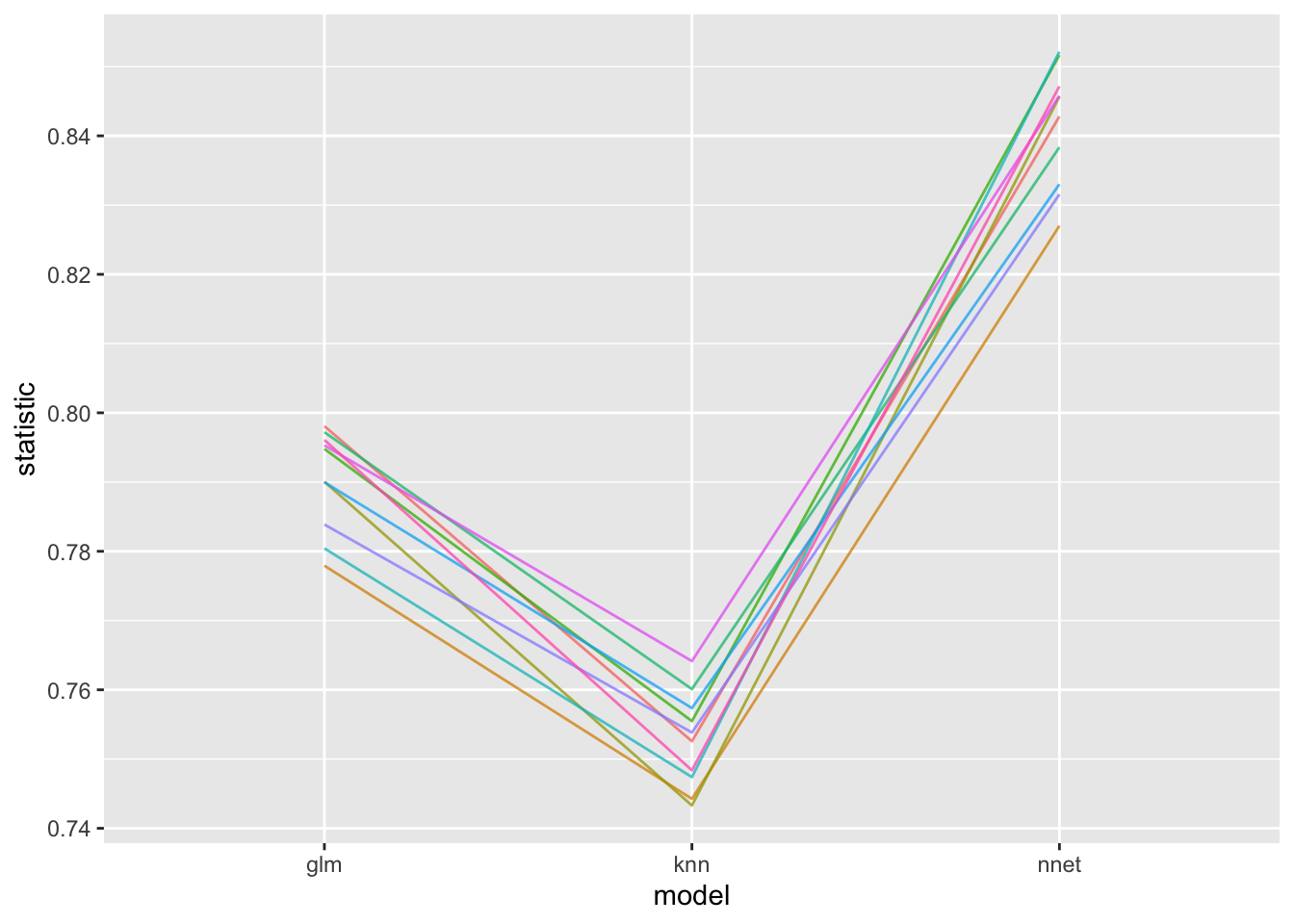
The first graph of the vignette plots the ROC cross-validation statistics for each fold. The fact that the lines are nearly all parallel indicates that there is probably a resampling effect, but it does look like there is a clear difference in the performance of the three models.
ggplot(rocs_stacked, aes(x = model, y = statistic, group = id, col = id)) + geom_line(alpha = .75) + theme(legend.position = "none")
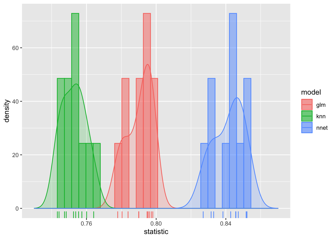
The following plot makes the performance differences even more apparent. There is very little overlap of the kernel density estimates of the three distributions.
ggplot(rocs_stacked, aes(x = statistic, col = model, fill = model)) +
  geom_histogram(aes(y=..density..), alpha=0.5, position="identity", bins = 35)+
  geom_density(alpha=.2) + xlim(min = .73, max = .87) +
  geom_rug()
Quantifying these differences is the point of our exercise. The strategy will be to fit a Bayesian model that explicitly accounts for the fold effects, and then compare the differences in posterior distributions to calculate the probability that the various distributions are indeed different.
Here, we fit the model with the tidyposterior function perf_mod(). Note that although the only parameter passed to perf_mod() is to set the seed, other options can be specified. A great deal of attention has been put into setting the defaults. I will explain the model perf_mod() executes below when we examine the resulting model object.
roc_model <- perf_mod(rocs, seed = 2824)
I have suppressed the voluminous output generated by fitting the model, but if you run it yourself, you will see that there was a lot going on under the covers. Four independent Markov chains were initiated for the stan Monte Carlo algorithm used to evaluate the model, each chain going through 1,000 warm up iterations and then another 1,000 to fit the model.
perf_mod()is based on the glmer() function from the rstanarm package. We can assess the rstanarm model object which is returned as part of perf_mod model object.
summary(roc_model$stan)
##
## Model Info:
##  function:     stan_glmer
##  family:       gaussian [identity]
##  formula:      statistic ~ model + (1 | id)
##  algorithm:    sampling
##  sample:       4000 (posterior sample size)
##  priors:       see help('prior_summary')
##  observations: 30
##  groups:       id (10)
##
## Estimates:
##                                     mean   sd   10%   50%   90%
## (Intercept)                       0.8    0.0  0.8   0.8   0.8
## modelknn                          0.0    0.0  0.0   0.0   0.0
## modelnnet                         0.1    0.0  0.0   0.1   0.1
## b[(Intercept) id:Fold01]          0.0    0.0  0.0   0.0   0.0
## b[(Intercept) id:Fold02]          0.0    0.0  0.0   0.0   0.0
## b[(Intercept) id:Fold03]          0.0    0.0  0.0   0.0   0.0
## b[(Intercept) id:Fold04]          0.0    0.0  0.0   0.0   0.0
## b[(Intercept) id:Fold05]          0.0    0.0  0.0   0.0   0.0
## b[(Intercept) id:Fold06]          0.0    0.0  0.0   0.0   0.0
## b[(Intercept) id:Fold07]          0.0    0.0  0.0   0.0   0.0
## b[(Intercept) id:Fold08]          0.0    0.0  0.0   0.0   0.0
## b[(Intercept) id:Fold09]          0.0    0.0  0.0   0.0   0.0
## b[(Intercept) id:Fold10]          0.0    0.0  0.0   0.0   0.0
## sigma                             0.0    0.0  0.0   0.0   0.0
## Sigma[id:(Intercept),(Intercept)] 0.0    0.0  0.0   0.0   0.0
##
## Fit Diagnostics:
##            mean   sd   10%   50%   90%
## mean_PPD 0.8    0.0  0.8   0.8   0.8
##
## The mean_ppd is the sample average posterior predictive distribution of the outcome variable (for details see help('summary.stanreg')).
##
## MCMC diagnostics
##                                   mcse Rhat n_eff
## (Intercept)                       0.0  1.0  2691
## modelknn                          0.0  1.0  2977
## modelnnet                         0.0  1.0  3314
## b[(Intercept) id:Fold01]          0.0  1.0  3389
## b[(Intercept) id:Fold02]          0.0  1.0  1162
## b[(Intercept) id:Fold03]          0.0  1.0  3683
## b[(Intercept) id:Fold04]          0.0  1.0  2016
## b[(Intercept) id:Fold05]          0.0  1.0  2888
## b[(Intercept) id:Fold06]          0.0  1.0  3557
## b[(Intercept) id:Fold07]          0.0  1.0  3332
## b[(Intercept) id:Fold08]          0.0  1.0  1952
## b[(Intercept) id:Fold09]          0.0  1.0  1929
## b[(Intercept) id:Fold10]          0.0  1.0  3219
## sigma                             0.0  1.0  1391
## Sigma[id:(Intercept),(Intercept)] 0.0  1.0  1386
## mean_PPD                          0.0  1.0  4180
## log-posterior                     0.2  1.0   688
##
## For each parameter, mcse is Monte Carlo standard error, n_eff is a crude measure of effective sample size, and Rhat is the potential scale reduction factor on split chains (at convergence Rhat=1).
The default model constructed by perf_mod() specified by the R formula statistic ~ model + (1 | id) is a Bayesian, multi-level, varying intercept, linear regression model with an intercept, coefficients for the knn and nnet model effects, and an intercept for each of the cross-validation folds. This model might be written as:
Yi = \(\alpha\) + \(\beta\)Xi + b[i]
in the one of the common notations used by Bayesians. (For example, see Gelman and Hill (2007).
rstanarm allows R users to build a wide range of Bayesian regression models using the stan engine without having to explicitly program in stan. That’s the good news. The bad news is that R’s formula interface takes some getting used to. A good source for learning the how to interpret formulas for the type of model we are considering here is the vignette for the lme4 package which implements Frequentist analog of this sort of model. (For an in depth discussion of the pros and cons of R formula interface see the Max Kuhn’s two posts on the subject: pros here and cons here .
You can examine the prior default prior distributions that were selected for this model as follows:
rstanarm::prior_summary(roc_model$stan)
## Priors for model 'roc_model$stan'
## ------
## Intercept (after predictors centered)
##   Specified prior:
##     ~ normal(location = 0, scale = 10)
##   Adjusted prior:
##     ~ normal(location = 0, scale = 0.38)
##
## Coefficients
##   Specified prior:
##     ~ normal(location = [0,0], scale = [2.5,2.5])
##   Adjusted prior:
##     ~ normal(location = [0,0], scale = [0.094,0.094])
##
## Auxiliary (sigma)
##   Specified prior:
##     ~ exponential(rate = 1)
##   Adjusted prior:
##     ~ exponential(rate = 26)
##
## Covariance
##  ~ decov(reg. = 1, conc. = 1, shape = 1, scale = 1)
## ------
## See help('prior_summary.stanreg') for more details
Now, that the model has been fit, we use the tidyposterior function tidy() to extract the posterior samples from the perf_mod() model object, examine the first few values and plot the posterior distributions for the three models being compared. (Note that you may also find the tidybayes package helpful in examining draws from the posterior distribution.)
roc_post <- tidy(roc_model)
glimpse(roc_post)
## Observations: 12,000
## Variables: 2
## $ model     <chr> "glm", "glm", "glm", "glm", "glm", "glm", "glm", "glm"…
## $ posterior <dbl> 0.7934, 0.7905, 0.7919, 0.7891, 0.7889, 0.7887, 0.7867…
Also, even though this is a relatively simple ANOVA type model, some model checking ought to be done to determine whether the model is good enough to be interpreted. This kind of checking can be done interactively with the shinystan application that can be launched with the command:
launch_shinystan(roc_model$stan)
The following screen capture from shinystan shows the diagnostics for the intercept for the seventh fold of the cross-validation. Note that the mixing (variability from high to low) in the top left graph which shows a trace of the Markov chain for this parameter looks quite good.

The vignette shows violin plots for each of the three models, but in order to make the comparison with the data plot above, I plot the distributions with histograms, kernel density, and rug plots.
roc_post2 <- as.data.frame(roc_post) # get object of class data.frame
ggplot(roc_post2, aes(x = posterior, col = model, fill = model)) +
  geom_histogram(aes(y=..density..), alpha=0.5, position="identity", bins = 100)+
  geom_density(alpha=.2) + xlim(min = .74, max = .86) +
  geom_rug()

Notice that the distribution all look like pretty narrow, normal distributions. And although it sure looks like there is quite a bit of difference between the distributions of ROC values for the glm and nnet models, we can quantify the difference by setting up a contrast computing the posterior difference in RMSE for the two models as nnet - glm.
glm_v_nnet <- contrast_models(roc_model, "nnet", "glm")
head(glm_v_nnet)
##   difference model_1 model_2
## 1    0.04669    nnet     glm
## 2    0.04897    nnet     glm
## 3    0.05226    nnet     glm
## 4    0.05251    nnet     glm
## 5    0.05364    nnet     glm
## 6    0.05583    nnet     glm
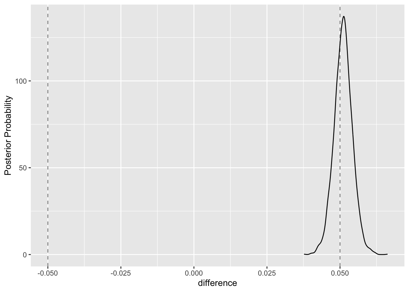
Ideally, before beginning a modeling effort, one would have some idea about how different the models have to be in order to make any practical difference. Let’s suppose that there needs to be at least a 5% increase in ROC area between the two distributions for there to be a practical difference. We can compute this probability by setting the size parameter to the summary() function to 0.05.
summary(glm_v_nnet, size = 0.05)
## # A tibble: 1 x 9
##   contrast probability   mean  lower  upper  size pract_neg pract_equiv
##   <chr>          <dbl>  <dbl>  <dbl>  <dbl> <dbl>     <dbl>       <dbl>
## 1 nnet vs…           1 0.0511 0.0459 0.0563  0.05         0       0.351
## # … with 1 more variable: pract_pos <dbl>
The column labeled probability indicates that all of the density of the difference is positive. mean, lower and upper give the mean of the posterior difference distribution, and the lower and upper bounds plotted. pract_neg and prac_pos report the result of a calculation that uses the Highest Density Interval HDI, the narrowest interval containing some prespecified percentage of the probability density curve, to determine the Region of Practical Equivalence, ROPE. pract_neg indicates that none of the density is below the interval of meaningful difference and prac_pos indicates that 65% of the density is above the area of practical equivalence. The latter can be interpreted as saying that the probability that the two distributions are different for all practicable purposes is .65. Likewise, pract_equiv means that there is a 35% chance that the two distributions are practically equivalent.
ggplot(glm_v_nnet, size = .05)
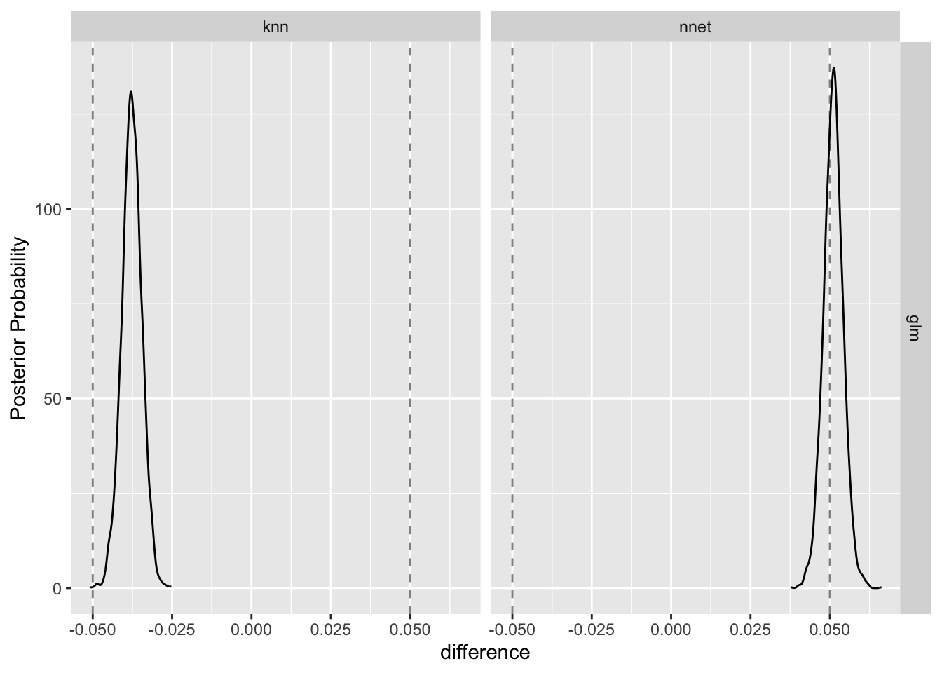
The contrast_models() function is also flexible enough to perform multiple simultaneous contrasts. Here, we set up to contrast both the glm model against the nnet model and the knn model at the 5% level
models_contrast <- contrast_models(roc_model, list("knn","nnet"), list("glm", "glm"))
summary(models_contrast, size=.05)
## # A tibble: 2 x 9
##   contrast probability    mean   lower   upper  size pract_neg pract_equiv
##   <chr>          <dbl>   <dbl>   <dbl>   <dbl> <dbl>     <dbl>       <dbl>
## 1 knn vs …           0 -0.0377 -0.0430 -0.0325  0.05   0.00025       1.000
## 2 nnet vs…           1  0.0511  0.0459  0.0563  0.05   0             0.351
## # … with 1 more variable: pract_pos <dbl>
Note that first row of the table above and the following plot both indicate that there is no practical difference between the glm and knn models at the 5% level.
ggplot(models_contrast, size = .05)
Because the vignette also mentions accuracy, the fraction of correct predictions, we briefly repeat the above analysis using accuracy as the performance measure.
acc <- precise_example %>%
  select(id, contains("Accuracy")) %>%
  setNames(tolower(gsub("_Accuracy$", "", names(.))))
acc_model <- perf_mod(acc,seed = 2824)
The posterior distributions for accuracy are tightly clustered and indicate that the models yield different levels of performance for this measure.
acc_post <- as.data.frame(tidy(acc_model)) # get object of class data.frame
ggplot(roc_post2, aes(x = posterior, col = model, fill = model)) +
  geom_histogram(aes(y=..density..), alpha=0.5, position="identity", bins = 50) +
  geom_density(alpha=.2) + xlim(min = .74, max = .86) +
  geom_rug()
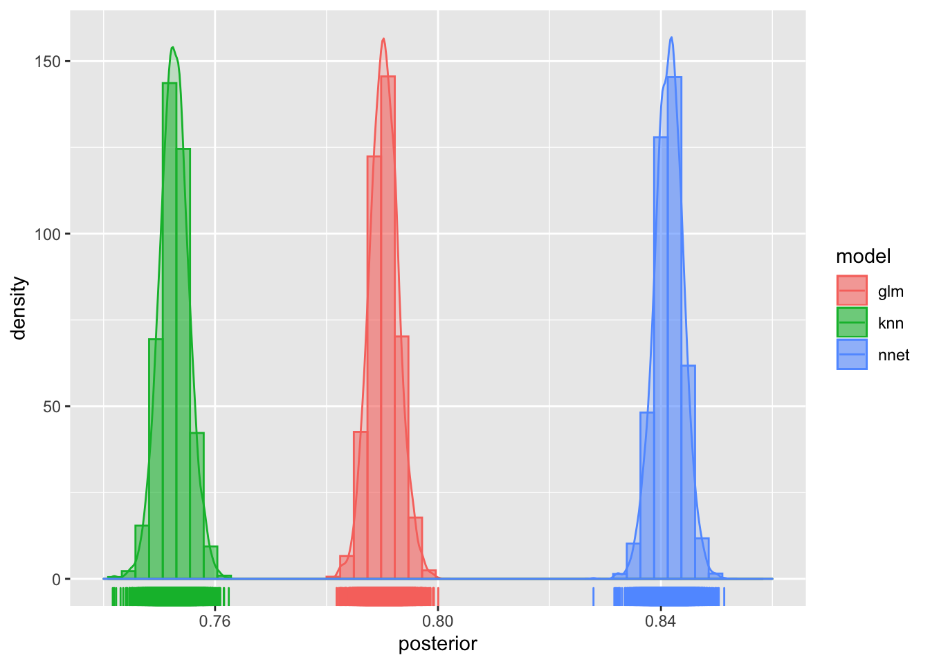
And, the contrast_models() function that confirms the practical difference.
acc_models_contrast <- contrast_models(acc_model, list("knn","nnet"), list("glm", "glm"))
summary(acc_models_contrast, size=.05)
## # A tibble: 2 x 9
##   contrast probability    mean   lower   upper  size pract_neg pract_equiv
##   <chr>          <dbl>   <dbl>   <dbl>   <dbl> <dbl>     <dbl>       <dbl>
## 1 knn vs …           0 -0.239  -0.250  -0.229   0.05         1     0
## 2 nnet vs…           1  0.0687  0.0583  0.0792  0.05         0     0.00175
## # … with 1 more variable: pract_pos <dbl>
ggplot(acc_models_contrast, size = .05)
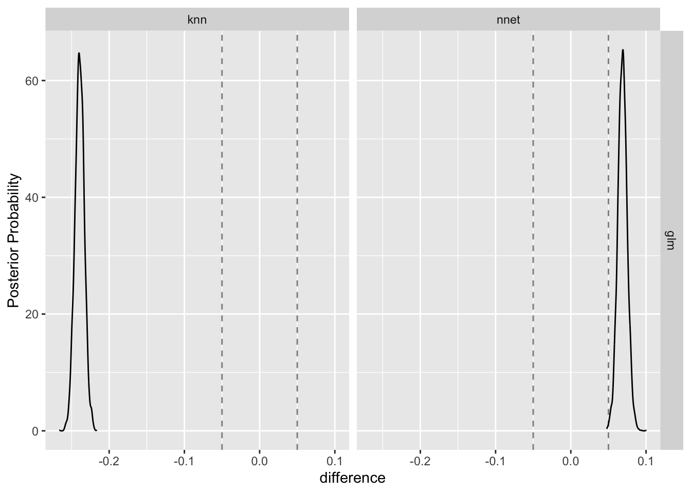
Note that the nnet model comes out on top with respect to both ROC and accuracy, but there appears to be a practical differences in practical differences. A modeler who is primarily interested in accuracy as the performance metric would likely be more confident than a modeler who has selected ROC as the performance metric. This example should serve as a warning not to engage in performance measure hacking. Choose your performance measure before you compute anything.
For additional reading, look here for a short presentation by Max Kuhn on the key tidyposterior ideas, and see the the following papers for an in-depth look at the underlying theory:
Benavoli et al. (2017) and
Kruschke and Liddell (2017). For Bayesian analysis in general, and more on the ROPE concept see: Kruschke (2014). Doing Bayesian Data Analysis, Second Edition: A Tutorial with R, JAGS, and Stan (2 edition).
You may leave a comment below or discuss the post in the forum community.rstudio.com.