Dr. Rama Ramakrishnan is Professor of the Practice at MIT Sloan School of Management where he teaches courses in Data Science, Optimization and applied Machine Learning.
When starting to work with a new dataset, it is useful to quickly pinpoint which pairs of variables appear to be strongly related. It helps you spot data issues, make better modeling decisions, and ultimately arrive at better answers.
The correlation coefficient is used widely for this purpose, but it is well-known that it can’t detect non-linear relationships. Take a look at this scatterplot of two variables \(x\) and \(y\).
set.seed(42)
x <- seq(-1,1,0.01)
y <- sqrt(1 - x^2) + rnorm(length(x),mean = 0, sd = 0.05)

ggplot(mapping = aes(x, y)) +
geom_point() 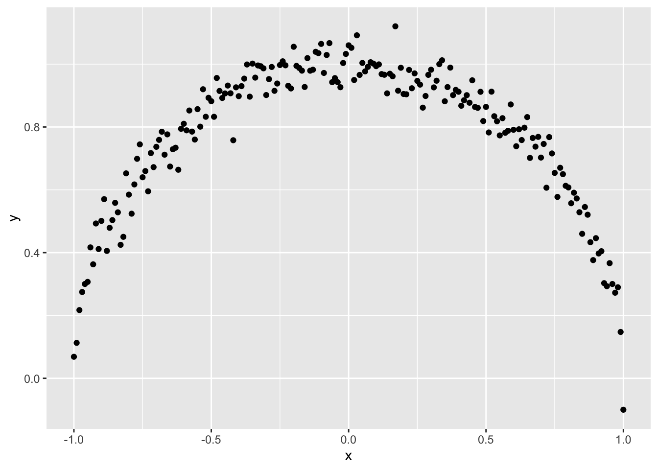
It is obvious to the human eye that \(x\) and \(y\) have a strong relationship but the correlation coefficient between \(x\) and \(y\) is only -0.01.
Further, if either variable of the pair is categorical, we can’t use the correlation coefficient. We will have to turn to other metrics. If \(x\) and \(y\) are both categorical, we can try Cramer’s V or the phi coefficient. If \(x\) is continuous and \(y\) is binary, we can use the point-biserial correlation coefficient.
But using different metrics is problematic. Since they are derived from different assumptions, we can’t compare the resulting numbers with one another. If the correlation coefficient between continuous variables \(x\) and \(y\) is 0.6 and the phi coefficient between categorical variables \(u\) and \(v\) is also 0.6, can we safely conclude that the relationships are equally strong? According to Wikipedia,
The correlation coefficient ranges from −1 to +1, where ±1 indicates perfect agreement or disagreement, and 0 indicates no relationship. The phi coefficient has a maximum value that is determined by the distribution of the two variables if one or both variables can take on more than two values.
A phi coefficient value of 0.6 between \(u\) and \(v\) may not mean much if its maximum possible value in this particular situation is much higher. Perhaps we can normalize the phi coefficient to map it to the 0-1 range? But what if that modification introduces biases?
Wouldn’t it be nice if we had one uniform approach that was easy to understand, worked for continuous and categorical variables alike, and could detect linear and nonlinear relationships?
(BTW, when \(x\) and \(y\) are continuous, looking at a scatter plot of \(x\) vs \(y\) can be very effective since the human brain can detect linear and non-linear patterns very quickly. But even if you are lucky and all your variables are continuous, looking at scatterplots of all pairs of variables is hard when you have lots of variables in your dataset; with just 100 predictors (say), you will need to look through 4950 scatterplots and this obviously isn’t practical)
A Potential Solution
To devise a metric that satisfies the requirements we listed above, let’s invert the problem: What does it mean to say that \(x\) and \(y\) don’t have a strong relationship?
Intuitively, if there’s no relationship between \(x\) and \(y\), we would expect to see no patterns in a scatterplot of \(x\) and \(y\) - no lines, curves, groups etc. It will be a cloud of points that appears to be randomly scattered, perhaps something like this:
x <- seq(-1,1,0.01)
y <- runif(length(x),min = -1, max = 1)

ggplot(mapping = aes(x, y)) +
geom_point() 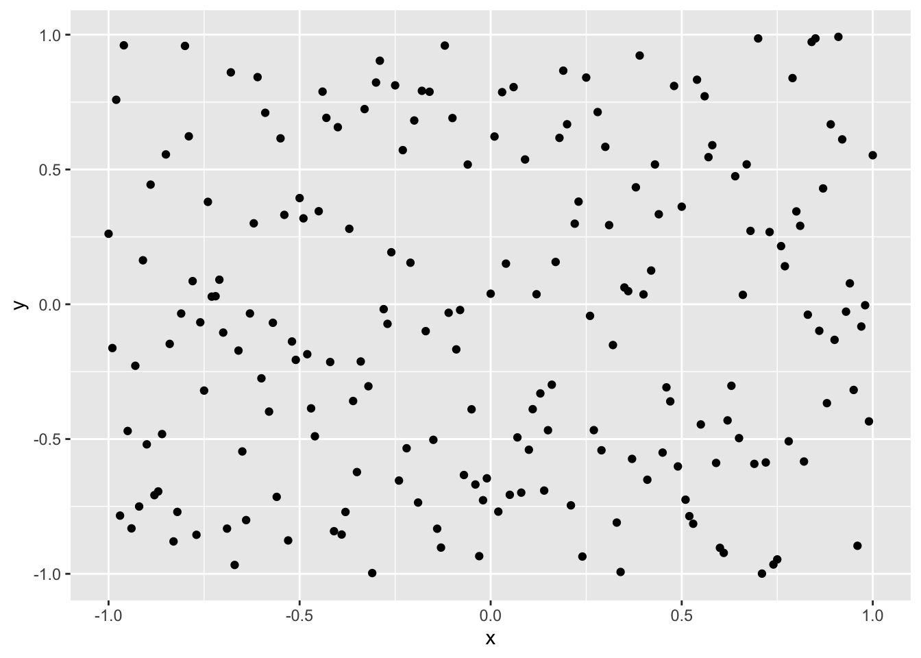
In this situation, does knowing the value of \(x\) give us any information on \(y\)?
Clearly not. \(y\) seems to be somewhere between -1 and 1 with no particular pattern, regardless of the value of \(x\). Knowing \(x\) does not seem to help reduce our uncertainty about the value of \(y\).
In contrast, look at the first picture again.
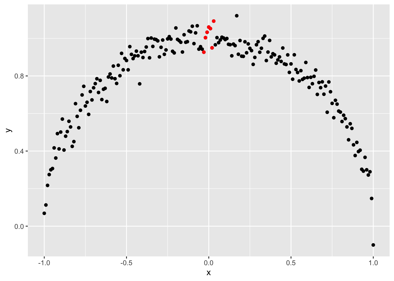
Here, knowing the value of \(x\) does help. If we know that \(x\) is around 0.0, for example, from the graph we will guess that \(y\) is likely near 1.0 (the red dots). We can be confident that \(y\) is not between 0 and 0.8. Knowing \(x\) helps us eliminate certain values of \(y\), reducing our uncertainty about the values \(y\) might take.
This notion - that knowing something reduces our uncertainty about something else - is exactly the idea behind mutual information from Information Theory.
According to Wikipedia (emphasis mine),
Intuitively, mutual information measures the information that \(X\) and \(Y\) share: It measures how much knowing one of these variables reduces uncertainty about the other. For example, if \(X\) and \(Y\) are independent, then knowing \(X\) does not give any information about \(Y\) and vice versa, so their mutual information is zero.
Furthermore,
Not limited to real-valued random variables and linear dependence like the correlation coefficient, MI is more general and determines how different the joint distribution of the pair \((X,Y)\) is to the product of the marginal distributions of \(X\) and \(Y\).
This is very promising!
As it turns out, however, implementing mutual information is not so simple. We first need to estimate the joint probabilities (i.e., the joint probability density/mass function) of \(x\) and \(y\) before we can calculate their Mutual Information. If \(x\) and \(y\) are categorical, this is easy but if one or both of them is continuous, it is more involved.
But we can use the basic insight behind mutual information – that knowing \(x\) may reduce our uncertainty about \(y\) – in a different way.
The X2Y Metric
Consider three variables \(x\), \(y\) and \(z\). If knowing \(x\) reduces our uncertainty about \(y\) by 70% but knowing \(z\) reduces our uncertainty about \(y\) by only 40%, we will intuitively expect that the association between \(x\) and \(y\) will be stronger than the association between \(z\) and \(y\).
So, if we can quantify the reduction in uncertainty, that can be used as a measure of the strength of the association. One way to do so is to measure \(x\)’s ability to predict \(y\) - after all, if \(x\) reduces our uncertainty about \(y\), knowing \(x\) should help us predict \(y\) better than if we didn’t know \(x\).
Stated another way, we can think of reduction in prediction error \(\approx\) reduction in uncertainty \(\approx\) strength of association.
This suggests the following approach:
- Predict \(y\) without using \(x\).
- If \(y\) is continuous, we can simply use the average value of \(y\).
- If \(y\) is categorical, we can use the most frequent value of \(y\).
- These are sometimes referred to as a baseline model.
- Predict \(y\) using \(x\)
- We can take any of the standard predictive models out there (Linear/Logistic Regression, CART, Random Forests, SVMs, Neural Networks, Gradient Boosting etc.), set \(x\) as the independent variable and \(y\) as the dependent variable, fit the model to the data, and make predictions. More on this below.
- Calculate the % decrease in prediction error when we go from (1) to (2)
- If \(y\) is continuous, we can use any of the familiar error metrics like RMSE, SSE, MAE etc. I prefer mean absolute error (MAE) since it is less susceptible to outliers and is in the same units as \(y\) but this is a matter of personal preference.
- If \(y\) is categorical, we can use Misclassification Error (= 1 - Accuracy) as the error metric.
In summary, the % reduction in error when we go from a baseline model to a predictive model measures the strength of the relationship between \(x\) and \(y\). We will call this metric
x2ysince it measures the ability of \(x\) to predict \(y\).
(This definition is similar to R-Squared from Linear Regression. In fact, if \(y\) is continuous and we use the Sum of Squared Errors as our error metric, the x2y metric is equal to R-Squared.)
To implement (2) above, we need to pick a predictive model to use. Let’s remind ourselves of what the requirements are:
- If there’s a non-linear relationship between \(x\) and \(y\), the model should be able to detect it
- It should be able to handle all possible \(x\)-\(y\) variable types: continuous-continuous, continuous-categorical, categorical-continuous and categorical-categorical
- We may have hundreds (if not thousands) of pairs of variables we want to analyze so we want this to be quick
Classification and Regression Trees (CART) satisfies these requirements very nicely and that’s the one I prefer to use. That said, you can certainly use other models if you like.
Let’s try this approach on the ‘semicircle’ dataset from above. We use CART to predict \(y\) using \(x\) and here’s how the fitted values look:
# Let's generate the data again
set.seed(42)
x <- seq(-1,1,0.01)

d <- data.frame(x = x,
                    y = sqrt(1 - x^2) + rnorm(length(x),mean = 0, sd = 0.05))

library(rpart)
preds <- predict(rpart(y~x, data = d, method = "anova"), type = "vector")

# Set up a chart
ggplot(data = d, mapping = aes(x = x)) +
  geom_point(aes(y = y), size = 0.5) +
  geom_line(aes(y=preds, color = '2')) +
  scale_color_brewer(name = "", labels='CART', palette="Set1")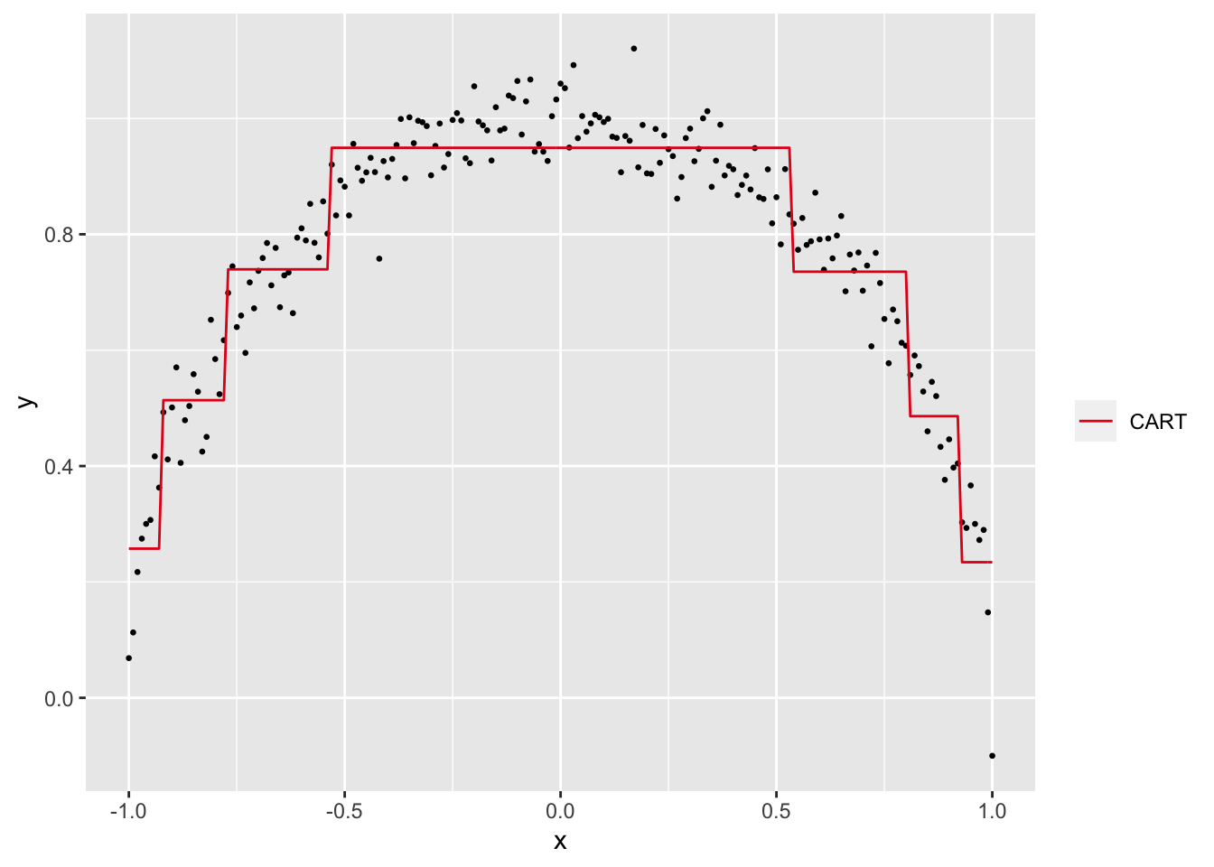
Visually, the CART predictions seem to approximate the semi-circular relationship between \(x\) and \(y\). To confirm, let’s calculate the x2y metric step by step.
- The MAE from using the average of \(y\) to predict \(y\) is 0.19.
- The MAE from using the CART predictions to predict \(y\) is 0.06.
- The % reduction in MAE is 68.88%.
Excellent!
If you are familiar with CART models, it is straightforward to implement the x2y metric in the Machine Learning environment of your choice. An R implementation is here and details can be found in the appendix but, for now, I want to highlight two functions from the R script that we will use in the examples below:
x2y(u, v)calculates thex2ymetric between two vectors \(u\) and \(v\)dx2y(d)calculates thex2ymetric between all pairs of variables in a dataframe \(d\)
Two Caveats
Before we demonstrate the x2y metric on a couple of datasets, I want to highlight two aspects of the x2y approach.
Unlike metrics like the correlation coefficient, the x2y metric is not symmetric with respect to \(x\) and \(y\). The extent to which \(x\) can predict \(y\) can be different from the extent to which \(y\) can predict \(x\). For the semi-circle dataset, x2y(x,y) is 68.88% but x2y(y,x) is only 10.2%.
This shouldn’t come as a surprise, however. Let’s look at the scatterplot again but with the axes reversed.
ggplot(data = d, mapping = aes(x = y)) +
  geom_point(aes(y = x), size = 0.5)  +
  geom_point(data = d[abs(d$x) < 0.05,], aes(x = y, y = x), color = "orange" ) +
  geom_point(data = d[abs(d$y-0.6) < 0.05,], aes(x = y, y = x), color = "red" )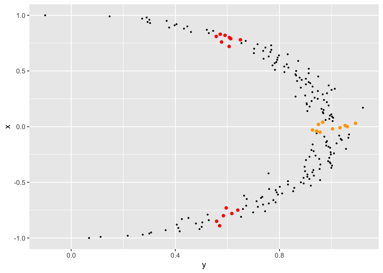
When \(x\) is around 0.0, for instance, \(y\) is near 1.0 (the orange dots). But when \(y\) is around 0.6, \(x\) can be in the (-0.75, - 1.0) range or in the (0.5, 0.75) range (the red dots). Knowing \(x\) reduces the uncertainty about the value of \(y\) a lot more than knowing \(y\) reduces the uncertainty about the value of \(x\).
But there’s an easy solution if you must have a symmetric metric for your application: just take the average of x2y(x,y) and x2y(y,x).
The second aspect worth highlighting is about the comparability of the x2y metric across variable pairs. All x2y values where the \(y\) variable is continuous will be measuring a % reduction in MAE. All x2y values where the \(y\) variable is categorical will be measuring a % reduction in Misclassification Error. Is a 30% reduction in MAE equal to a 30% reduction in Misclassification Error? It is problem dependent, there’s no universal right answer.
On the other hand, since (1) all x2y values are on the same 0-100% scale (2) are conceptually measuring the same thing, i.e., reduction in prediction error and (3) our objective is to quickly scan and identify strongly-related pairs (rather than conduct an in-depth investigation), the x2y approach may be adequate.
Application to the Iris Dataset
The iris flower dataset is iconic in the statistics/ML communities and is widely used to illustrate basic concepts. The dataset consists of 150 observations in total and each observation has four continuous variables - the length and the width of petals and sepals - and a categorical variable indicating the species of iris.
Let’s take a look at 10 randomly chosen rows.
iris %>% sample_n(10) %>% pander| Sepal.Length | Sepal.Width | Petal.Length | Petal.Width | Species |
|---|---|---|---|---|
| 5.9 | 3 | 5.1 | 1.8 | virginica |
| 5.5 | 2.6 | 4.4 | 1.2 | versicolor |
| 6.1 | 2.8 | 4 | 1.3 | versicolor |
| 5.9 | 3.2 | 4.8 | 1.8 | versicolor |
| 7.7 | 2.6 | 6.9 | 2.3 | virginica |
| 5.7 | 4.4 | 1.5 | 0.4 | setosa |
| 6.5 | 3 | 5.2 | 2 | virginica |
| 5.2 | 2.7 | 3.9 | 1.4 | versicolor |
| 5.6 | 2.7 | 4.2 | 1.3 | versicolor |
| 7.2 | 3.2 | 6 | 1.8 | virginica |
We can calculate the x2y values for all pairs of variables in iris by running dx2y(iris) in R (details of how to use the dx2y() function are in the appendix).
dx2y(iris) %>% pander| x | y | perc_of_obs | x2y |
|---|---|---|---|
| Petal.Width | Species | 100 | 94 |
| Petal.Length | Species | 100 | 93 |
| Petal.Width | Petal.Length | 100 | 80.73 |
| Species | Petal.Length | 100 | 79.72 |
| Petal.Length | Petal.Width | 100 | 77.32 |
| Species | Petal.Width | 100 | 76.31 |
| Sepal.Length | Petal.Length | 100 | 66.88 |
| Sepal.Length | Species | 100 | 62 |
| Petal.Length | Sepal.Length | 100 | 60.98 |
| Sepal.Length | Petal.Width | 100 | 54.36 |
| Petal.Width | Sepal.Length | 100 | 48.81 |
| Species | Sepal.Length | 100 | 42.08 |
| Sepal.Width | Species | 100 | 39 |
| Petal.Width | Sepal.Width | 100 | 31.75 |
| Petal.Length | Sepal.Width | 100 | 30 |
| Sepal.Width | Petal.Length | 100 | 28.16 |
| Sepal.Width | Petal.Width | 100 | 23.02 |
| Species | Sepal.Width | 100 | 22.37 |
| Sepal.Length | Sepal.Width | 100 | 18.22 |
| Sepal.Width | Sepal.Length | 100 | 12.18 |
The first two columns in the output are self-explanatory. The third column - perc_of_obs - is the % of observations in the dataset that was used to calculate that row’s x2y value. When a dataset has missing values, only observations that have values present for both \(x\) and \(y\) will be used to calculate the x2y metrics for that variable pair. The iris dataset has no missing values so this value is 100% for all rows. The fourth column is the value of the x2y metric and the results are sorted in descending order of this value.
Looking at the numbers, both Petal.Length and Petal.Width seem to be highly associated with Species (and with each other). In contrast, it appears that Sepal.Length and Sepal.Width are very weakly associated with each other.
Note that even though Species is categorical and the other four variables are continuous, we could simply “drop” the iris dataframe into the dx2y() function and calculate the associations between all the variables.
Application to a COVID-19 Dataset
Next, we examine a COVID-19 dataset that was downloaded from the COVID-19 Clinical Data Repository in April 2020. This dataset contains clinical characteristics and COVID-19 test outcomes for 352 patients. Since it has a good mix of continuous and categorical variables, having something like the x2y metric that can work for any type of variable pair is convenient.
Let’s read in the data and take a quick look at the columns.
df <- read.csv("covid19.csv", stringsAsFactors = FALSE)
str(df)
## 'data.frame': 352 obs. of 45 variables:
## $ date_published : chr "2020-04-14" "2020-04-14" "2020-04-14" "2020-04-14" ...
## $ clinic_state : chr "CA" "CA" "CA" "CA" ...
## $ test_name : chr "Rapid COVID-19 Test" "Rapid COVID-19 Test" "Rapid COVID-19 Test" "Rapid COVID-19 Test" ...
## $ swab_type : chr "" "Nasopharyngeal" "Nasal" "" ...
## $ covid_19_test_results : chr "Negative" "Negative" "Negative" "Negative" ...
## $ age : int 30 77 49 42 37 23 71 28 55 51 ...
## $ high_risk_exposure_occupation: logi TRUE NA NA FALSE TRUE FALSE ...
## $ high_risk_interactions : logi FALSE NA NA FALSE TRUE TRUE ...
## $ diabetes : logi FALSE FALSE FALSE FALSE FALSE FALSE ...
## $ chd : logi FALSE FALSE FALSE FALSE FALSE FALSE ...
## $ htn : logi FALSE TRUE FALSE TRUE FALSE FALSE ...
## $ cancer : logi FALSE FALSE FALSE FALSE FALSE FALSE ...
## $ asthma : logi TRUE TRUE FALSE TRUE FALSE FALSE ...
## $ copd : logi FALSE FALSE FALSE FALSE FALSE FALSE ...
## $ autoimmune_dis : logi FALSE FALSE FALSE FALSE FALSE FALSE ...
## $ temperature : num 37.1 36.8 37 36.9 37.3 ...
## $ pulse : int 84 96 79 108 74 110 78 NA 97 66 ...
## $ sys : int 117 128 120 156 126 134 144 NA 160 98 ...
## $ dia : int 69 73 80 89 67 79 85 NA 97 65 ...
## $ rr : int NA 16 18 14 16 16 15 NA 16 16 ...
## $ sats : int 99 97 100 NA 99 98 96 97 99 100 ...
## $ rapid_flu : logi FALSE FALSE FALSE FALSE FALSE FALSE ...
## $ rapid_flu_results : chr "" "" "" "" ...
## $ rapid_strep : logi FALSE TRUE FALSE FALSE FALSE TRUE ...
## $ rapid_strep_results : chr "" "Negative" "" "" ...
## $ ctab : logi TRUE TRUE TRUE TRUE TRUE TRUE ...
## $ labored_respiration : logi FALSE FALSE FALSE FALSE FALSE FALSE ...
## $ rhonchi : logi FALSE FALSE FALSE TRUE FALSE FALSE ...
## $ wheezes : logi FALSE FALSE FALSE TRUE FALSE FALSE ...
## $ cough : logi FALSE NA TRUE TRUE TRUE TRUE ...
## $ cough_severity : chr "" "" "" "Mild" ...
## $ fever : logi NA NA NA FALSE FALSE TRUE ...
## $ sob : logi FALSE NA FALSE FALSE TRUE TRUE ...
## $ sob_severity : chr "" "" "" "" ...
## $ diarrhea : logi NA NA NA TRUE NA NA ...
## $ fatigue : logi NA NA NA NA TRUE TRUE ...
## $ headache : logi NA NA NA NA TRUE TRUE ...
## $ loss_of_smell : logi NA NA NA NA NA NA ...
## $ loss_of_taste : logi NA NA NA NA NA NA ...
## $ runny_nose : logi NA NA NA NA NA TRUE ...
## $ muscle_sore : logi NA NA NA TRUE NA TRUE ...
## $ sore_throat : logi TRUE NA NA NA NA TRUE ...
## $ cxr_findings : chr "" "" "" "" ...
## $ cxr_impression : chr "" "" "" "" ...
## $ cxr_link : chr "" "" "" "" ...#%>% panderThere are lots of missing values (denoted by ‘NA’) and lots of blanks as well - for example, see the first few values of the rapid_flu_results field above. We will convert the blanks to NAs so that all the missing values can be treated consistently. Also, the rightmost three columns are free-text fields so we will remove them from the dataframe.
df <- read.csv("covid19.csv",
                  stringsAsFactors = FALSE,
                  na.strings=c("","NA") # read in blanks as NAs
                  )%>%
  select(-starts_with("cxr"))  # remove the chest x-ray note fields

str(df)
## 'data.frame': 352 obs. of 42 variables:
## $ date_published : chr "2020-04-14" "2020-04-14" "2020-04-14" "2020-04-14" ...
## $ clinic_state : chr "CA" "CA" "CA" "CA" ...
## $ test_name : chr "Rapid COVID-19 Test" "Rapid COVID-19 Test" "Rapid COVID-19 Test" "Rapid COVID-19 Test" ...
## $ swab_type : chr NA "Nasopharyngeal" "Nasal" NA ...
## $ covid_19_test_results : chr "Negative" "Negative" "Negative" "Negative" ...
## $ age : int 30 77 49 42 37 23 71 28 55 51 ...
## $ high_risk_exposure_occupation: logi TRUE NA NA FALSE TRUE FALSE ...
## $ high_risk_interactions : logi FALSE NA NA FALSE TRUE TRUE ...
## $ diabetes : logi FALSE FALSE FALSE FALSE FALSE FALSE ...
## $ chd : logi FALSE FALSE FALSE FALSE FALSE FALSE ...
## $ htn : logi FALSE TRUE FALSE TRUE FALSE FALSE ...
## $ cancer : logi FALSE FALSE FALSE FALSE FALSE FALSE ...
## $ asthma : logi TRUE TRUE FALSE TRUE FALSE FALSE ...
## $ copd : logi FALSE FALSE FALSE FALSE FALSE FALSE ...
## $ autoimmune_dis : logi FALSE FALSE FALSE FALSE FALSE FALSE ...
## $ temperature : num 37.1 36.8 37 36.9 37.3 ...
## $ pulse : int 84 96 79 108 74 110 78 NA 97 66 ...
## $ sys : int 117 128 120 156 126 134 144 NA 160 98 ...
## $ dia : int 69 73 80 89 67 79 85 NA 97 65 ...
## $ rr : int NA 16 18 14 16 16 15 NA 16 16 ...
## $ sats : int 99 97 100 NA 99 98 96 97 99 100 ...
## $ rapid_flu : logi FALSE FALSE FALSE FALSE FALSE FALSE ...
## $ rapid_flu_results : chr NA NA NA NA ...
## $ rapid_strep : logi FALSE TRUE FALSE FALSE FALSE TRUE ...
## $ rapid_strep_results : chr NA "Negative" NA NA ...
## $ ctab : logi TRUE TRUE TRUE TRUE TRUE TRUE ...
## $ labored_respiration : logi FALSE FALSE FALSE FALSE FALSE FALSE ...
## $ rhonchi : logi FALSE FALSE FALSE TRUE FALSE FALSE ...
## $ wheezes : logi FALSE FALSE FALSE TRUE FALSE FALSE ...
## $ cough : logi FALSE NA TRUE TRUE TRUE TRUE ...
## $ cough_severity : chr NA NA NA "Mild" ...
## $ fever : logi NA NA NA FALSE FALSE TRUE ...
## $ sob : logi FALSE NA FALSE FALSE TRUE TRUE ...
## $ sob_severity : chr NA NA NA NA ...
## $ diarrhea : logi NA NA NA TRUE NA NA ...
## $ fatigue : logi NA NA NA NA TRUE TRUE ...
## $ headache : logi NA NA NA NA TRUE TRUE ...
## $ loss_of_smell : logi NA NA NA NA NA NA ...
## $ loss_of_taste : logi NA NA NA NA NA NA ...
## $ runny_nose : logi NA NA NA NA NA TRUE ...
## $ muscle_sore : logi NA NA NA TRUE NA TRUE ...
## $ sore_throat : logi TRUE NA NA NA NA TRUE ...#%>% panderNow, let’s run it through the x2y approach. We are particularly interested in non-zero associations between the covid_19_test_results field and the other fields so we zero in on those by running dx2y(df, target = "covid_19_test_results") in R (details in the appendix) and filtering out the zero associations.
dx2y(df, target = "covid_19_test_results") %>%
  filter(x2y >0) %>%
pander| x | y | perc_of_obs | x2y |
|---|---|---|---|
| covid_19_test_results | loss_of_smell | 21.88 | 18.18 |
| covid_19_test_results | loss_of_taste | 22.73 | 12.5 |
| covid_19_test_results | sats | 92.9 | 2.24 |
Only three of the 41 variables have a non-zero association with covid_19_test_results. Disappointingly, the highest x2y value is an unimpressive 18%. It is based on just 22% of the observations (since the other 78% of observations had missing values) and makes one wonder if this modest association is real or if it is just due to chance.
If we were working with the correlation coefficient, we could easily calculate a confidence interval for it and gauge if what we are seeing is real or not. Can we do the same thing for the x2y metric?
We can, by using bootstrapping. Given \(x\) and \(y\), we can sample with replacement a 1000 times (say) and calculate the x2y metric each time. With these 1000 numbers, we can construct a confidence interval easily (this is available as an optional confidence argument in the R functions we have been using; please see the appendix).
Let’s re-do the earlier calculation with “confidence intervals” turned on by running dx2y(df, target = "covid_19_test_results", confidence = TRUE) in R.
dx2y(df, target = "covid_19_test_results", confidence = TRUE) %>%
  filter(x2y >0) %>%
pander(split.tables = Inf)| x | y | perc_of_obs | x2y | CI_95_Lower | CI_95_Upper |
|---|---|---|---|---|---|
| covid_19_test_results | loss_of_smell | 21.88 | 18.18 | -8.08 | 36.36 |
| covid_19_test_results | loss_of_taste | 22.73 | 12.5 | -11.67 | 25 |
| covid_19_test_results | sats | 92.9 | 2.24 | -1.85 | 4.48 |
The 95% confidence intervals all contain 0.0, so none of these associations appear to be real.
Let’s see what the top 10 associations are, between any pair of variables.
dx2y(df) %>%head(10) %>% pander| x | y | perc_of_obs | x2y |
|---|---|---|---|
| loss_of_smell | loss_of_taste | 20.17 | 100 |
| loss_of_taste | loss_of_smell | 20.17 | 100 |
| fatigue | headache | 40.06 | 90.91 |
| headache | fatigue | 40.06 | 90.91 |
| fatigue | sore_throat | 27.84 | 89.58 |
| headache | sore_throat | 30.4 | 89.36 |
| sore_throat | fatigue | 27.84 | 88.89 |
| sore_throat | headache | 30.4 | 88.64 |
| runny_nose | fatigue | 25.57 | 84.44 |
| runny_nose | headache | 25.57 | 84.09 |
Interesting. loss_of_smell and loss_of_taste are perfectly associated with each other. Let’s look at the raw data.
with(df, table(loss_of_smell, loss_of_taste))## loss_of_taste
## loss_of_smell FALSE TRUE
## FALSE 55 0
## TRUE 0 16They agree for every observation in the dataset and, as a result, their x2y is 100%.
Moving down the x2y ranking, we see a number of variables - fatigue, headache, sore_throat, and runny_nose - that are all strongly associated with each other, as if they are all connected by a common cause.
When the number of variable combinations is high and there are lots of missing values, it can be helpful to scatterplot x2y vs perc_of_obs.
ggplot(data = dx2y(df), aes(y=x2y, x = perc_of_obs)) +
         geom_point()
## Warning: Removed 364 rows containing missing values (geom_point).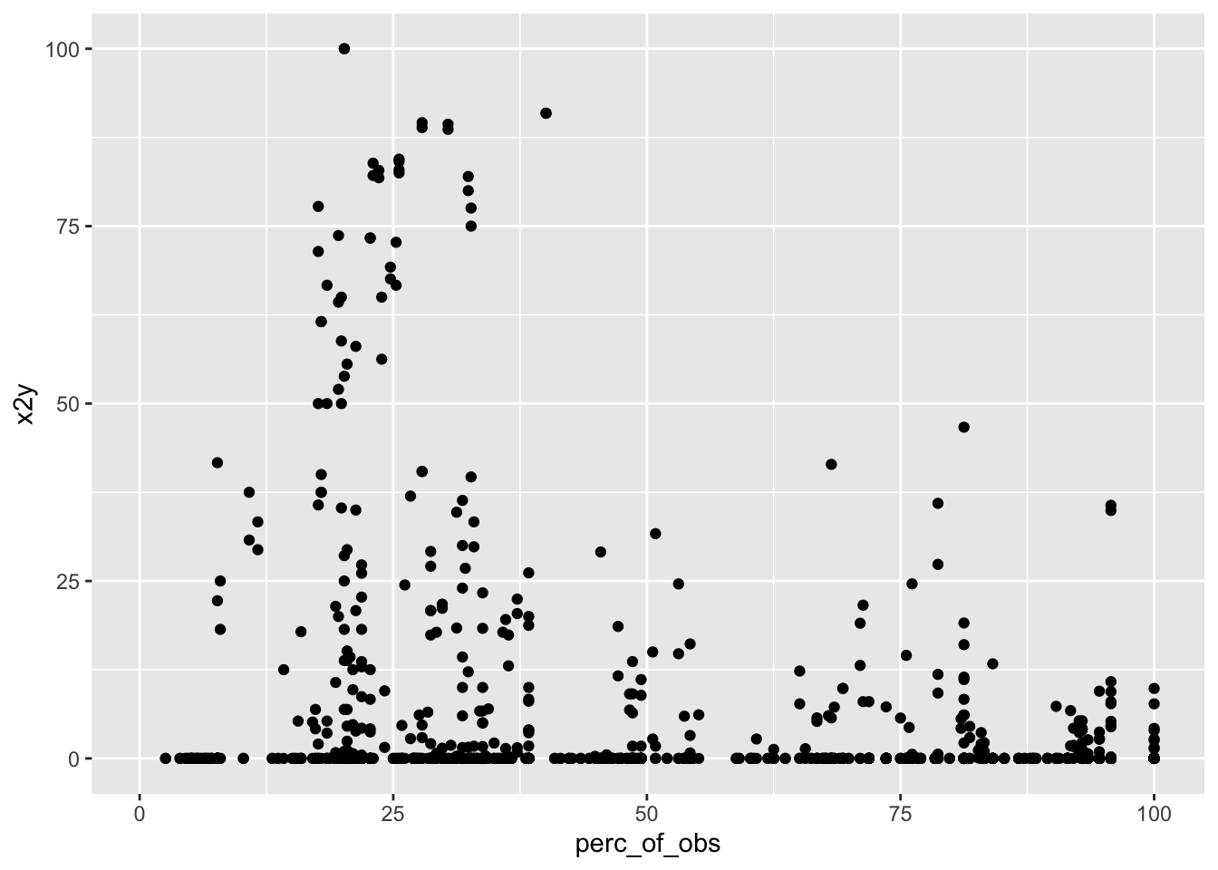
Unfortunately, the top-right quadrant is empty: there are no strongly-related variable pairs that are based on at least 50% of the observations. There are some variable pairs with x2y values > 75% but none of them are based on more than 40% of the observations.
Conclusion
Using an insight from Information Theory, we devised a new metric - the x2y metric - that quantifies the strength of the association between pairs of variables.
The x2y metric has several advantages:
- It works for all types of variable pairs (continuous-continuous, continuous-categorical, categorical-continuous and categorical-categorical)
- It captures linear and non-linear relationships
- Perhaps best of all, it is easy to understand and use.
I hope you give it a try in your work.
(If you found this note helpful, you may find these of interest)
Appendix: How to use the R script
The R script depends on two R packages - rpart and dplyr - so please ensure that they are installed in your environment.
The script has two key functions: x2y() and dx2y().
Using the x2y() function
Usage: x2y(u, v, confidence = FALSE)
Arguments:
u,v: two vectors of equal lengthconfidence: (OPTIONAL) a boolean that indicates if a confidence interval is needed. Default is FALSE.
Value: A list with the following elements:
perc_of_obs: the % of total observations that were used to calculatex2y. If some observations are missing for either \(u\) or \(v\), this will be less than 100%.x2y: thex2ymetric for using \(u\) to predict \(v\)
Additionally, if x2y() was called with confidence = TRUE:
CI_95_Lower: the lower end of a 95% confidence interval for thex2ymetric estimated by bootstrapping 1000 samplesCI_95_Upper: the upper end of a 95% confidence interval for thex2ymetric estimated by bootstrapping 1000 samples
Using the dx2y() function
Usage: dx2y(d, target = NA, confidence = FALSE)
Arguments:
d: a dataframetarget: (OPTIONAL) if you are only interested in thex2yvalues between a particular variable indand all other variables, settargetequal to the name of the variable you are interested in. Default is NA.confidence: (OPTIONAL) a boolean that indicates if a confidence interval is needed. Default is FALSE.
Value: A dataframe with each row containing the output of running x2y(u, v, confidence) for u and v chosen from the dataframe. Since this is just a standard R dataframe, it can be sliced, sorted, filtered, plotted etc.
Update on April 16, 2021: I learned from a commenter that a similar approach was proposed in April 2020, and that the R package ppsr which implements that approach is now available on CRAN.
You may leave a comment below or discuss the post in the forum community.rstudio.com.