In a previous post, I introduced the topic of Functional Data Analysis (FDA). In that post, I provided some background on Functional Analysis, the mathematical theory that makes FDA possible, identified FDA resources that might be of interest R users, and showed how to turn a series of data points into an FDA object. In this post, I will pick up where I left off and move on to doing some very basic FDA descriptive statistics.
Let’s continue with the same motivating example from last time. We will use synthetic data generated by a Brownian motion process and pretend that it is observed longitudinal data. However, before getting to the statistics, I would like to take a tiny, tidy diversion. The functions in fda and other fundamental FDA R packages require data structured in matrices. Consequently, the examples in the basic FDA reference works (listed below) construct matrices using code that seems to be convenient for the occasion. I think this makes adapting sample code to user data a little harder than it needs to be. There ought to be standard data structures for working with FDA data. I propose tibbles or data frames with function values packed into lists.
The following function generates n_points data points for each of n_curve Brownian motion curves that represent the longitudinal data collected from n_curve subjects.
library(fda)
library(tidyverse)
library(plotly)

# Function to simulate data
fake_curves <- function(n_curves = 100, n_points = 80, max_time = 100){
  ID <- 1:n_curves
  x <- vector(mode = "list", length = n_curves)
  t <- vector(mode = "list", length = n_curves)

  for (i in 1:n_curves){
    t[i] <- list(sort(runif(n_points,0,max_time)))
    x[i] <- list(cumsum(rnorm(n_points)) / sqrt(n_points))
  }
  df <- tibble(ID,t,x)
  names(df) <- c("ID", "Time", "Curve")
  return(df)
}
Notice that each curve is associated with a unique set of random time points that lie in the interval [0, max_time]. Not being restricted to situations where data from all subjects must be observed at the same times is a big deal. However, in practice you may encounter problems that will require curve alignment procedures. We will ignore this for now. Note that the variables Time and Curve contain lists of data points in each cell.
set.seed(123)
n_curves <- 40
n_points <- 80
max_time <- 100
df <- fake_curves(n_curves = n_curves,n_points = n_points, max_time = max_time)
head(df)
## # A tibble: 6 x 3
## ID Time Curve
## <int> <list> <list>
## 1 1 <dbl [80]> <dbl [80]>
## 2 2 <dbl [80]> <dbl [80]>
## 3 3 <dbl [80]> <dbl [80]>
## 4 4 <dbl [80]> <dbl [80]>
## 5 5 <dbl [80]> <dbl [80]>
## 6 6 <dbl [80]> <dbl [80]>Later on, this kind of structure will be convenient for data sets that contain both FDA curves and other scalar covariates. Note that if you are using the RStudio IDE running the function View(df) will show you an expanded view of the tibble under a tab labeled df that should look something like this:

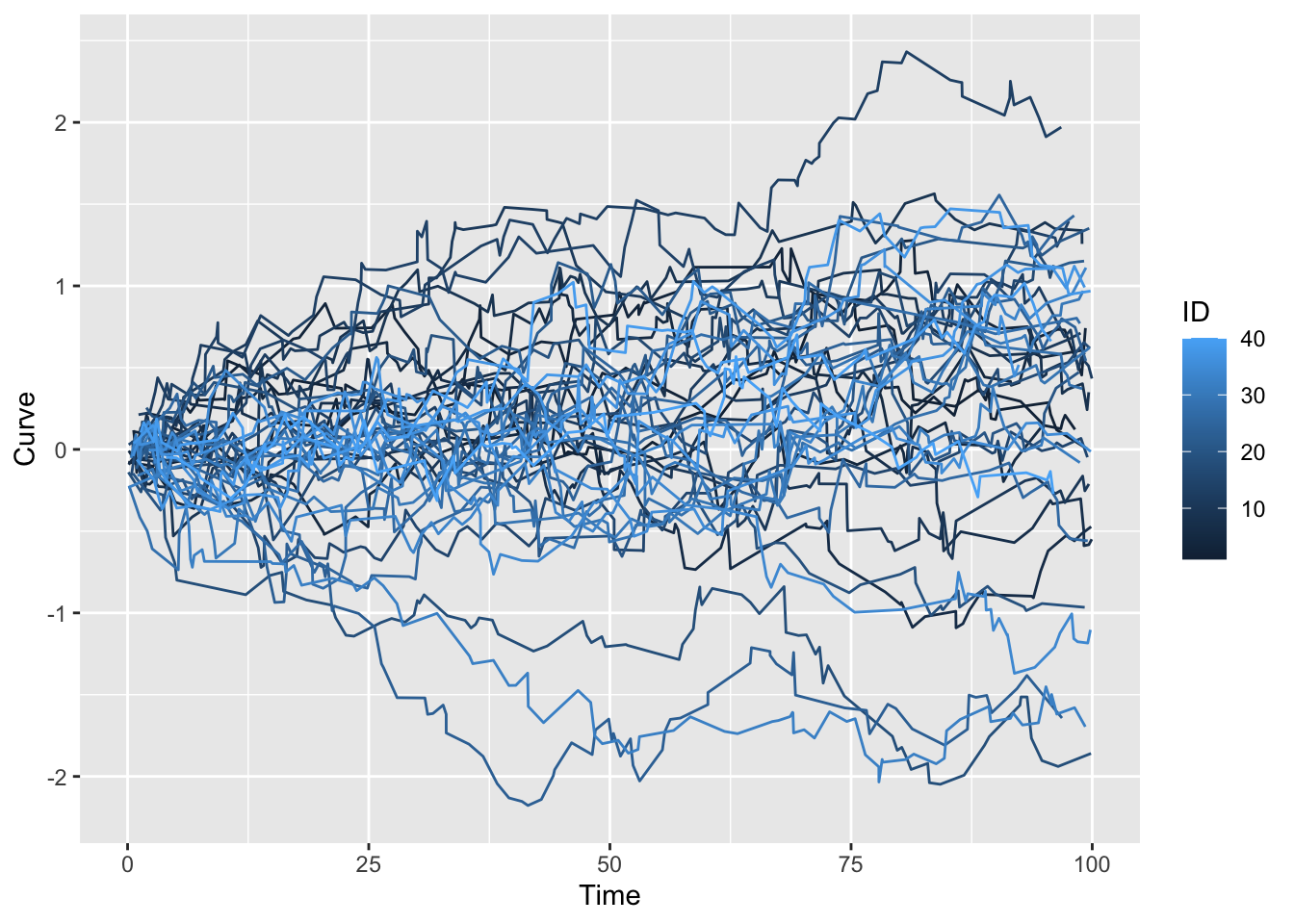
Next, we unpack the data into a long form tibble and plot.
df_1 <- df %>% select(!c(ID,Curve)) %>% unnest_longer(Time)
df_2 <- df %>% select(!c(ID,Time)) %>% unnest_longer(Curve)
ID <- sort(rep(1:n_curves,n_points))
df_l <- cbind(ID,df_1,df_2)
p <- ggplot(df_l, aes(x = Time, y = Curve, group = ID, col = ID)) +
      geom_line()
p
Now that we have the data, remember that FDA treats each curve as a basic data element living in an infinite dimensional vector space. The vectors, \(X\), are random functions: \(X: \Omega \Rightarrow \mathscr{H}\) where \(\Omega\) is an underlying probability space and \(\mathscr{H}\) is typically a complete Hilbert Space of square integrable functions. That is, for each \(\omega \in \Omega\), \(\parallel X(\omega) \parallel ^2 = \int X((\omega)(t))^2 dt < \infty\). In multivariate statistics we work with random variables that live in a Euclidean space, here we are dealing with random functions that live in a Hilbert space. In this context, square integrable means \(E \parallel X \parallel ^2 < \infty\). You will find lucid elaborations of all of this in the references below which I have reproduced below from the previous post.
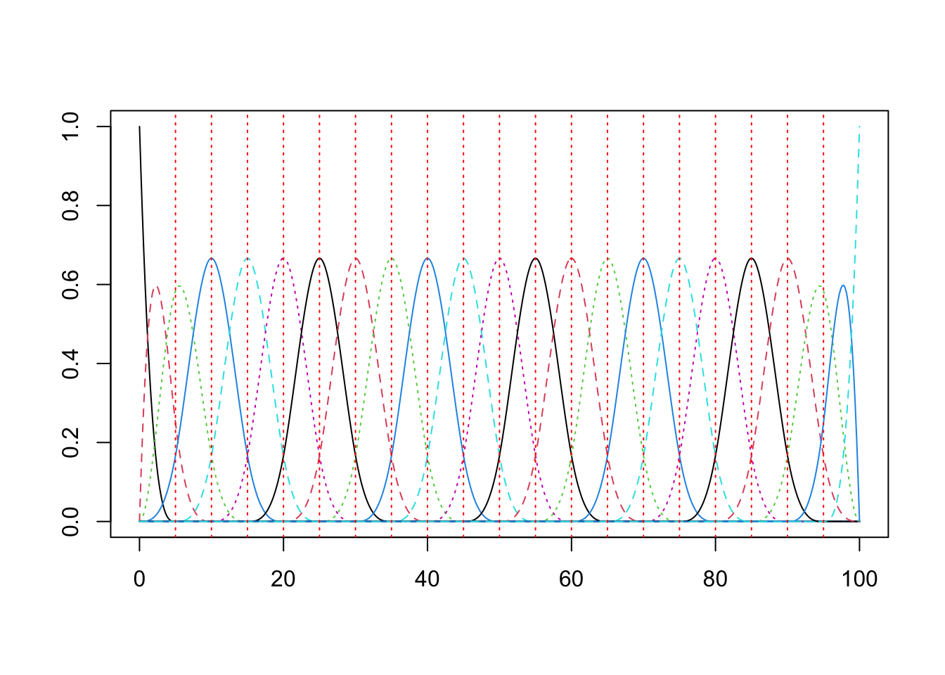
The bridge from the theory to practice is the ability to represent the random functions as a linear combination of basis vectors. This was the topic of the previous post. Here is some compact code to construct the basis.
knots    = c(seq(0,max_time,5)) #Location of knots
n_knots   = length(knots) #Number of knots
n_order   = 4 # order of basis functions: for cubic b-splines: order = 3 + 1
n_basis   = length(knots) + n_order - 2;
basis = create.bspline.basis(rangeval = c(0,max_time), n_basis)
plot(basis)
This next bit of code formats the data in the long form tibble into the matrix input expected by the
 fda functions and creates an fda object that contains the coefficients and basis functions used to smooth data. Note the smoothing constant of lambda = .5.
argvals <- matrix(df_l$Time, nrow = n_points, ncol = n_curves)
y_mat <- matrix(df_l$Curve, nrow = n_points, ncol = n_curves)

W.obj <- Data2fd(argvals = argvals, y = y_mat, basisobj = basis, lambda = 0.5)
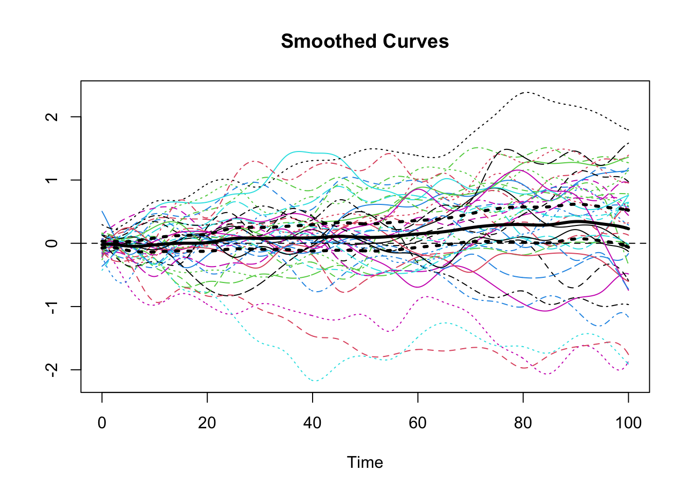
Next somewhat anticlimactically after all of the preparation and theory, we use the fda functions mean.fd() and std.fd() to calculate the pointwise mean and standard deviation from information contained in fda object. In order to use these objects to calculate the pointwise confidence interval for the mean it is necessary to construct a couple of new fda objects for the upper and lower curves. Then, we plot the smoothed curves for our data along with the pointwise mean and pointwise 95% confidence bands for the mean.
W_mean <- mean.fd(W.obj)
W_sd <- std.fd(W.obj)
# Create objects for the standard upper and lower standard deviation
SE_u <- fd(basisobj = basis)
SE_l <- fd(basisobj = basis)
# Fill in the sd values
SE_u$coefs <- W_mean$coefs +  1.96 * W_sd$coefs/sqrt(n_curves)
SE_l$coefs <- W_mean$coefs -  1.96 * W_sd$coefs/sqrt(n_curves)

plot(W.obj, xlab="Time", ylab="", lty = 1)
## [1] "done"title(main = "Smoothed Curves")
lines(SE_u, lwd = 3, lty = 3)
lines(SE_l, lwd = 3, lty = 3)
lines(W_mean, lwd = 3) Finally, we compute the covariance/correlation matrix for our sample of smoothed curves and use
 plotly to create an interactive plot of the three dimensional correlation surface along with a contour map.
days <- seq(0,100, by=2)
cov_W <- var.fd(W.obj)
var_mat <-  eval.bifd(days,days,cov_W)
fig <- plot_ly(x = days, y = days, z = ~var_mat) %>%
add_surface(contours = list(
z = list(show=TRUE,usecolormap=TRUE, highlightcolor="#ff0000", project=list(z=TRUE))))
fig <- fig %>%
layout(scene = list(camera=list(eye = list(x=1.87, y=0.88, z=-0.64))))
figReferences
Books
- Kokoszka, P. and Reimherr, M. (2017). Introduction to Functional Data Analysis. CRC.
- Ramsay, J.O. and Silverman, B.W. (2005). Functional Data Analysis. Springer.
- Ramsay, J.0., Hooker, G. and Graves, S. (2009) Functional Data Analysis with R and MATLAB Springer.
Online Resources
- Cao, J. (2019). Functional Data Analysis Course
- Staicu, A. and Park, Y. (2016) Short Course on Applied Functional Data Analysis
Recommended Papers
- Sørensen, H. Goldsmith, J. and Sangalli, L. (2013). An introduction with medical applications fo functional data analysis Wiley
- Wang, J., Chiou, J. and Müller, H. (2015). Review of Functional Data Analysis
- Yao, F., Müller, H, Wang, J. (2012). Functional Data Analysis for Sparse Longitudinal Data JASA J100, I 470
You may leave a comment below or discuss the post in the forum community.rstudio.com.