I have written about the basics of Functional Data Analysis in three prior posts. In Post 1, I used the fda package to introduce the fundamental concept of using basis vectors to represent longitudinal or time series data as a curve in an abstract vector space. In Post 2, I continued to rely on the fda package to show basic FDA descriptive statistics. In Post 3, I introduced Functional PCA with the help of the fdapace package. In this post, I pick up where that last post left off and look at how one might explore a sparse, longitudinal data set with the FPCA tools provided in the fdapace package. I will begin by highlighting some of the really nice tools available in the brolgar package for doing exploratory longitudinal data analysis. While the first three posts made do with artificial data constructed with an algorithm for generating data from a Wiener Process, in this post I’ll use the wages data set available in brolgar.
brolgar is a beautiful, tidyverse inspired package, based on the tsibble data structure that offers a number of super helpful functions for visualizing and manipulating longitudinal data. See the arXiv paper Tierney, Cook and Prvan (2021) for an overview, and the seven package vignettes for examples. Collectively, these vignettes offer a pretty thorough exploration of the wages data set. Using wages for this post should provide a feeling for what additional insight FDA may have to offer.
Longitudinal Data
Let’s look at the data. wages contains measurements on hourly wages associated with years of experience in the workforce along with several covariates for male high school dropouts who were between 14 and 17 years old when first measured. In what follows, I will use onlyln_wages, the natural log of wages in 1990 dollars, and xp the number of years of work experience.
library(brolgar)
library(fdapace)
library(tidyverse)
library(plotly)
dim(wages)
## [1] 6402 9head(wages)## # A tsibble: 6 x 9 [!]
## # Key: id [1]
## id ln_wages xp ged xp_since_ged black hispanic high_grade
## <int> <dbl> <dbl> <int> <dbl> <int> <int> <int>
## 1 31 1.49 0.015 1 0.015 0 1 8
## 2 31 1.43 0.715 1 0.715 0 1 8
## 3 31 1.47 1.73 1 1.73 0 1 8
## 4 31 1.75 2.77 1 2.77 0 1 8
## 5 31 1.93 3.93 1 3.93 0 1 8
## 6 31 1.71 4.95 1 4.95 0 1 8
## # … with 1 more variable: unemploy_rate <dbl>A summary of the variables shows that wages vary from 2 dollars per hour to a high of about 73 dollars per hour. Time varies between 0 and almost 13 years.
wages %>% select(ln_wages, xp) %>% summary()## ln_wages xp id
## Min. :0.708 Min. : 0.001 Min. : 31
## 1st Qu.:1.591 1st Qu.: 1.609 1st Qu.: 3194
## Median :1.842 Median : 3.451 Median : 6582
## Mean :1.897 Mean : 3.957 Mean : 6301
## 3rd Qu.:2.140 3rd Qu.: 5.949 3rd Qu.: 9300
## Max. :4.304 Max. :12.700 Max. :12543Next, we construct the tsibble data structure to make use of some of the very convenient brolgar sampling functions, and count the number of observations for each subject.
wages_t <- as_tsibble(wages,
                    key = id,
                    index = xp,
                    regular = FALSE)

num_obs <- wages_t %>% features(ln_wages,n_obs)
summary(num_obs$n_obs)
## Min. 1st Qu. Median Mean 3rd Qu. Max.
## 1.00 5.00 8.00 7.21 9.00 13.00Just like the brolgar package vignettes, we filter out subjects with less than 3 observations. Then we use the sample_n_keys() function to generate a random sample of 10 wages versus year’s experience curves and plot them.
df <- wages_t %>%  add_n_obs() %>% filter(n_obs > 3)
set.seed(123)
df %>%
  sample_n_keys(size = 10) %>%
  ggplot(aes(x = xp,  y = ln_wages, group = id, color = id)) +
  geom_line()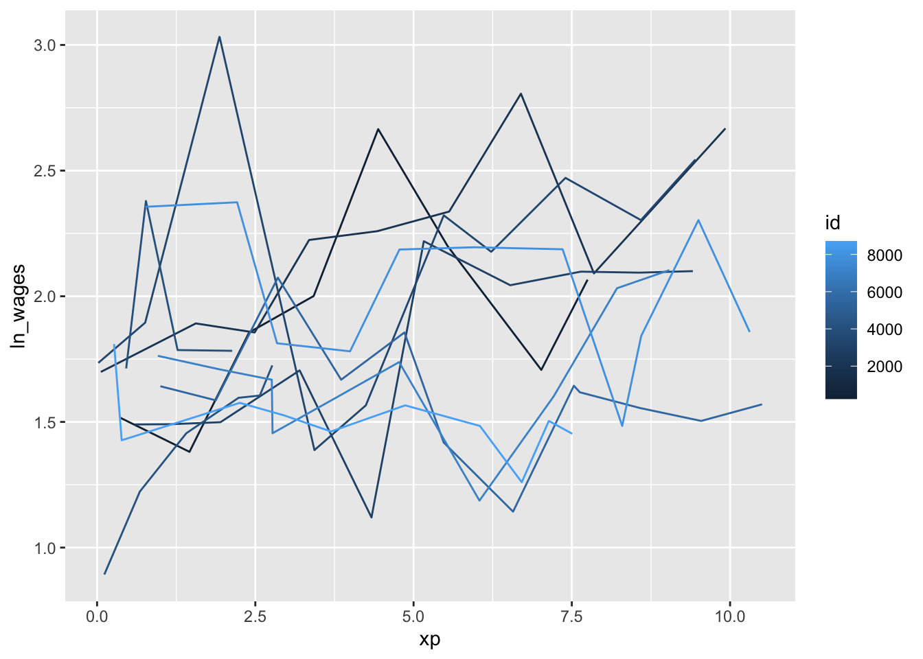
brolgar makes it easy to generates lots of panels with small numbers of curves in order to get a feel for the data.
df %>% ggplot(aes(x = xp, y = ln_wages, group = id, colour = id)) +
        geom_line() +
        facet_sample(n_per_facet = 3, n_facets = 20)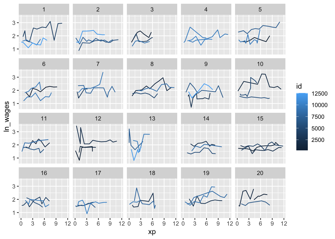
Finally, for comparison with the plots produced by fdapace we plot the curves for the first two subjects in the tsibble.
df  %>% filter(id == 31 | id == 36)  %>%
        ggplot(aes(x = xp, y = ln_wages, group = id, color = id)) +
         geom_line()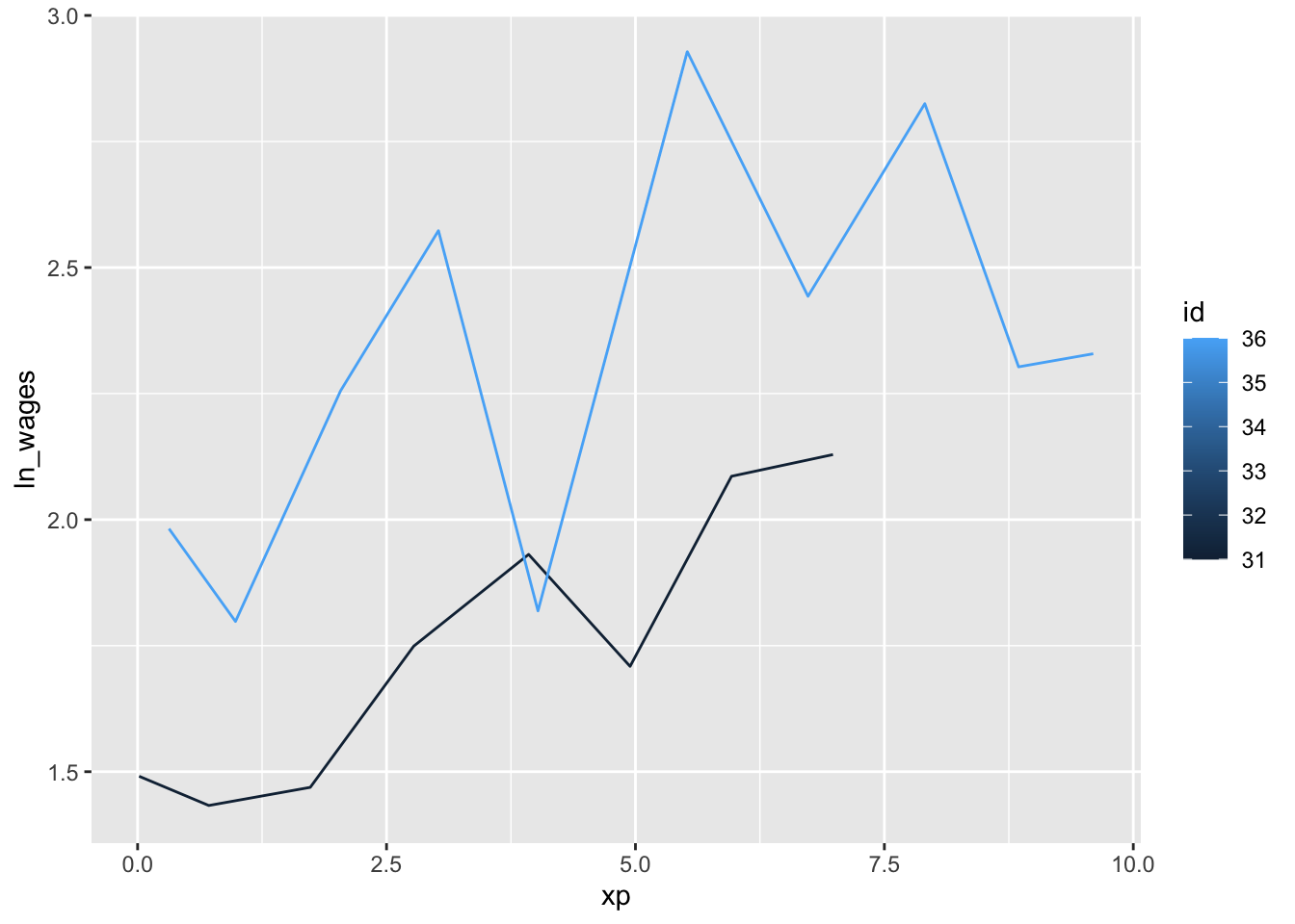
We finish our initial look at the data by noting that we are really dealing with sparse data here. Some curves have only 4 measurements, no curve has more than 13 measurements, and all subjects were measured at different times. This is a classic longitudinal data set.
Functional PCA
As I mentioned in my previous post, Principal Components by Conditional Expectation (PACE), described in Yao, Müller & Wang (2005), was designed for sparse data. The method works by pooling the data. Curves are not individually smoothed. Instead, estimates of the FPC scores are obtained from the entire ensemble of data. (See equation (5) in the reference above.)
The first step towards using FPCA functions in the fdapace package is to reshape the data so that the time and wages data for each subject are stored as lists in separate columns of a tibble where each row contains all of the data for a single id. (Standard dplyr operations might not work as expected on a tsibble.) The following code pulls just the required data into a tibble before the dplyr code in the somewhat untidy ‘for loop’ builds the data structure we will use for the analysis.
df2 <- df %>% select(id, xp, ln_wages) %>% as_tibble()

uid <- unique(df2$id)
N <- length(uid)
Wages <- rep(0,N)
Exp <- rep(0,N)

for (k in 1:N){
  Wages[k] <-  df2 %>% filter(id == uid[k]) %>% select(ln_wages) %>% pull()  %>% list()
  Exp[k]  <-   df2 %>% filter(id == uid[k]) %>% select(xp)  %>% pull() %>% list()
}
df3 <- tibble( uid, Wages, Exp )
glimpse(df3)
## Rows: 764
## Columns: 3
## $ uid <int> 31, 36, 53, 122, 134, 145, 155, 173, 207, 222, 223, 226, 234, 24…
## $ Wages <list> <1.491, 1.433, 1.469, 1.749, 1.931, 1.709, 2.086, 2.129>, <1.98…
## $ Exp <list> <0.015, 0.715, 1.734, 2.773, 3.927, 4.946, 5.965, 6.984>, <0.31…he FPCA() function computes the functional principal components. Note that in the function call the input data are the two columns of lists we created above. The dataType parameter specifies the data as being sparse. error = FALSE means we are using a simple model that does not account for unobserved error. kernel =epan` means that the we are using the Epanechnikov for smoothing the pooled data to compute the mean and covariance. (For this data set, Epanechnikov seems to yield better results than the default Gaussian kernel.)
res_wages <- FPCA(df3$Wages,df3$Exp, list(dataType='Sparse', error=FALSE, kernel='epan', verbose=TRUE))The plot method for the resulting FPCA object provides a visual summary of the results. Going clockwise from the upper left, the Design Plot shows that collectively the data are fairly dense over the support except at the upper range near twelve years. The computed mean function for the data shows a little dip in wages near the beginning and then a clear upward trend until it abruptly drops towards the end. The first three eigenfunctions are plotted at the bottom right, and the scree plot at the bottom left shows that the first eigenfunction accounts for about 60% of the total variation and that it takes about eight eigenfunctions to account for 99% of the variance. Note that the default label for the time access in all of the fdapace plots is s for support.
plot(res_wages)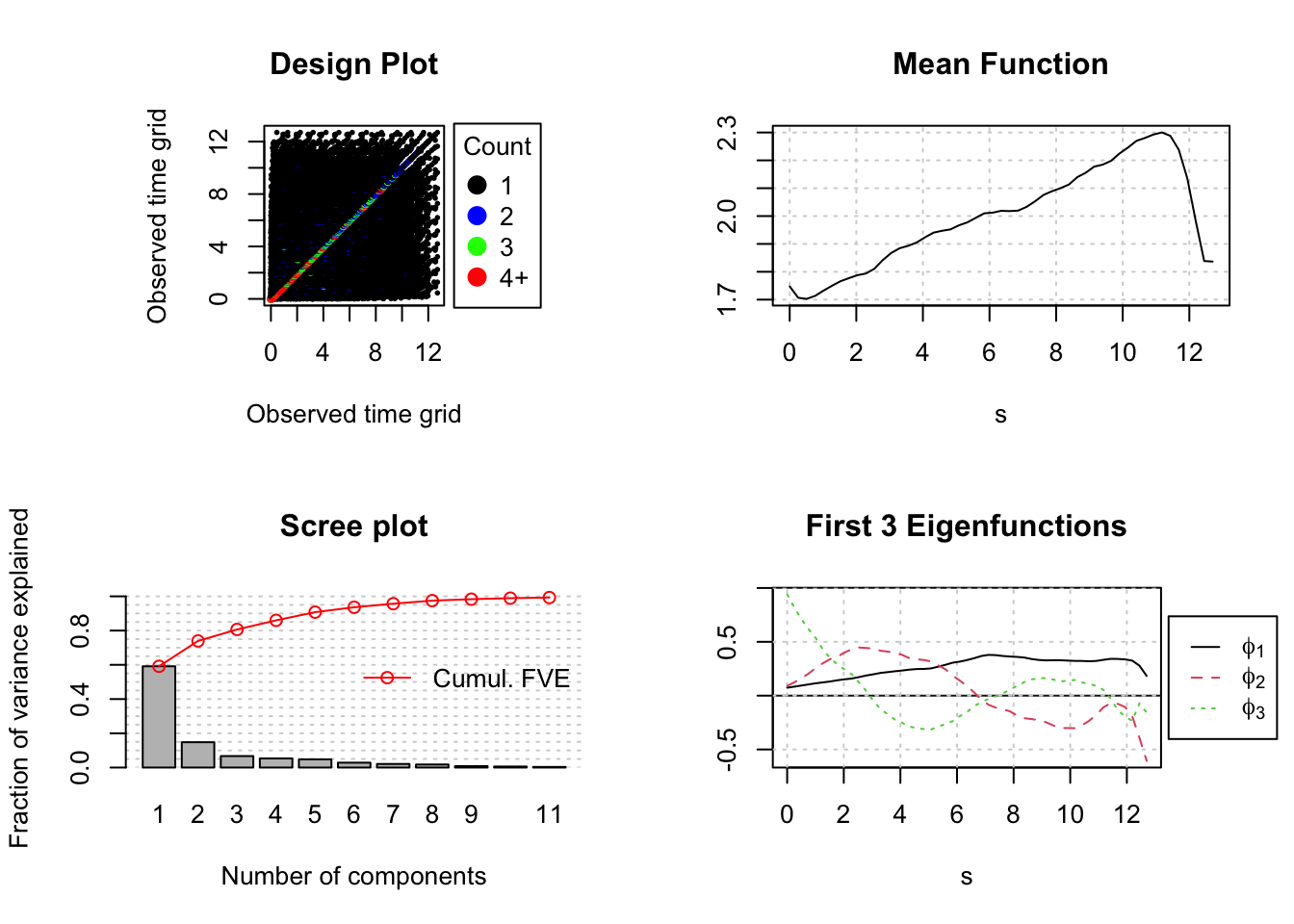 We can obtain the exact estimates for the cumulative Fraction of Variance Explained by picking
 cumFVE out of the FPCA object.
round(res_wages$cumFVE,3)## [1] 0.591 0.739 0.806 0.860 0.908 0.936 0.957 0.975 0.983 0.989 0.993The following plot shows the smoothed curves estimated for the first two subjects. These are the same subject plotted in the third plot above. The circles indicate the input data. Everything looks pretty good here.
CreatePathPlot(res_wages, subset=1:2, main = 'Estimated Paths for IDs 31 and 36'); grid()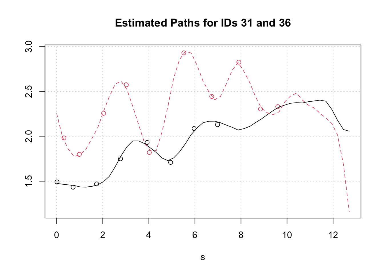 But looking at just one more subject shows how quickly things can apparently go off the rails. The green curve for subject id 53 after 1.77 years is pure algorithmic imagination. Although there are several data points in the first two years, there is nothing thereafter.
CreatePathPlot(res_wages, subset= 1:3, showMean=TRUE)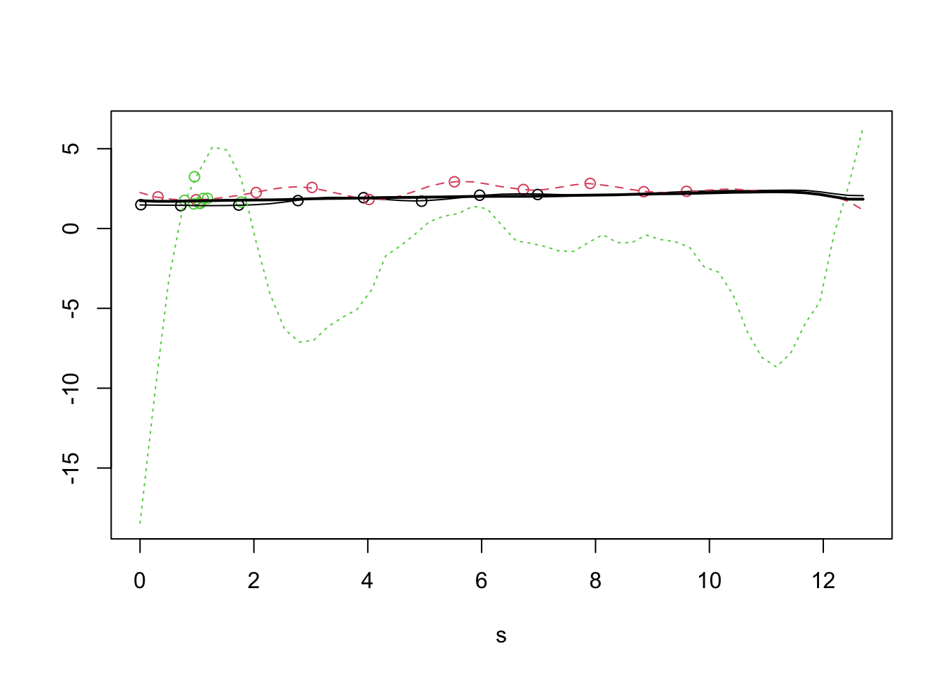
The value of the FPCA analysis lies in estimating the mean function and the covariance operator which are constructed from the pooled data, and not in predicting an individual paths.
The covariance surface is easily plotted with the help of the extractor function GetCovSurface() which fetches the time grid and associated covariance surface stored in the FPCA object. These are in the right format for a three dimensional, interactive plotly visualization. Rotating the plot and changing the viewing angle reveals quite a bit about the details of the estimated covariance surface.
covS <- GetCovSurface(df3$Wages,df3$Exp)
x <- covS$workGrid
Surf <- covS$cov

fig <- plot_ly(x = x, y = x, z = ~Surf) %>%
  add_surface(contours = list(
    z = list(show=TRUE,usecolormap=TRUE,
             highlightcolor="#ff0000", project=list(z=TRUE))))

fig <- fig %>%
  layout(scene = list(camera=list(eye = list(x=1.87, y=0.88, z=-0.64))))

fig
The next plot, the Modes of Variation Plot shows the modes of variation about the mean for the first two eigenfunctions. The mean function is indicated by the red line. The dark gray shows the variation of the first eigenfunction, and the light gray shows the variation of the second. The plot indicates that all of the subjects begin their careers with similar entry level wages, start to diverge by their second year, reach peak variation around year eight and then begin to converge again by year eleven.
CreateModeOfVarPlot(res_wages, main = "Modes of Variation of Eigenvectors")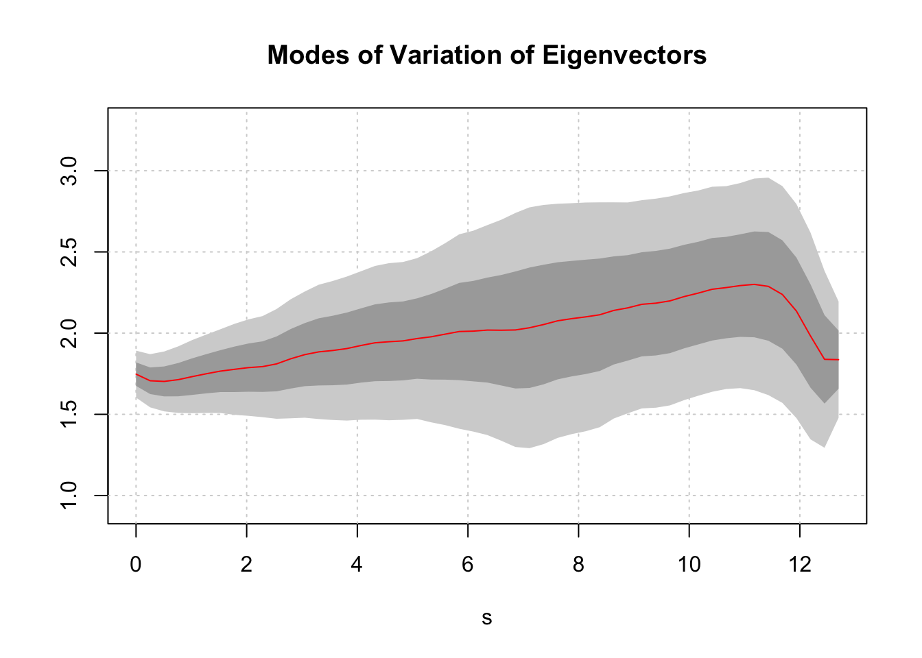 ### Some Conclusions
This short post neither presents a comprehensive view of functional principal components analysis, nor does it provide the last word on the wages data set. Nevertheless, juxtaposing the highly visual but traditional exploratory analysis conducted by the authors of the brolgar package with a basic FPCA look does provide some insight into the promise and pitfalls of using FPCA to explore sparse, longitudinal data sets.
On the promise side:
FDA offers a global perspective that facilitates thinking about an individual subject’s time path as a whole. For the
wagesdata set, we see individual trajectories developing in a wages/time space that can be parsimoniously represented, analyzed and compared.FPCA works with very sparse data, does not require the same number of observations for each subject, and does not demand that the observations be taken at the same time points.
There is really no concept of missing data per se, and no need for data imputation. The amount of information required to represent a subject can vary over a wide range.
As to the pitfalls:
As with plain old multivariate PCA, eigenvectors may not have any obvious meaning, and trajectories in an abstract space may be difficult to interpret.
There is really no way to avoid the missing data daemon. The
wagesdata set shows the sensitivity of FPCA trajectories to both the number and the locations of the observed data points. It is not possible to reconstruct individual trajectories for which there are too few observations.
That’s all for now. Thank you for following along.
You may leave a comment below or discuss the post in the forum community.rstudio.com.