An elegant application of Functional Data Analysis is to model longitudinal data as a curve and then study the curve’s dynamics. For example, in pharmacokinetics and other medical studies analyzing multiple measurements of drug or protein concentrations in blood samples, it may be interest to determine if the concentrations in subjects undergoing one type of treatment rise quicker than those undergoing an alternative treatment. In this post, I will generate some plausible fake data for measurements taken over time for two groups of subjects, use the techniques of Functional Data Analysis to represent these data as a continuous curve for each subject, and look at some of the dynamic properties of the curves, in particular their velocities and accelerations.
Synthetic Data
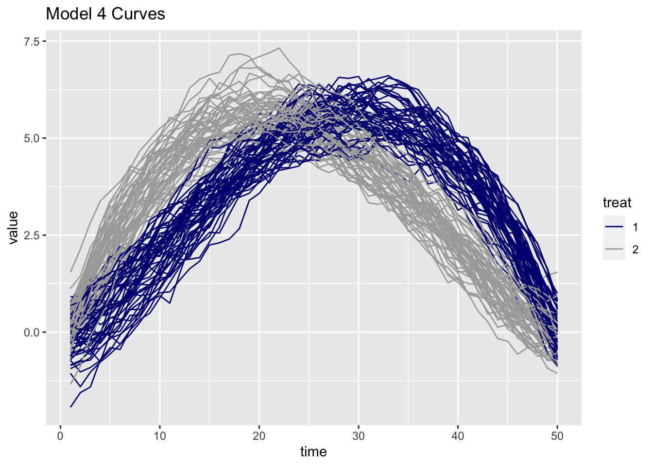
The fdaoutlier package contains functions to generate a number of stochastic models with a mechanism to generate reasonable outliers for each type of model. THe curves produced by model 4 look like they can serve plausible synthetic concentration curves. Instead of thinking of normal curves and outliers, I imagine the two related sets of curves to be the results of two different treatments influencing some measured concentration curve. In the example below, the curves associated with treatment 2 are of the form: \[X_i(t) = \mu t(1 - t)^m + e_i(t),\] while those associated with treatment 1 are of the form: \[X_i(t) = \mu(1 - t)t^m + e_i(t)\] where:
- \(t\in [0,1]\),
- \(e_i(t)\) is a Gaussian process with zero mean and covariance function of the form: \[\gamma(s,t) = \alpha\exp\{-\beta|t-s|^\nu\},\]
- \(m\) is a constant
- \(\mu\) is the mean value
- \(\alpha\), \(\beta\), and \(\nu\) are coefficients in the covariance function
library(fdaoutlier)
library(tidyverse)
library(fda)
library(gganimate)
library(gridExtra)
The following code generates two different sets of longitudinal data from Model 4 which is described in the vignette to the fdaoutlier package.
set.seed(95139)
n_curves <- 100
n_obs <- 50
mod4 <- simulation_model4(n = n_curves, p = n_obs, outlier_rate = .5, seed = 50, plot = FALSE)
index <- 1:n_curves
index1 <- mod4$true_outliers
# curves_mat is an n_curves x n_obs matrix
curves_mat <- mod4$data
treat <- rep(2,n_obs)
curves <- data.frame(index, treat, curves_mat)
curves <- curves %>% mutate(treat = if_else((index %in% index1),1,2))
There are 50 curves for each treatment and 50 points for each curve. This is probably the simplest case possible, and it is good enough to show how to explore the dynamics of curves. However, if you work with real longitudinal data you know that things are rarely this simple. But please be assured that FDA can deal with considerably more complexity, including a variable number of measurements for each subject, different measurement times for each subject, and situations where you have far fewer than 50 points for each subject. I have explored some of these situations in previous posts. For example, look here to see how to work with different time points, and here for some ideas for working with sparse data. The first link above also points to basic references that should help you to get started with your data.
Now, I reformat the data into a long form data frame and plot both sets of curves.
time <- 1:n_obs

curves_l <- pivot_longer(curves, cols = !c("index", "treat"), names_to = "Xval") %>%
            mutate(time = rep(time,100), .before = "treat", treat = as.factor(treat)) %>%
            dplyr::select(-Xval)

p <- curves_l %>% ggplot(aes(time,value, color = treat)) +
     geom_line(aes(group = index)) +
     scale_color_manual(values=c("navy blue", "dark grey")) +
     ggtitle("Model 4 Curves")
p
So far we just have plots based on a relatively small number of data points. Nevertheless, our eyes extrapolate, and we imagine seeing two sets of continuous curves with one set clearly rising to its maximum value faster than the other set. But we really don’t have continuous curves yet, we just have points.
The next step is to invoke the mathematics of FDA to embed the points in an infinite dimensional vector space where the data for each subject is modeled by a continuous function (curve). Exactly how this happens is a bit involved, but the general idea is that we create a basis and then use the data and some techniques from the linear algebra of Hilbert spaces to estimate the time dependent coefficients that enable modeling each subject’s data points as a linear combination of the basis functions. So, from here on out we are not going to be working with the raw data anymore. We will be working with vector space models of the data. The upside is that we can now now have real curves (continuous function), and can calculate the values of the functions and other properties such as the first and second derivatives at any time point. If you are interested in the math, please have a look at the references listed at the bottom of my post on Functional PCA.
Modeling the data as functions with a B-Spline Basis
Here we use the function fda::create.bspline.basis() to create a B-Spline basis covering the interval of our observations. The plot of the curves above indicates that specifying a knot at every multiple of 5 ought to be adequate for representing our data. Note that using cubic splines n_order = 4 ensures that the splines will have continuous first and second derivatives at the knots.
knots    = c(seq(0,n_obs,5)) #Location of knots
n_knots   = length(knots) #Number of knots
n_order   = 4 # order of basis functions: for cubic b-splines: order = 3 + 1
n_basis   = length(knots) + n_order - 2;
spline_basis = create.bspline.basis(rangeval = c(0,n_obs), nbasis = n_basis, norder = n_order)
#plot(spline_basis)
The following code uses the function fda::Data2fda() and the spline-basis to convert the Model 4 data points into functions and produce one fda object for each of the two groups of treatments.
# df1 is an (n_curves/2) x (n_obs) matrix
df1 <- curves_mat[index1,] # data for treatment 1
index2 <- index[!(index %in% index1)]
df2 <- curves_mat[index2,]  # data for treatment 2
# Use the b-spline basis to create represent the curves as vectors in the function space
df1_obj <- Data2fd(argvals = 1:n_obs, y = t(df1), basisobj = spline_basis, lambda = 0.5)
df2_obj <- Data2fd(argvals = 1:n_obs, y = t(df2), basisobj = spline_basis, lambda = 0.5)
Computing Derivatives
Here we evaluate each function along with its first and second derivatives at a finer time scale than we used to originally display our data.
tfine <- seq(0,50,by=.5)
# Each matrix is 101 x 50 rows are different times, columns are curves
pos1 <- as.vector(eval.fd(tfine, df1_obj));     pos2 <- as.vector(eval.fd(tfine, df2_obj))
vel1 <- as.vector(eval.fd(tfine, df1_obj,1));   vel2 <- as.vector(eval.fd(tfine, df2_obj,1))
acc1 <- as.vector(eval.fd(tfine, df1_obj,2));   acc2 <- as.vector(eval.fd(tfine, df2_obj,2))
Note that the velocities and accelerations computed above were returned as matrices. We convert them to vectors and put them into a data frame for plotting.
time <- rep(tfine,50)
id1 <- rep(1:50,each=101)
id2 <- rep(51:100,each=101)

derv1 <- data.frame(time, id1, pos1, vel1, acc1)
derv2 <- data.frame(time, id2, pos2, vel2, acc2)

pv1 <- derv1 %>% ggplot(aes(time,vel1,col=id1)) + geom_line(aes(group = id1)) + ggtitle("Velocity Treatment 1")
pv2 <- derv2 %>% ggplot(aes(time,vel2,col=id2)) + geom_line(aes(group = id2)) + ggtitle("Velocity Treatment 2")
pa1 <- derv1 %>% ggplot(aes(time,acc1,col=id1)) + geom_line(aes(group = id1)) +ggtitle("Acceleration Treatment 1")
pa2 <- derv2 %>% ggplot(aes(time,acc2,col=id2)) + geom_line(aes(group = id2)) + ggtitle("Acceleration Treatment 2")

grid.arrange(pv1, pa1, pv2, pa2, nrow = 2,ncol = 2, padding = unit(1, "line"))
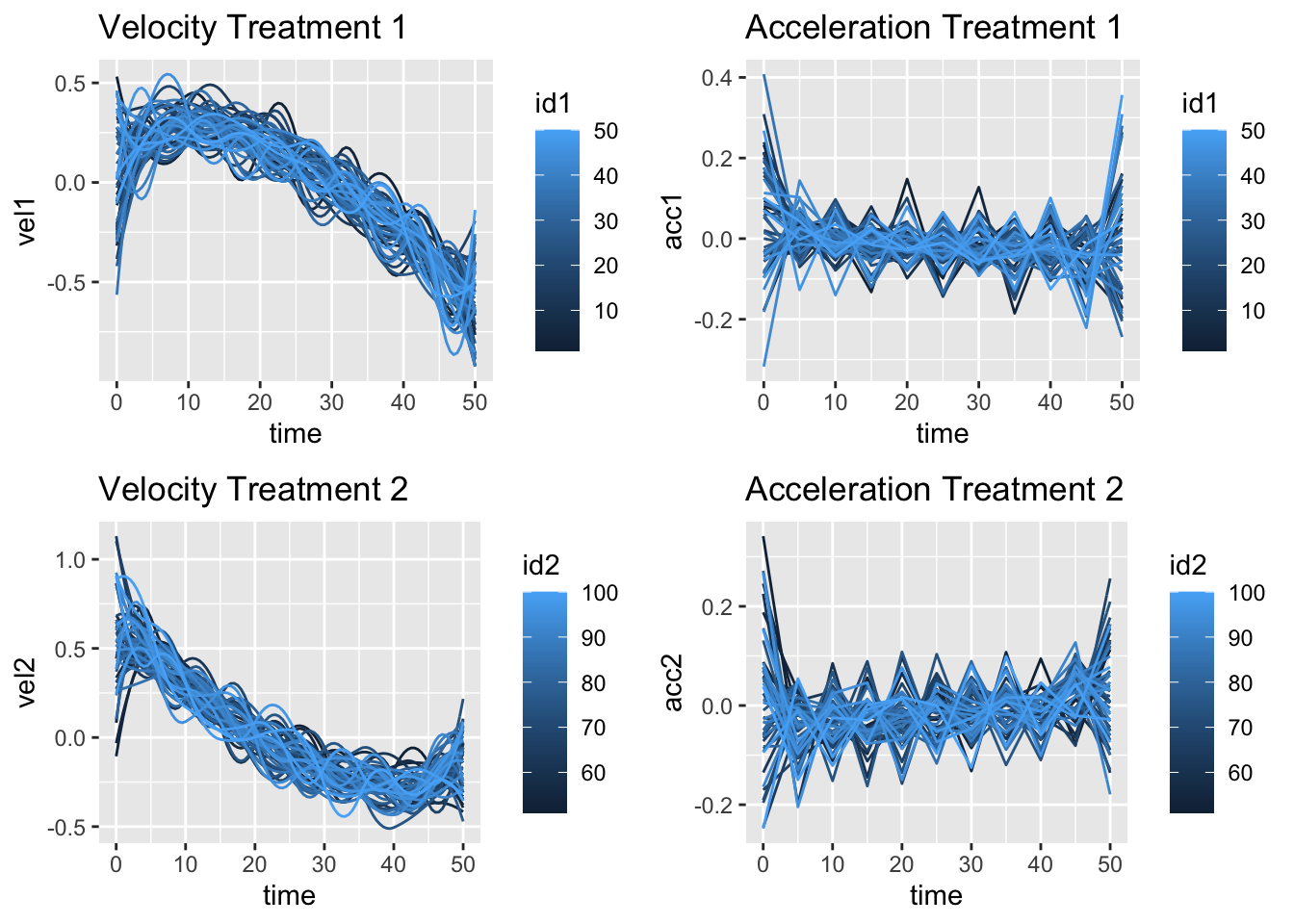
The velocities for treatment 1 head upwards before they decrease while the velocities for treatment 2 go straight down, and the curve up again. The accelerations for treatment 1 slope downward slightly while those of treatment two slope upward. So the plots indicate that the two sets of curves look like they behave differently.
Testing for Differences
We can test for differences using the function fda::tperm.fd() which implements a resampling method to do pointwise t-tests. The functional data representing the curves for the two samples are combined in a single array and the labels for the curves are randomly shuffled. Recalculating the maximum value of the t-statistic for each point enables computing a null distribution. Then, at each time point, the observed data are compared with the 1 - \(\alpha\) quantile of the null distribution.
The plot below shows the result of performing the t-test to compare the first derivatives of the two treatments. I use the function fda.deriv.fd() to calculate the first derivative for each treatment on the fly, just to show another way of doing things in the fda package. You can easily modify the code to compare accelerations.
dfdt1 <- deriv.fd(df1_obj,1)
dfdt2 <- deriv.fd(df2_obj,1)
tres <- tperm.fd(dfdt1,dfdt2,plotres=FALSE)

max_q <- tres$qval
tres_dat <-tibble(time = tres$argvals, t_values = tres$Tvals,
                  q_vals = tres$qvals.pts)

p <- tres_dat %>% ggplot(aes(time,t_values, colour = "t_value")) + geom_line() +
    geom_line(aes(time, q_vals, colour = "q_vals")) +
    geom_line(aes(time, max_q,colour = "max_q"), linetype= "dashed") +
    labs(x = "time", y = "") +
    ggtitle("Statistics for Pointwise t-test")
p
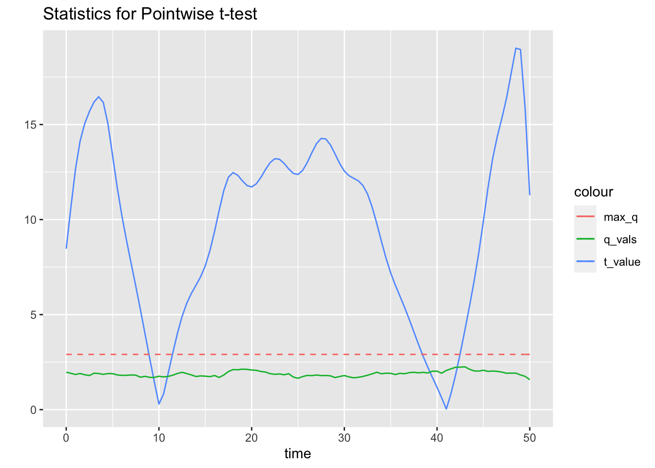
The blue curve shows the t-statistic for the observed values. The green curve represents the 95% quantiles, and the dashed red line is the 95% quantile of the maximum of null distribution t-statistics. The t-test confirms that the derivatives are indeed different except in the regions of overlap around time = 10 and time = 40.
Examine Phase Plots
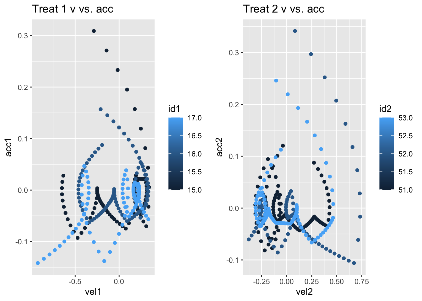
Phase plots are useful for evaluating how the curves develop in the abstract phase space created by looking at position versus velocity, or velocity versus acceleration. Here we pick three curves from each treatment and plot velocity versus acceleration.
phase1 <- derv1 %>% filter(id1 %in% 15:17)
phase2 <- derv2 %>% filter(id2 %in% 51:53)
pph1 <- phase1 %>% ggplot(aes(vel1,acc1,col=id1)) + geom_point() + ggtitle("Treat 1 v vs. acc")
pph2 <- phase2 %>% ggplot(aes(vel2,acc2,col=id2)) + geom_point() + ggtitle("Treat 2 v vs. acc")

grid.arrange(pph1, pph2, ncol = 2, padding = unit(1, "line"))
Based on this small sample, it certainly appears that the curves associated with the two different treatments inhabit different regions of phase space.
Finally, it is easy and helpful to animate a phase diagram to show how a function develops in phase space over time. The animation below shows the first curve for treatment 1.
pos <- eval.fd(tfine, df2_obj[1])
vel <- eval.fd(tfine, df2_obj[1],1)
acc <- eval.fd(tfine, df2_obj[1],2)
phase_dat <- tibble(tfine, vel, acc)

p <- ggplot(phase_dat, aes(vel,acc)) +  geom_point() + ggtitle("Trajectory in Phase Space")

anim <- p + transition_time(tfine) + shadow_mark()
anim_save("anim.gif", anim)
#anim
You may leave a comment below or discuss the post in the forum community.rstudio.com.