Enes Gencer is a lead data scientist at Doktar and a graduate of Tilburg University (Research Master, Economics). Enes’ interests include data science problems in Economics, Finance, and Agriculture.
Introduction
Inflation is a hot topic for both globally and in Turkey nowadays. Inspired by Rami Krispin, I reverse engineered his U.S. Electricity dashboard and created a dashboard to explore a forecast for inflation in Turkey. In this post, I would like to begin to describe some of the technology that went into creating the dashboard.
The data and machine learning pipelines are automated via Docker, Github Actions, and R Markdown. The dashboard has too many dimensions to cover in a single blog post so in this blog post, I focus on the underlying economics and the forecasting method I choose, Elastic Net. In the coming blog posts, I might write on different aspects like flexdashboard, Docker, or a more interesting forecasting method like LSTM using Keras on R.
Getting Started
First, we load the required libraries and data set.
library(tidyverse)
library(lubridate)
library(caret)
library(zoo)
library(ggthemes)
library(magick)

load("processed_data.Rdata")
Dataset
The data set consists of monthly macroeconomic variables. The dependent variable is the Y-o-Y change in CPI, and the independent variables are lags of
- Price indexes
- Tendency surveys of the economic agents
- Production statistics
- Balance of payments statistics
- Exchange rate return
- Month (to take into account seasonality)
- CPI Forecast of TBATS model (inspired by the stacking methods)
First, I only included lags to avoid hindsight bias or the “knew-it-all-along” phenomenon. For instance, as of today, the model predicts March inflation. However, March statistics are not announced yet. If the model is constructed to use March statistics, then it has no value in real-life prediction.
Second, the analysis does not cover the effect of interest rates on inflation. That is only because I have a pre-written script to pull monthly variables. Therefore, I do not want to spend time adjusting the frequency. Also, the effect of the interest rate is known anyway. Central banks shift the price of money (or cost of borrowing) by changing interest rates, which is the primary tool to manage inflation. A rise in interest rate has two effects: first, it makes borrowing more costly, so people defer their consumption. Second, it might reduce the present value of financial assets. Hence, creating a negative wealth effect. Both impacts cause the inflationary pressures to ease.
We have the training data:
forecast_date = "2022-03-31"

train_data <- forecast_df %>%
  filter(Date < forecast_date)

tail(train_data,3)
## # A tibble: 3 × 94
## Date CPI CPI_Lag1 CLI_Lag1 Domestic_PPI_Lag1 Inflation_Expectation_La…
## <date> <dbl> <dbl> <dbl> <dbl> <dbl>
## 1 2021-12-31 0.361 0.213 102. 0.546 15.6
## 2 2022-01-31 0.487 0.361 102. 0.799 21.4
## 3 2022-02-28 0.544 0.487 101. 0.935 25.4
## # … with 88 more variables: FS_Confidience_Lag1 <dbl>,
## # RS_Confidience_Lag1 <dbl>, Production_Volume_Lag1 <dbl>,
## # Export_Orders_Lag1 <dbl>, BoP_Lag1 <dbl>, Utilization_Rate_Lag1 <dbl>,
## # Consumer_Confidience_Lag1 <dbl>, Import_Annual_Ret_Lag1 <dbl>,
## # Import_Monthly_Ret_Lag1 <dbl>, UsdTry_Annual_Ret_Lag1 <dbl>,
## # UsdTry_Monthly_Ret_Lag1 <dbl>, CPI_Lag2 <dbl>, CLI_Lag2 <dbl>,
## # Domestic_PPI_Lag2 <dbl>, Inflation_Expectation_Lag2 <dbl>, …And the test data:
test_data <- forecast_df %>%
  filter(Date  == forecast_date)

head(test_data)
## # A tibble: 1 × 94
## Date CPI CPI_Lag1 CLI_Lag1 Domestic_PPI_Lag1 Inflation_Expectation_La…
## <date> <dbl> <dbl> <dbl> <dbl> <dbl>
## 1 2022-03-31 NA 0.544 101. 1.05 24.8
## # … with 88 more variables: FS_Confidience_Lag1 <dbl>,
## # RS_Confidience_Lag1 <dbl>, Production_Volume_Lag1 <dbl>,
## # Export_Orders_Lag1 <dbl>, BoP_Lag1 <dbl>, Utilization_Rate_Lag1 <dbl>,
## # Consumer_Confidience_Lag1 <dbl>, Import_Annual_Ret_Lag1 <dbl>,
## # Import_Monthly_Ret_Lag1 <dbl>, UsdTry_Annual_Ret_Lag1 <dbl>,
## # UsdTry_Monthly_Ret_Lag1 <dbl>, CPI_Lag2 <dbl>, CLI_Lag2 <dbl>,
## # Domestic_PPI_Lag2 <dbl>, Inflation_Expectation_Lag2 <dbl>, …Modelling
I evaluated multiple machine learning algorithms: Elastic Net, generalized linear models, Random Forest, and Support Vector Machines. I decided that Elastic Net has crucial advantages. First, there is a very high correlation between the explanatory variables. Notice that I included multiple lags of a given variable. Also, two different variables might have associations through multiple macroeconomic channels. Hence, multi-collinearity has to be taken into account. Second, I prefer an interpretable model to validate the model results with stylized macroeconomic facts. Third, in this case, it has higher performance (in terms of RMSE and MAPE) compared to more complex models like Support Vector Machines or Random Forest. Therefore, Elastic Net provides me a sweet spot for interpretability, performance, and speed.
So, what is Elastic Net? It is a regularized regression technique that linearly combines L_1 and L_2 penalties. Basically, it is a combination of LASSO and Ridge regressions. In other words, it sets a group of the coefficient to zero and shrinks the remaining ones towards zero.
Mathematically, Elastic Net optimizes the following equation:
\(\min_{\beta_0,\beta} \frac{1}{N} \sum_{i=1}^{N} w_i l(y_i,\beta_0+\beta^T x_i) + \lambda\left[(1-\alpha)\|\beta\|_2^2/2 + \alpha \|\beta\|_1\right]\)
Visual comparison between LASSO, Ridge, and Elastic Net penalties:
magick::image_read(path = "elastic-net.png")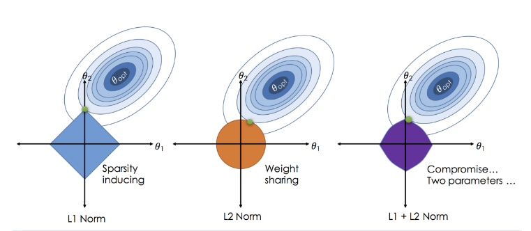 Source: Zou, H., & Hastie, T. (2005). Regularization and variable selection via the elastic net.
# Construct time slices for time-series cross validation

time_slices <- trainControl(
  method = "timeslice",
  initialWindow = 36,
  fixedWindow = TRUE,
  horizon = 3,
  savePredictions = TRUE,
  verboseIter = FALSE
)

# Train the model

elastic_net_fit <- train(
  CPI ~ .,
  data = train_data[,-1],
  na.action = "na.pass",
  method = "glmnet",
  preProcess = c("center", "scale"),
  trControl = time_slices
)
I use time-series cross-validation with a fixed window size to tune the hyper-parameters and evaluate the model performance. My idea is that the inflation dynamics might evolve. For instance, we have observed the increasing effect of the exchange rate on inflation in recent years. However, as a result of the commodity super-cycle, we might see the producer price index come into play. Therefore, having a more flexible model structure with respect to time makes sense.
In this case, the model is trained on the first 36 observations and evaluated on the 3 consecutive values on the test set. Then, the time slice shifts one month.
To learn more details on time-series cross-validation, please visit: https://robjhyndman.com/hyndsight/tscv/
Results
First, I get the best hyper parameters and collect the predictions of the selected model.
# Visualize results

lasso_preds %>%
  rename(Actual = CPI,
         Forecasted = pred) %>%
  gather(key = "Variable", value = "Value", Actual:Forecasted) %>%
  ggplot(aes(x = Date, y = Value, color = Variable))+
  geom_line(size = 0.75, alpha = 0.5)+
  geom_point(size = 0.75, alpha = 0.75)+
  scale_color_manual(values = c("steelblue4", "darkred"))+
  theme_bw()+
  scale_y_continuous(labels = scales::percent)+
  scale_x_date(breaks = seq(min(lasso_preds$Date),
                            max(lasso_preds$Date),
                            by="4 months"),
             date_labels = '%m-%y')+
  labs(x = "",
       y = "",
       subtitle = "Based on YoY CPI changes",
       title = "One-month ahead inflation forecast",
       color = "")+
  expand_limits(y = 0)+
  theme(plot.subtitle = element_text(face = "italic"))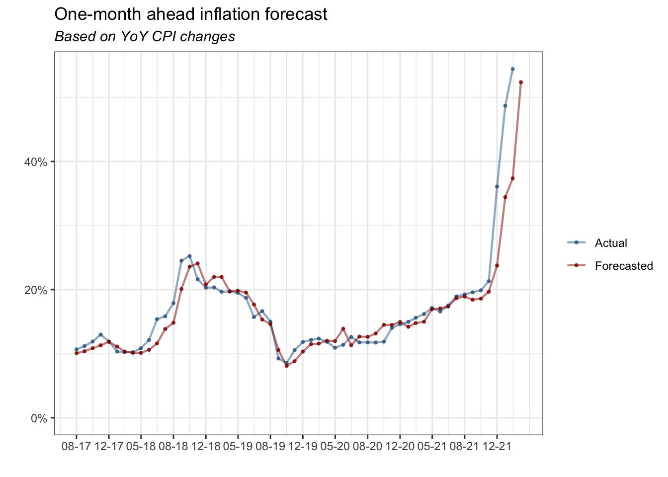
The plot shows a one-month ahead inflation forecast and actual inflation based on the YoY CPI changes.
lasso_preds %>%
  ggplot(aes(x = pred, y = CPI))+
  geom_point(size = 1.5, alpha = 0.8, color = "darkred")+
  geom_abline(intercept = 0,
              slope = 1,
              size = 0.3,
              linetype = 3,
              alpha = 0.8,
              color = "steelblue4")+
  theme_bw()+
  scale_y_continuous(labels = scales::percent)+
  scale_x_continuous(labels = scales::percent)+
  expand_limits(y = 0, x = 0)+
  labs(title = "Model Prediction & True Value",
       x = "Model Prediction",
       y = "True Value")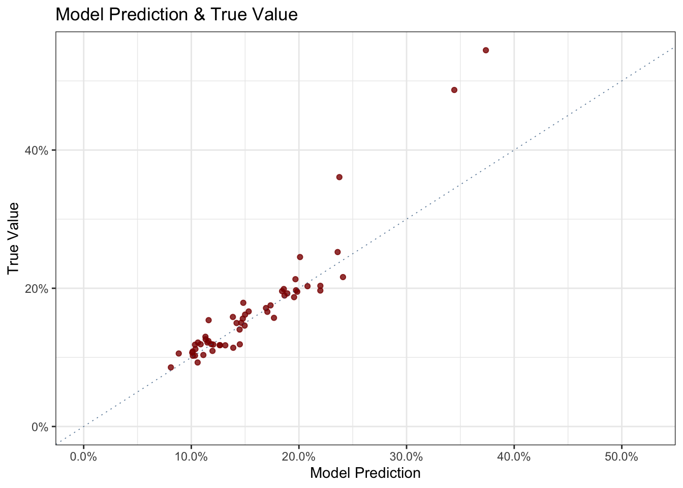
The second plot shows the predictions vs. the real values. You would expect to see the points are piled up around the 45-degree line. The model seems consistent in its predictions except for the three outliers, which will become sounder in the following plot.
lasso_preds %>%
  mutate(Residual = CPI - pred) %>%
  ggplot(aes(x = Date, y = Residual))+
  geom_point(size = 1.5, alpha = 0.8, color = "steelblue4")+
  geom_ribbon(stat='smooth', se=TRUE, alpha=0.05) +
  geom_line(stat='smooth', alpha=1, color = "darkred")+
  theme_bw() +
  labs(y = "Residuals",
       x = "",
       title = "Elastic Net Model Residuals",
       subtitle = "Over time")+
  scale_y_continuous(labels = scales::percent)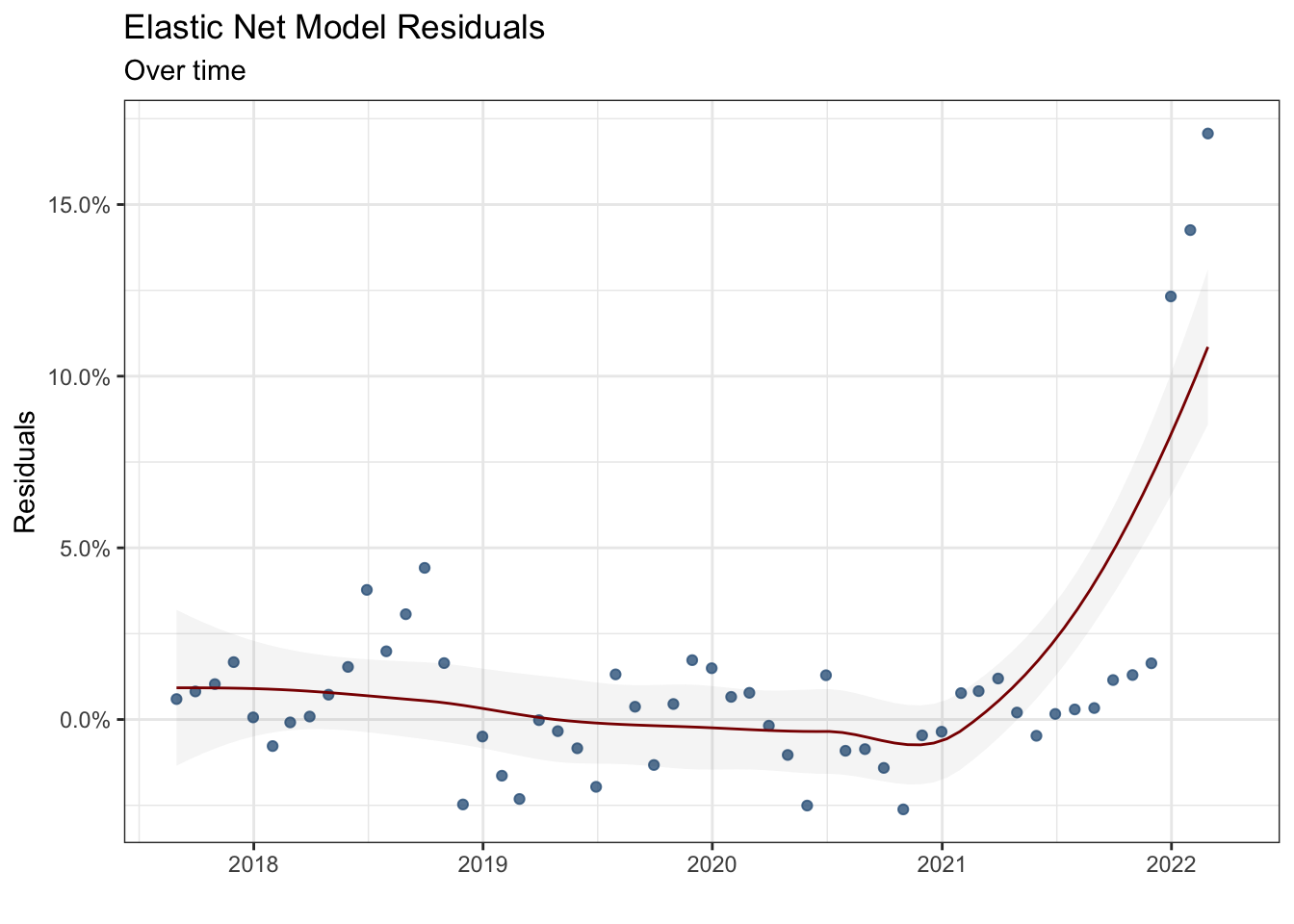
The third plot shows the model residuals over time. Notice that the model performance improves over time (until 2021), the smoothed residual curve gets closer to zero, and the frequency of outliers decreases. However, since 2021, the model performance has started to deteriorate caused by economic shocks. A different dynamic that cannot be taken into account comes into play.
var_names <- coef(elastic_net_fit$finalModel,
                  elastic_net_fit$finalModel$lambdaOpt) %>%
  rownames()

var_values <- coef(elastic_net_fit$finalModel,
                   elastic_net_fit$finalModel$lambdaOpt) %>%
  as.numeric()

model_result <- tibble(Variable_Names = var_names,
                       Coefficients = var_values)

model_result %>%
  mutate(Variable = gsub('[[:digit:]]+', '',
                         str_remove(model_result$Variable_Names,
                                    "_Lag"))) %>%
  group_by(Variable) %>%
  summarise(Overall_Effect = sum(Coefficients)) %>%
  filter(!Overall_Effect == 0) %>%
  filter(!Variable == "(Intercept)") %>%
  mutate(If_Positive = ifelse(Overall_Effect >0, "Positive", "Negative")) %>%
  mutate(Sum = sum(abs(Overall_Effect))) %>%
  mutate(Percent_Effect = Overall_Effect / Sum) %>%
  ggplot(aes(x = reorder(Variable, abs(Overall_Effect)), y = abs(Percent_Effect), fill = If_Positive))+
  geom_col(alpha = 3)+
  scale_y_continuous(labels = scales::percent)+
  expand_limits(y = c(0,0.45))+
  coord_flip() +
  labs(y = "",
       x = "",
       fill = "",
       title = "The weighted effects macroeconomic variables on Turkey's Inflation",
       subtitle = "Shows the overall effect through different lags",
       caption = "Source: CBRT")+
  theme_bw()+
  scale_fill_wsj()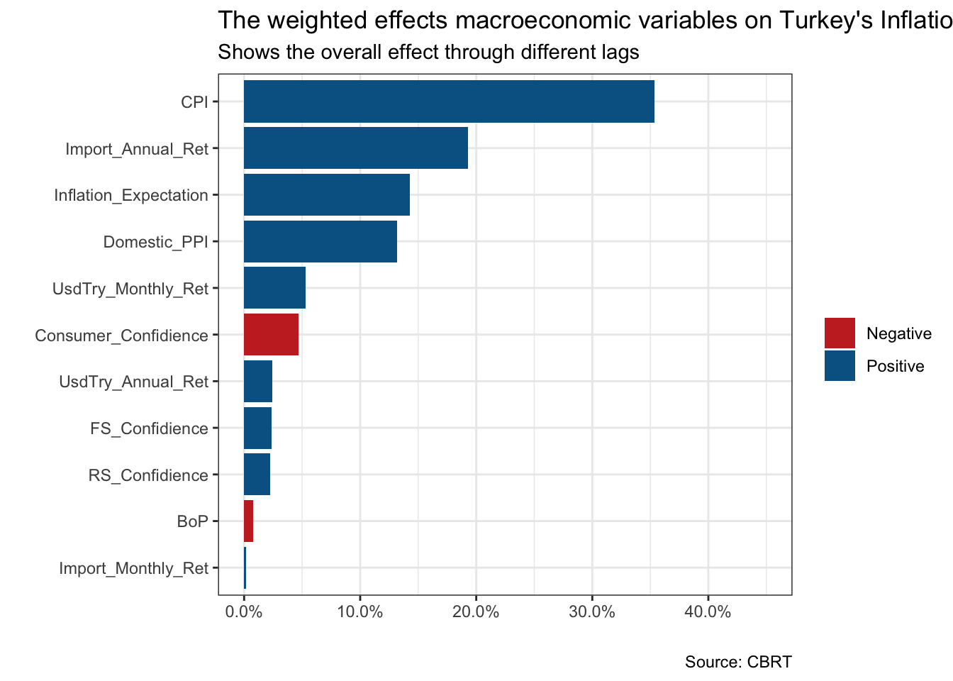
The final plot shows the weighted effect of macroeconomic variables on Turkey’s inflation. Notice two things. First, the values on the x-axis are not coefficients, but the share of each variable in total effect. Second, it shows the overall impact coming through multiple lags. Beyond the predictive abilities, the findings are consistent with macroeconomic facts. Remember that we want to interpret the model results. First, the highest share of CPI confirms the well-known “inertia’ phenomenon in inflation.”Inertia" refers to a situation in which prices in the whole economy adjust with the change in the price index. Therefore, it creates a self-sustaining loop.
Secondly, the effect of annual changes in import prices follows CPI. It is known as one of the most significant determinants of Turkey’s inflation. It is mainly because of the structure of the Turkish economy and production. Inflation expectations have the third-highest effect.
Theoretically, economic agents process all the information available constitutes expectation about the future and maximizes their utility. When the economic agents believe that future inflation rises, and behave accordingly, it turns into a self-fulfilling prophecy. Hence, it shows the importance of shaping the economic agents’ beliefs and expectations for a policy-maker.
Finally, the domestic producer price index is a variable with a relatively higher weight, which is consistent with the “pass-through effect”. The producer price index is more volatile due to its higher sensitivity towards shocks, however, it is expected that the producer and consumer price indexes move together in the long run. Therefore, in a relatively short-term analysis (which covers six months), we observe a partial “pass-through” effect.
Conclusion
To sum up, I focus on the underlying economics and machine learning algorithm used to forecast inflation. The elastic net algorithm is chosen considering the three factors: interpretability of model results, time efficiency, and model performance. The model results are consistent with the stylized facts of Turkey’s macroeconomics and underlying economic theory.
Beyond economics and theory, however, there is still a lot to uncover. The data and machine learning pipelines are automated via Github Actions and Docker. The dashboard is constructed with R Markdown and flexdashboard. Hopefully, I will discuss them in the coming posts with different dashboards. Till then, you can always reach me if you have any questions.
Note: for more information on the code and data used in this post, please see the author’s Github repository.
You may leave a comment below or discuss the post in the forum community.rstudio.com.